Research & Context
Being someone who has purchased ACG in the past and who has been recently looking into getting out into nature more, I already had some preconceptions of visual directions that this project may head in. I started off by looking at some campaigns within the same industry, brands like Arc’teryx, The North Face and Patagonia, these brands face similar issues to Nike’s ACG brand as they all started as active outerwear brands, and although they still hold some of that identity, modern fashion has taken the brands on board which has steered them away from their initial objective, hence the importance of studying how these brands handled their visual campaigns.
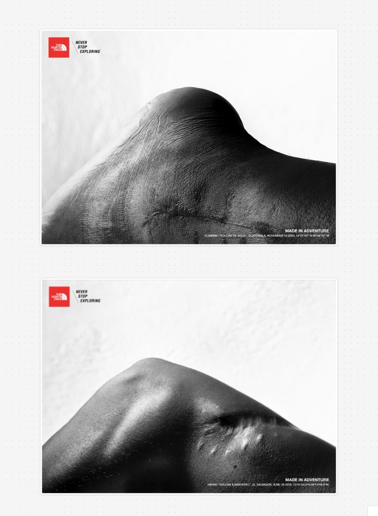
The North Face ran a campaign called ‘Never Stop Exploring’ showcasing injuries on body parts which were made to look like mountains, captioned with the information of the day the injury took place as well as the name of the peak, paired with the coordinates. All of this combined tells a story, the story paired with the striking black and white visuals help to motivate and inspire.
This is something I found within all of the modern campaigns which I looked at, striking imagery is at the forefront which is something I highly considered incorporating into the Off The Grid campaign as it helps become memorable and persuasive.
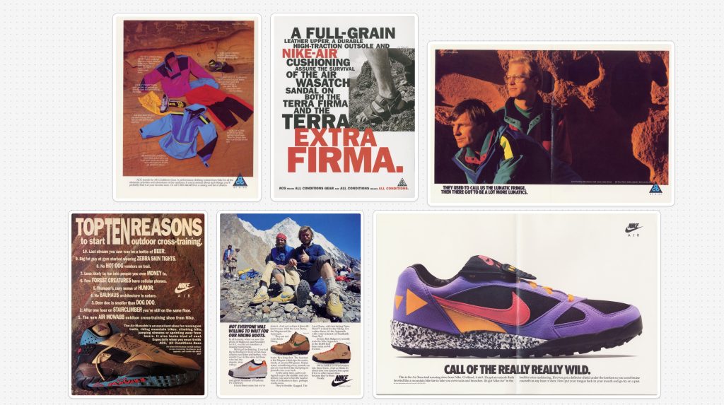
I also dived into some of nikes earlier ads and posters around the time that ACG was formed and in its early days, the strong visuals are striking and help to form an early visual language for the brand using an expressive colour palette to differentiate from the the dull competition that was on the market, this could be seen across their branding and most importantly their vibrant products. So this is also something that will be considered within the final outcome.
One of the other things I thought was crucial to look at was nike campaigns and branding, one of the things that stand out regardless of what nike sub brand it is a part of is how cohesive the campaign or visual language stays, it builds into a fully develop language that spans multiple mediums.
Conceptual Development
I started developing my ideas for the campaign in my sketching book using lateral thinking techniques and word association tasks to generate ideas, allowing me to focus on and pinpoint what the campaign would say and how it would speak to audiences; I looked at all different words associated with the city and nature to see how could play on the use of contrast between the two.
I further explored the elements on which I can persuade people to get outside, listing all of the potential outdoor activities and hobbies that could think of eg. Running, hiking, biking photography, birdwatching. I focused more on the sports and active outdoor activities rather than the hobbies due to the Nike and ACG being heavily involved with sports, activeness and movement, this allowed for a clearer direction and allowed me to further define the concept.
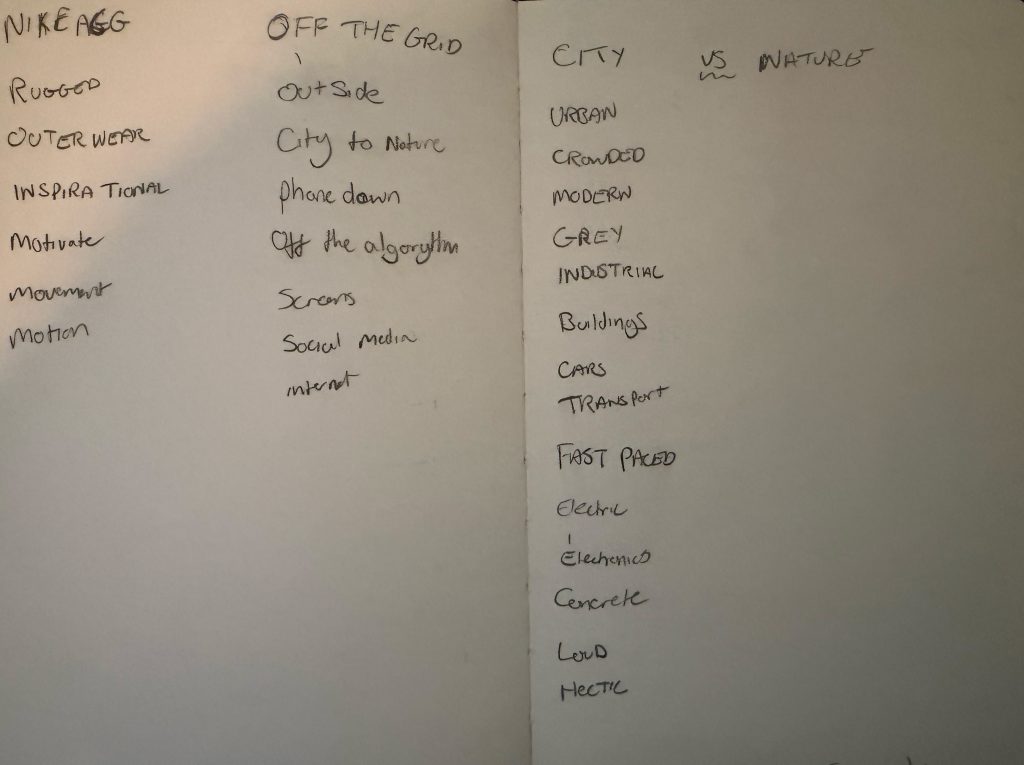
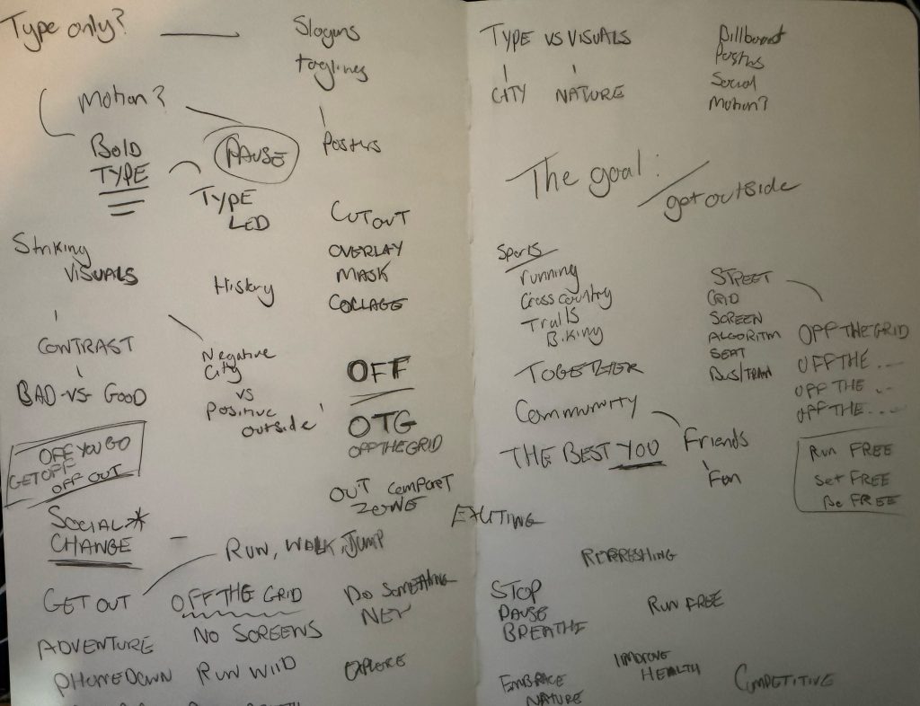
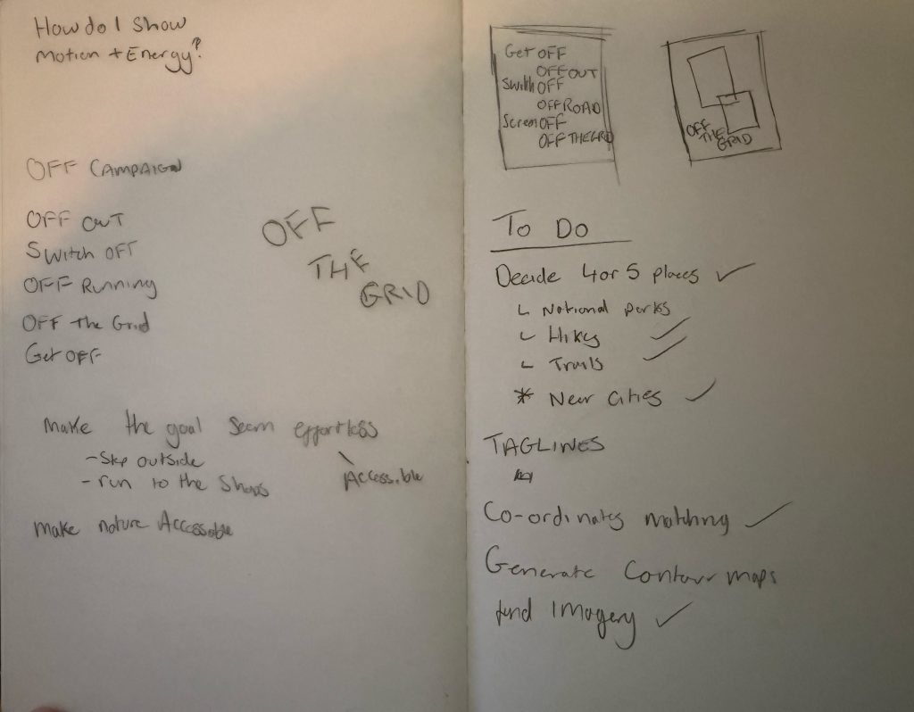
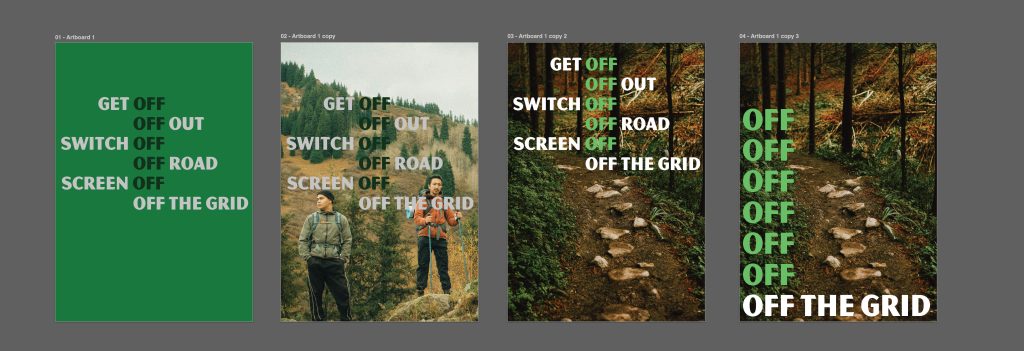
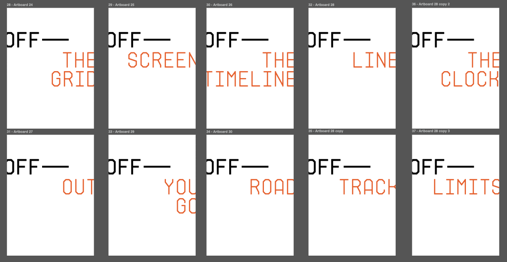
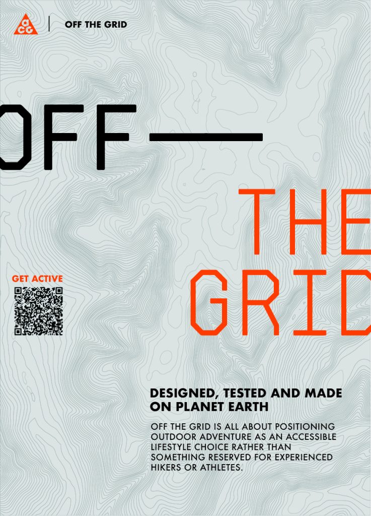
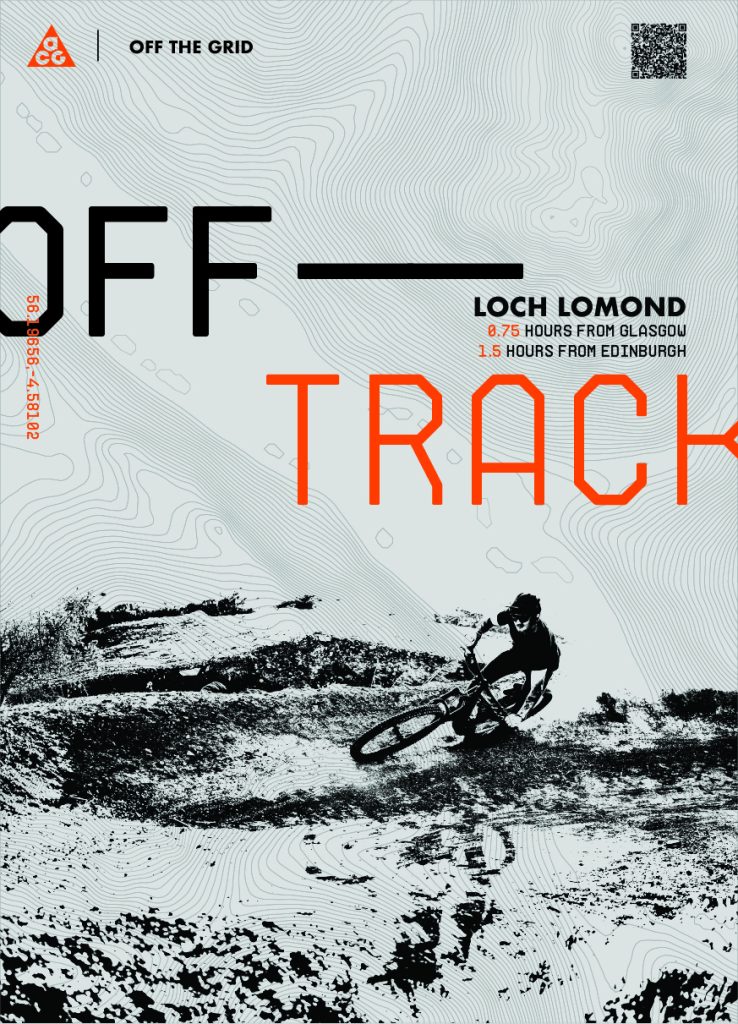
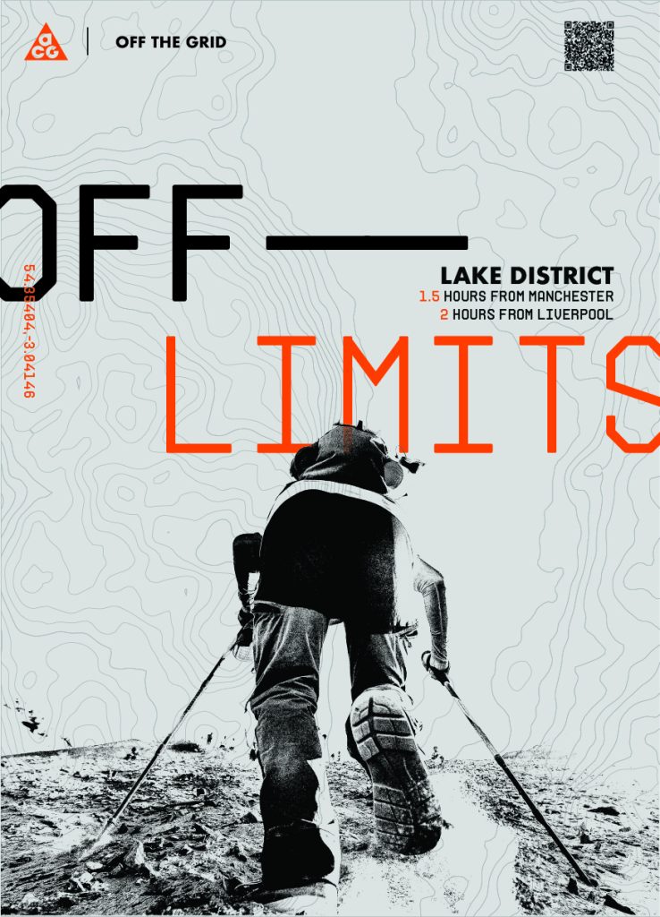
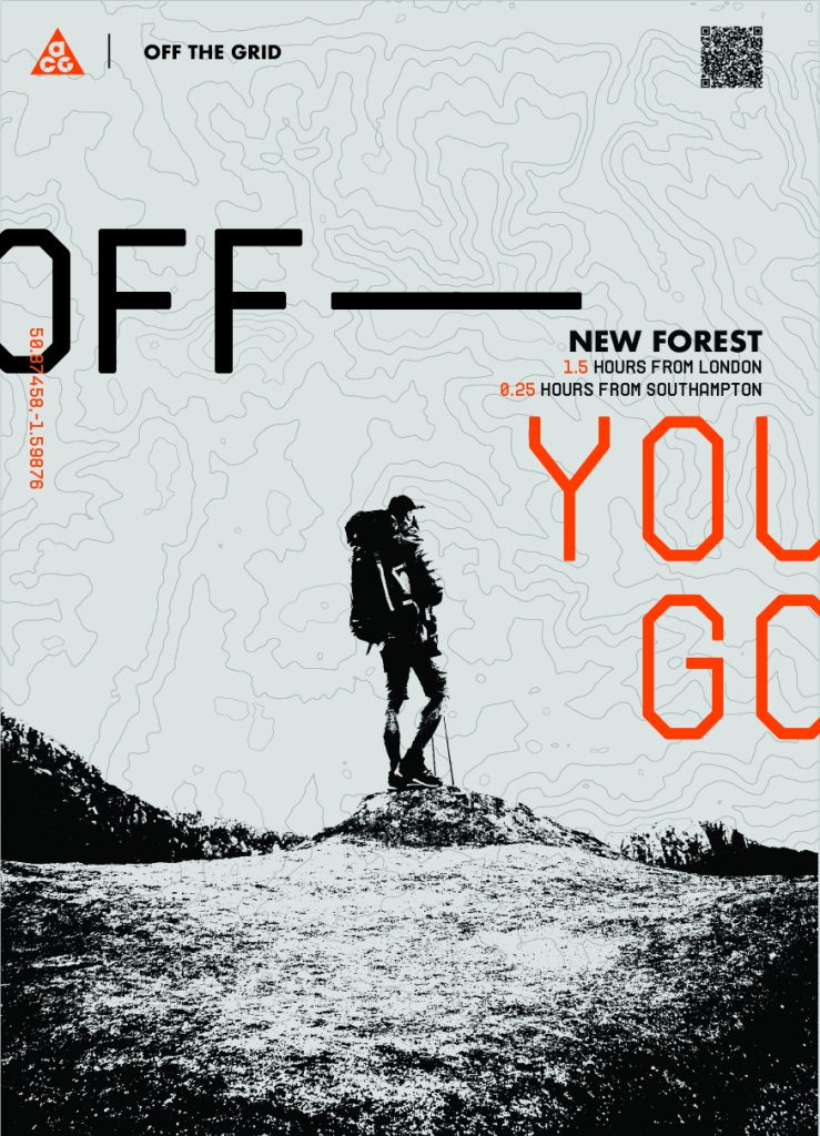
At this stage I was also looking into what the final deliverables would be for the campaign, I was deciding between an editorial magazine, a series of posters and motion advertisements. Within my sketchbook you can see one theme that kept coming up and it was using the word ‘OFF’ as an anchor word and attaching key phrases about being active and outdoors to it, following the theme of the campaign name ‘Off The Grid’ with phrases such as off out, off screen, get off and off you go.
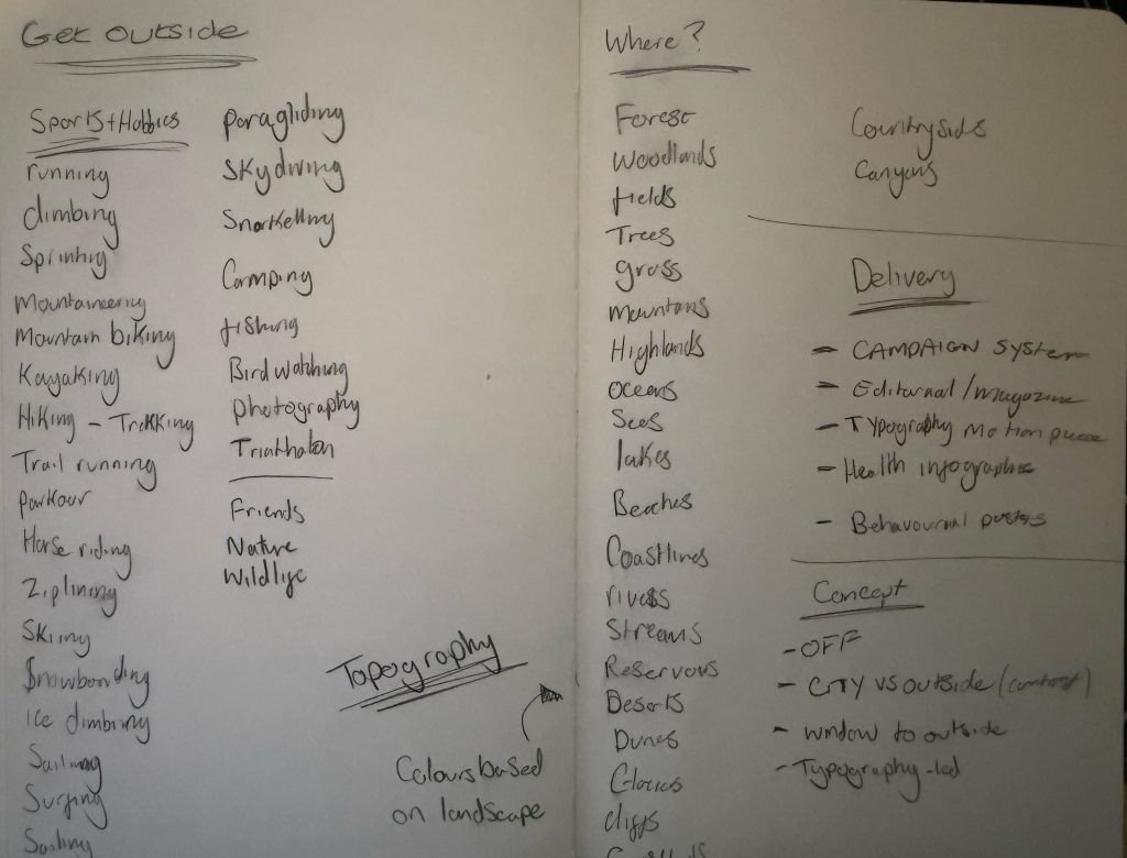
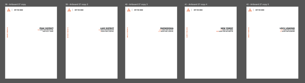
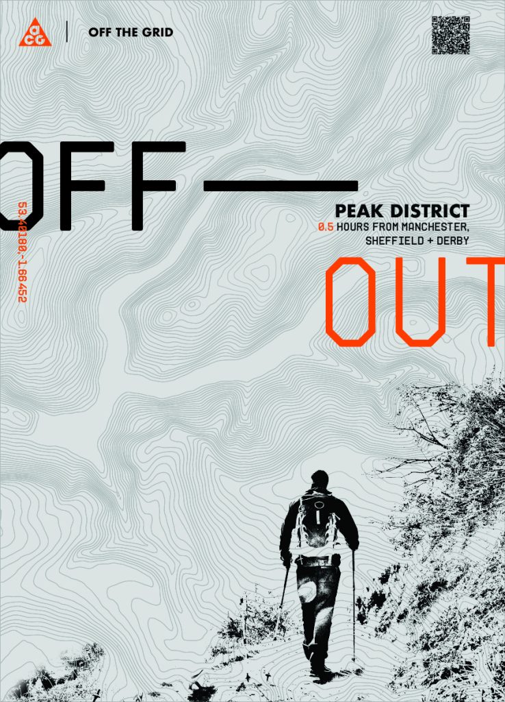
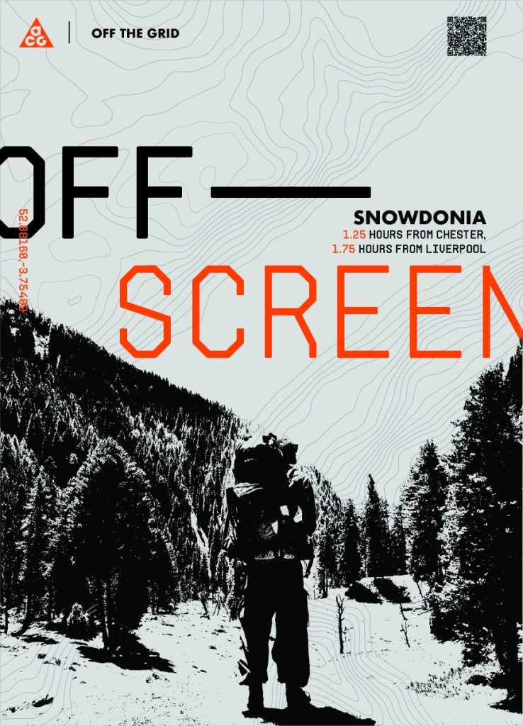
One of the things I wanted to dot loom at within the posters and campaign was aligning them with different hikes and national parks around the UK and how far they are from major cities showcasing that these activities are accessible and can be for anyone.
Experimentation & Prototyping
After initial development within my sketchbook, I went straight to software to get some quick visuals to start looking at what the ‘OFF…’ concept would look like in action, pulling from my initial research I felt it was necessary to try to incorporate imagery helping within persuasion and storytelling. My first initial visual ideas helped me to build upon the ‘OFF’ phrases that I wanted to explore, and also began using imagery but the concepts felt visually flat and and too structured. I then moved onto to a slightly more dynamic approach by overlapping different elements and using a generic contour topography map to create a more unique layout, using text half off the elements whilst still being legible which allowed the composition to feel as if it were off the grid, playing further into the campaign name. I experimented with choosing a blocky modern tech typeface, this and the rugged contour map contrasted really well and allows me to gain a feel of the city vs nature idea I tried to approach in my early development stage.
This allowed further experimentation and lead me in the right direction to capture the contrast within the campaign, I tried experimenting with the idea of contrast some more and created some more visually balanced monochromatic posters using structured type contrasting against the natural terrain within the contour map.
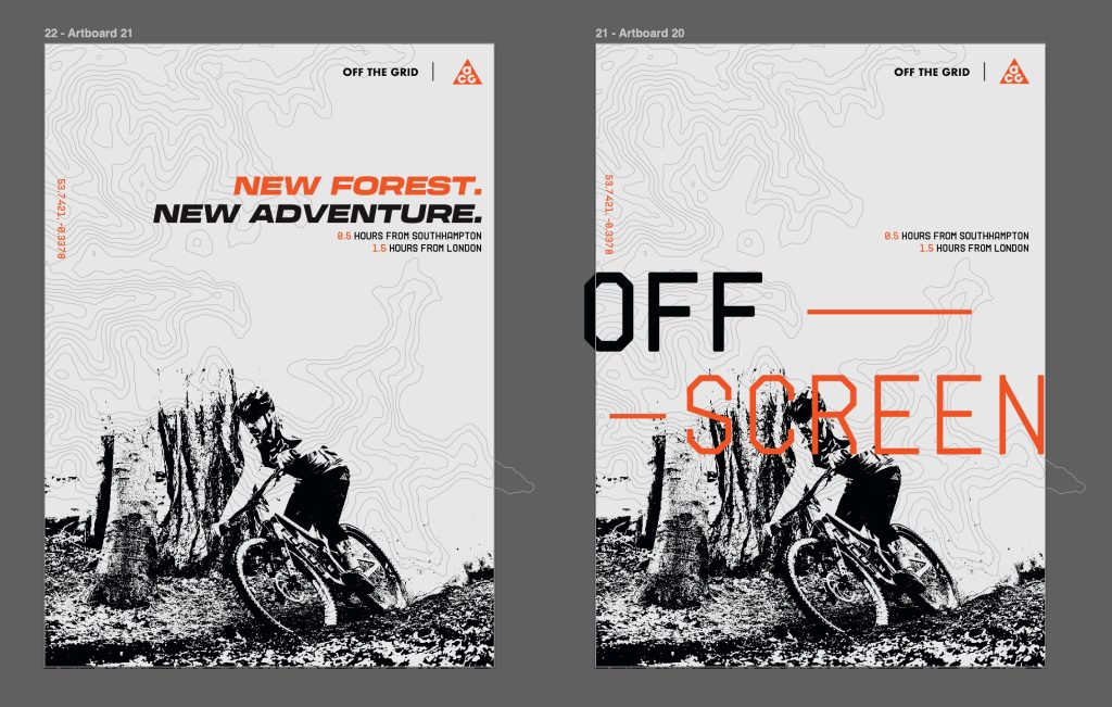
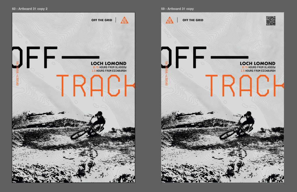
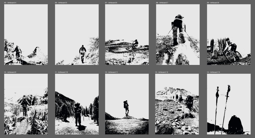
After this initial concept I started to define the layout and what the posters were all about. I incorporated imagery using threshold images of the earlier outdoor activities looked at within the conceptual development, these threshold black and white high contrast images really played into the natural rugged aspect of ACG and the campaign. Whilst the bold typography choices paired with lighter weight block serif allowed me to more city-oriented and functional.
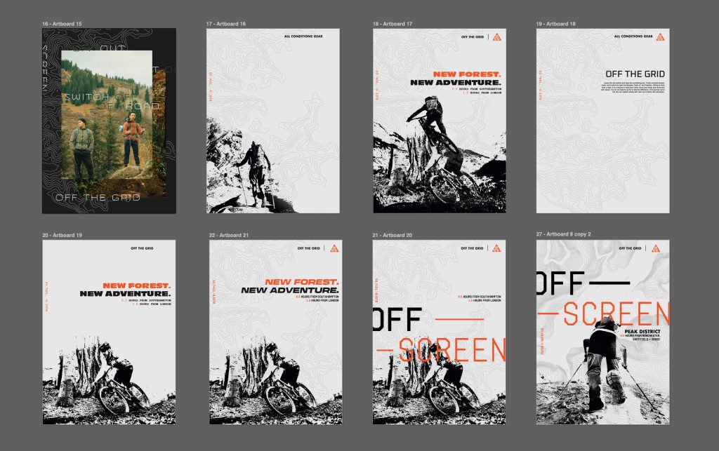
The typography experimentation evolved constantly with different iterations, trying more tech and functional feeling typefaces, landing on a typeface called Archimoto, with a very tactile feel. This was scaled up and paired with the earlier concept of hanging elements off of the page, each phrases hangs off the image just enough to feel as it is off yet still stay legible, the overhang is intentional.
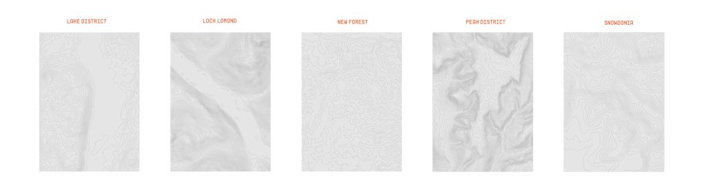
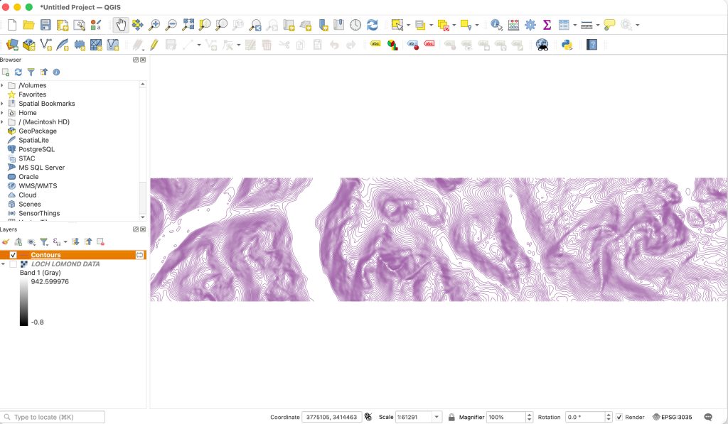
A large part of the experimentation and prototyping phase was looking identifying the chosen national parks and using a programme called QGIS(open-source geographic information system software) with open source map data to generate actual contour maps of the accessible areas, making each output unique in their own way, this also allowed me to pull coordinates of the topographic maps to pair up with each park as an additional piece of information tying the posters together. The coordinates idea is something that can be seen early on in the first concepts but I altered it so the the coordinates were relevant the each poster and matched up with the contour maps.
I also started to add in additional information indicating how far each of these nation parks is away from some of the major cities within the UK. Each element carefully selected with precision and intention.
User Testing & Feedback
One of the biggest adjustments based on user feedback was the change of direction previously looked at in terms of the main type. I asked for opinions of the 2 posters, 1 with the ‘new forest, new adventure type’ and the other with ‘OFF…’ phrases, and the feedback I received led me to go with the latter design style, It felt more dynamic, eye-catching and a persuasive and had a higher contrast with the rugged elements such as the imagery and contour maps.
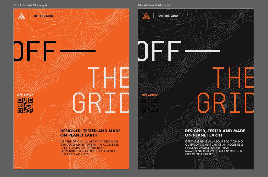
One of the other things that was picked up once I had started to build a unique and identifiable visual language for the campaign was that the printed media such as posters had a lack of information or call to action. I utilised a QR which worked well with the monochromatic background in the posters, which not only helps create a visual balance, but also gives direction on how to take part within the campaign, the QR code leads to an ACG landing page with more information about the hikes, trails and adventures, whilst also holding the same visual language as the rest of the campaign so everything feels cohesive.
With the placement of the QR code in the top right corner, I moved the logo to the top left which was also feedback I was given and allowed the posters to have a better flow reading from left to right.
Using all of the elements that I had created I was able to make a visual system that would allow me to layer different taglines, imagery and park information giving and endless supply of alternate posters that all had a cohesive visual language with relevant branding, colours and information.
Informed Design Decisions & Direction
Using all of the elements that I had created I was able to make a visual system that would allow me to layer different taglines, imagery and park information giving and endless supply of alternate posters that all had a cohesive visual language with relevant branding, colours and information.
Each one of my elements within the visual language has relevance and is intentional. The large type showcases a series of memorable slogans with a tech, city feeling typeface Archimoto, whilst other typography used is Futura bold, Nike and ACG heavily use Futura within their branding and it also contrasted well with the display typeface used. Each contour maps is uniquely generated and paired with the information based on the park it relates to; The park information is also accurate to the closest major cities and paired with coordinates which do not only create an interesting visual graphic but are individual to each poster contour map. The monochromatic colour palette is intentional to feel urban and industrial, yet wanted to explore vibrant colours which I referred to in my ACG historical research, the orange used is the ACG brand colour and contrasted well with industrial grey palette, allowing key information and elements to stand out against the rest of the visuals.
All these elements were built in a way that they’re able to spread across different mediums and platforms such as a series of social posts, a web landing page, and motion video graphics in both portrait and landscape making them accessible on mobile or laptop.
The way in which these elements and visuals are able to work across different mediums and sizes has allowed me to create a unique campaign that feels on brand to nikes ACG whilst also being true to the initial goal of my brief which was brand realignment with the outdoors and social change, to persuade young urban individuals to explore the outdoors.
References
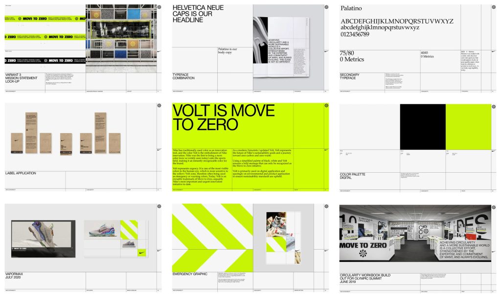
Accept & Proceed (n.d.) Nike Move to Zero. Available at: https://www.acceptandproceed.com/work/nike-move-to-zero(Accessed: 12 March 2026).
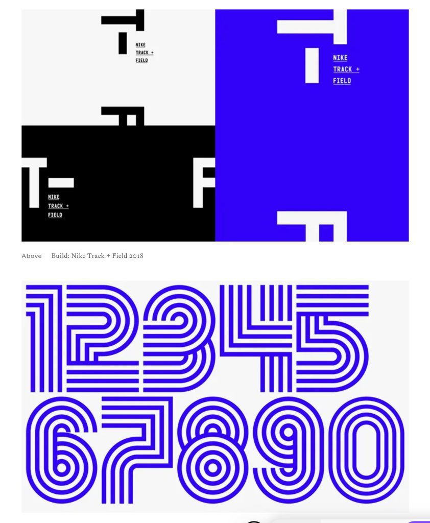
It’s Nice That (2018) Build updates Nike’s Track + Field branding, based on the athletic track’s “acceleration graphic”. Available at: https://www.itsnicethat.com/news/build-nike-track-and-field-graphic-design-310518 (Accessed: 9 March 2026).
Ads of the World (n.d.) Made in Adventure. Available at: https://www.adsoftheworld.com/campaigns/made-in-adventure (Accessed: 15 March 2026).
Creative Moment (n.d.) Why Nike is busy world-building for its ACG brand. Available at: https://www.creativemoment.co/why-nike-is-busy-world-building-for-its-acg-brand (Accessed: 18 March 2026).
Ads of the World (n.d.) Get Outside. Available at: https://www.adsoftheworld.com/campaigns/get-outside (Accessed: 21 March 2026).
Ads of the World (n.d.) Choose Your Way. Available at: https://www.adsoftheworld.com/campaigns/choose-your-way-6c351f38-bce1-446b-bedb-4384a08c3943 (Accessed: 25 March 2026).