Task 1 – Historical Design
Two historical examples of design work that arguably have some of the biggest impact on how public information is perceived in todays society is: Otl Aichers work for the Munich Olympics Identity in 1972 with its hard hitting, simplistic and memorable pictograms, and also Henry Beck’s 1933 London Underground Map with its clear and concise information. Each of these are extremely hard hitting in their own way, but serve as pivotal moments in the development of graphic design and reinforce how we use both of these systems on a day to day basis whether we realise it or not.
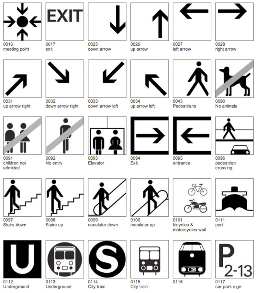
Otl Aicher created a system for the 1972 Munich olympics which went on to reach even further, with its impact and influence, a geometric and simplistic system that relies on the fundamentals of graphic design; no colour, no words, just icons. Icons that span across language barriers and are instantly recognisable, being used in hotels, hospitals, transportation and many more walks of life. Wether or not he knew it at the time, Oil Aicher set a standard for icon design when he created the 1972 Olympic system, with designers using his logic of consistency and geometry, minimal detail with maximum clarity and universal readability. Aicher’s work has allowed us as a society to communicate with iconography like we never have before with symbols for buses, luggage and fire escapes being recognisable with ease.
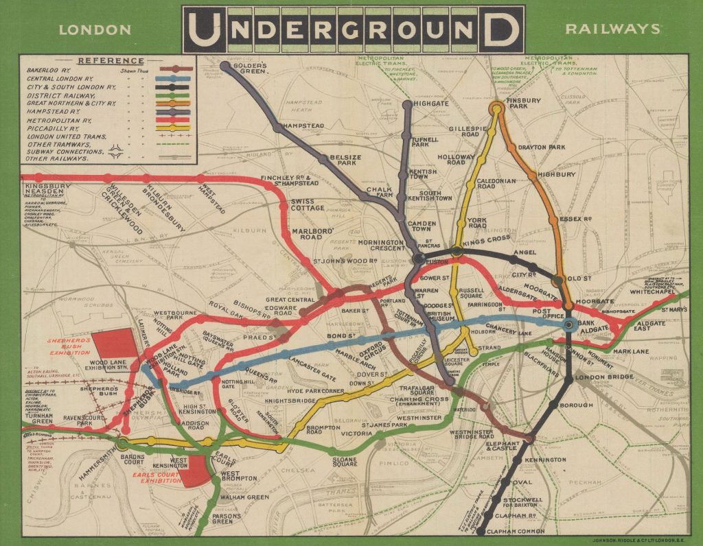
Four decades prior to this Henry Beck done something similar with how people take in travel information, he created the iconic London Underground with minimal detail and maximum clarity setting a standard for public transport maps across the world. Prior to this London Underground used a series of different maps, although these maps were geographically accurate, they were extremely busy and cluttered making them unreadable with no clear information being conveyed to the public. What is interesting about Beck’s take on the London Underground map is that Beck was an electrical draughtsman for the underground, not a graphic designer, this emphasises the importance of form and function and the pivotal role it plays in graphic design; it is not about being artistic but to solve a problem through visual communication. The majority of transport and train maps used today take influence from Beck’s work, the geometric and simplistic style, using colour to simplify the information provided allowing for a more enhanced and easy travel experience, a system for the London Underground was built upon this showing different train lines at each station with their respective colour for that specific line. People familiar with travel in London now immediately recognise black as the northern line, blue as Victoria line , red as the central line and so on; and this is due to beck’s approach to conveying information.
The reason I have chosen to look at the impact of Beck’s and Aicher’s work is to truly discover what travel would look like in the modern world without their intervention and the role that graphic design plays in absorbing information. Would it have evolved the same, or entirely different?
Task 2 – Contemporary Design
‘Don’t let Coke choke our oceans’ is a campaign launched by Greenpeace to confront the growing issue of plastic pollution in the ocean. The campaign focuses on holding major global corporations accountable for their environmental impact, specifically targeting Coca-Cola, who were labelled the number one ocean plastic polluter for the fifth year running at the time. By directly naming a recognisable brand, Greenpeace ensures the message feels immediate and unavoidable, shifting the issue from a distant environmental concern into a clear example of corporate responsibility. The campaign was distributed across posters and a video advertisement, allowing the message to reach audiences through both static and digital formats.
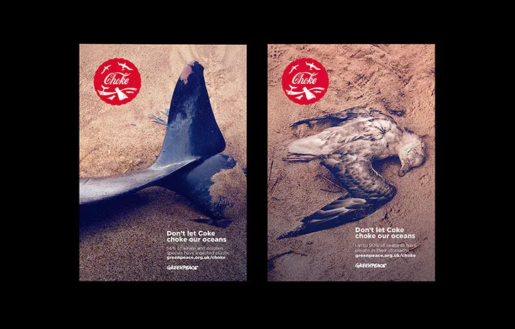
The campaign delivers such a strong impact due to Greenpeace’s use of hard-hitting, uncomfortable visuals. Rather than presenting plastic pollution in an abstract way, the design approach forces the viewer to confront the reality of environmental damage. This provocative style is highly effective because it interrupts the viewer’s attention and creates an emotional reaction, making the message difficult to ignore. By using discomfort as a design tool, Greenpeace ensures the campaign becomes memorable and encourages behavioural change through shock and urgency.
Emotion is a key driving force within the campaign, but it is reinforced through more than just disturbing imagery. The posters also include facts and figures, embedded within the typography, which adds credibility and strengthens persuasion. This combination of emotional impact and statistical evidence makes the campaign feel both powerful and trustworthy. The viewer is not only shocked, but also informed, increasing the likelihood of meaningful action such as reducing plastic use or pressuring corporations to change their packaging practices.
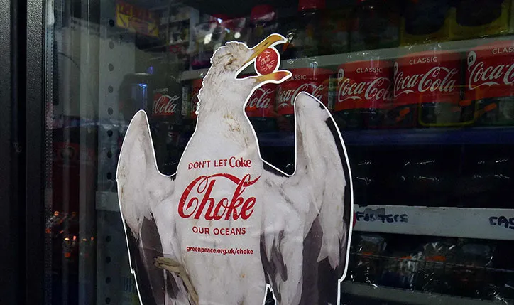
Another highly effective design method used is parody and conceptual branding. The campaign logo mimics Coca-Cola’s iconic visual identity, using a similar type style and colour palette, while emphasising the word “choke.” This instantly grabs attention through familiarity, creating an initial moment of humour, before the darker meaning becomes clear. This shift from playful recognition to discomfort is what makes the campaign particularly effective, as it creates an emotional hook while positioning Coca-Cola as the villain within the narrative.
The campaign’s strength is further enhanced through modern technology and digital platforms. Screens and online advertising allow Greenpeace to go beyond static posters, using motion graphics and video to intensify storytelling. The video campaign builds on the same core elements: provocative imagery, parody, and factual information, while placing Coca-Cola at the centre of the narrative. This multi-platform approach increases reach and reinforces the message, ensuring the campaign spreads awareness while applying pressure for real corporate and environmental change.
Task 3 – Collaborative Project – Green Time vs Screen Time
For the green time vs screen time task, I worked alongside Mike to create a concept all about harnessing the power of screens to get a younger demographic outside, everyone has a phone and a lot of people have cameras, and the campaign tries to encourage 14-29 year olds to use photography as an outlet to go outside and explore nature. The idea came quite early on so in our first session we got up and went straight out to get a bunch of photos which show a hand holding either a camera or a phone, the idea behind the posters was to use the screen of a phone or digital camera as a window to the outside world, showcasing imagery of nature whilst framing the device indoors. My moodboarding on the figjam board is the artistic directions to use a digital screen as a window to something else. This accompanied by type to further push the idea will help create a persuasive campaign that can work across billboard, posters and even moving image, to not put the screen down entirely but to use it as a tool for good.
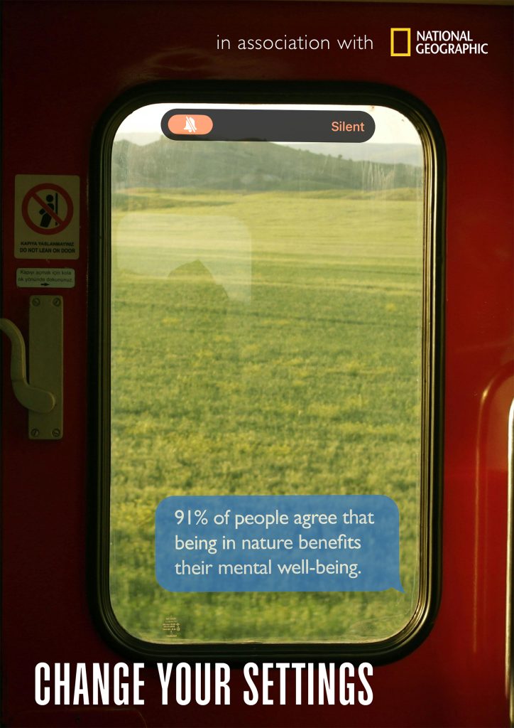
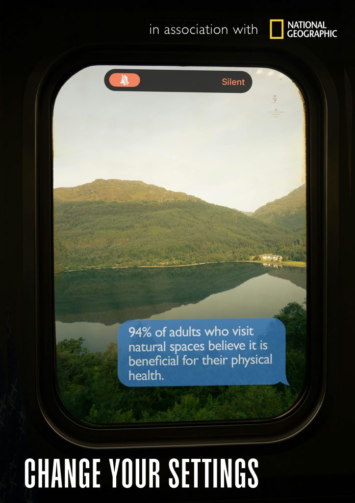
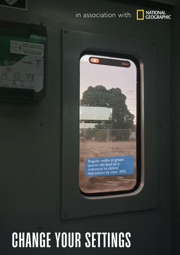
After a few weeks we revisited the campaign idea and moved forward in a different direction, we jumped on a call and looked at the direction and research that the other came up with in our initial discussion to find similarities in each of our directions, which we then tried to combine into one moodboard, which is shown on the right hand side of the figjam board. What we landed on was the idea of ‘a window into nature’ ; whilst looking at train windows that showed up in initial research and how the round corners resembled modern phones and tablets, which gave us an opportunity to create a conceptual visual all about switching the phone to silent and getting outside, using the notch at the top of the screen and the text message bubble to emphasise the idea of the phone screen whilst each visual has been specifically chosen dependant on what is outside the window, showing greenery and landscapes. We also agreed on ‘Change your settings’ as the title of the campaign as it felt like it was appropriate for the phone conceptual design and also references the idea of changing your physical setting to an outside space.
Task 4 – Proposal – Off The Grid
References
Tokyo Foundation for Welcome of Graphic Design (n.d.) Exhibition Back to Modern Graphic Design from West Germany. Available at: https://www.tfwsa.or.jp/post/exhibition-back-to-modern-graphic-design-from-west-germany(Accessed: 13 February 2026).
Transport for London (n.d.) Culture and Heritage: Harry Beck’s Tube Map. Available at: https://tfl.gov.uk/corporate/about-tfl/culture-and-heritage/art-and-design/harry-becks-tube-map (Accessed: 14 February 2026).
Creative Boom (2024) Mapping the design history of the underground. Creative Boom. Available at: https://www.creativeboom.com/inspiration/mapping-the-design-history-of-the-underground/ (Accessed: 14 February 2026).
Piktogramm.de (n.d.) Piktogramm.de. Available at: https://www.piktogramm.de/en/#c6 (Accessed: 14 February 2026).
Greenpeace Aotearoa (n.d.) Plastic Free Aotearoa. Greenpeace.org. Available at: https://www.greenpeace.org/aotearoa/act/plastic-free-nz-2/ (Accessed: 15 February 2026).
It’s Nice That (2018) Lovers’ campaign for Greenpeace borrowed from the “grotesque brand soup” found in our oceans. It’s Nice That. Available at: https://www.itsnicethat.com/articles/lovers-greenpeace-end-ocean-plastics-graphic-design-170418 (Accessed: 15 February 2026).
Lovers (n.d.) Greenpeace – Work. Lovers.co. Available at: https://lovers.co/work/greenpeace (Accessed: 15 February 2026).
YouTube (n.d.) Brand Day London: Lovers & Greenpeace campaign to end ocean plastics. YouTube. Available at: https://www.youtube.com/watch?v=txKtT0h_vMs (Accessed: 15 February 2026).