Subject, Audience & Purpose- Describe the Live Design Brief and include general background research about your chosen subject, audience and purpose.
Project 3 will consist of looking at a problem Kennings and eDecks are currently facing, which is boosting their winter sales, and this will be approached alongside marketing students, who will create a campaign idea which directly targets this problem. The goal is to correspond with the marketing group and help them execute their campaign goals through graphic design techniques and visuals. The process was started by identifying the subject, audience and purpose. Having these clear understandings will lead to a more streamlined workflow and allow the problem at hand to be solved effectively.
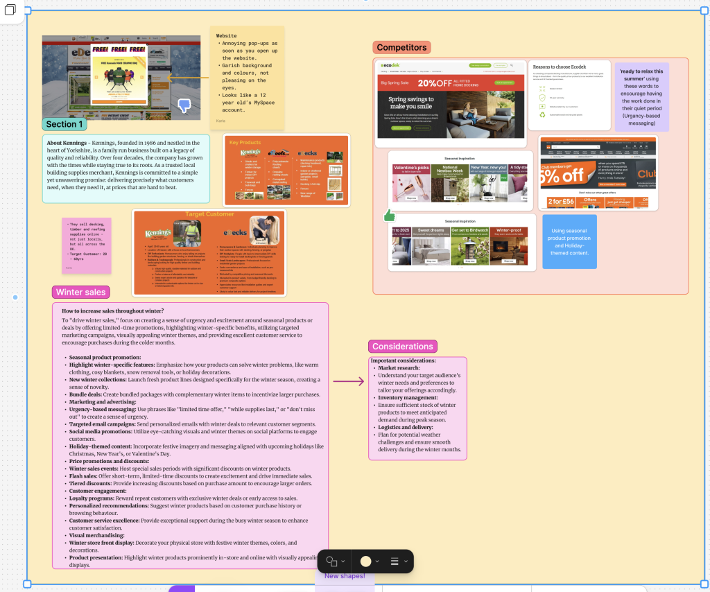
One of the key things about the project is that Kennings and eDecks/eRoofs are two separate companies, although they are interlinked and the line between them is fine; it is crucial to acknowledge the difference to ensure that the correct problem is being tackled. Kennings is the parent company and focuses on building supplies, working directly with other businesses at trade prices, and is based solely in the local area; whereas eDecks focuses directly on a business-to-consumer sales model, with a larger product range, and is predominantly online, providing products nationwide. Identifying these differences allows a deeper look into the competitors and how they position themselves strategically and visually, especially during these winter periods.
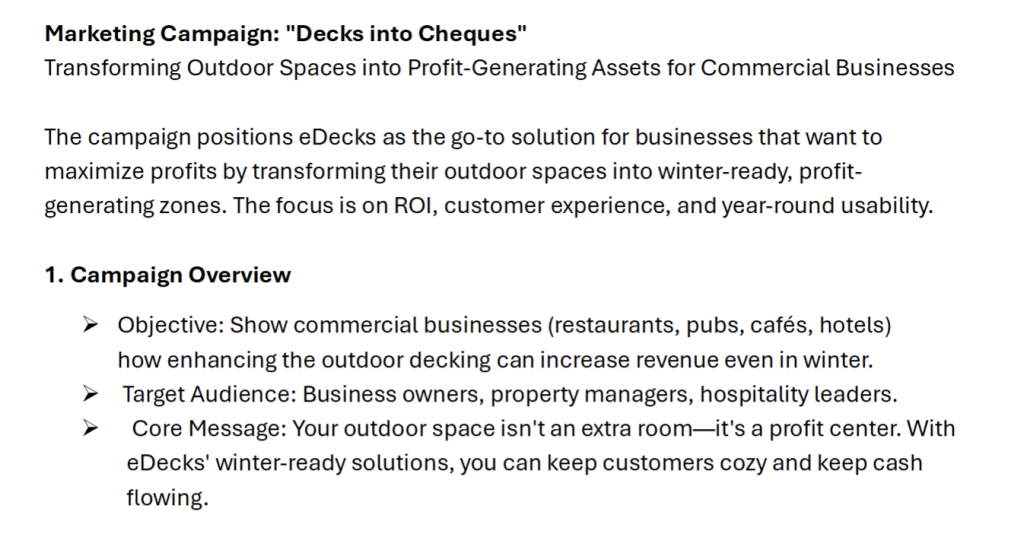
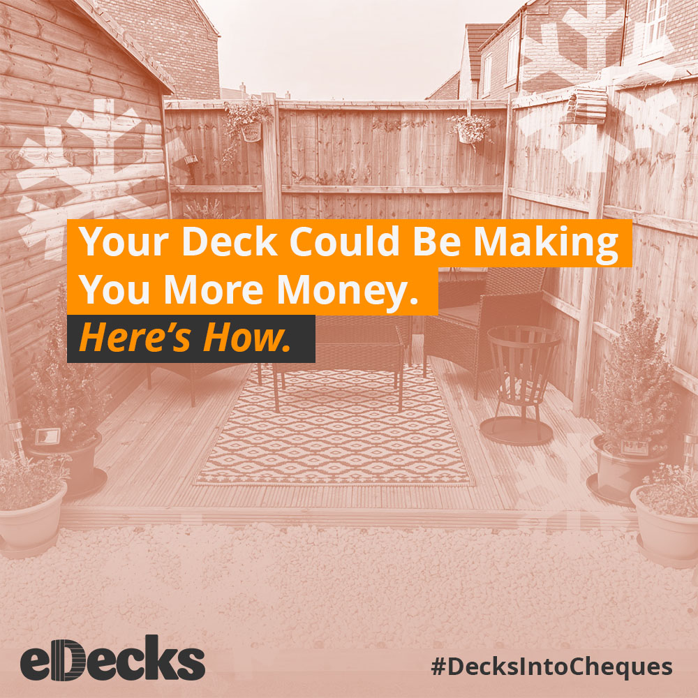
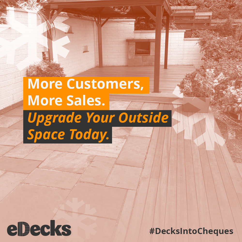
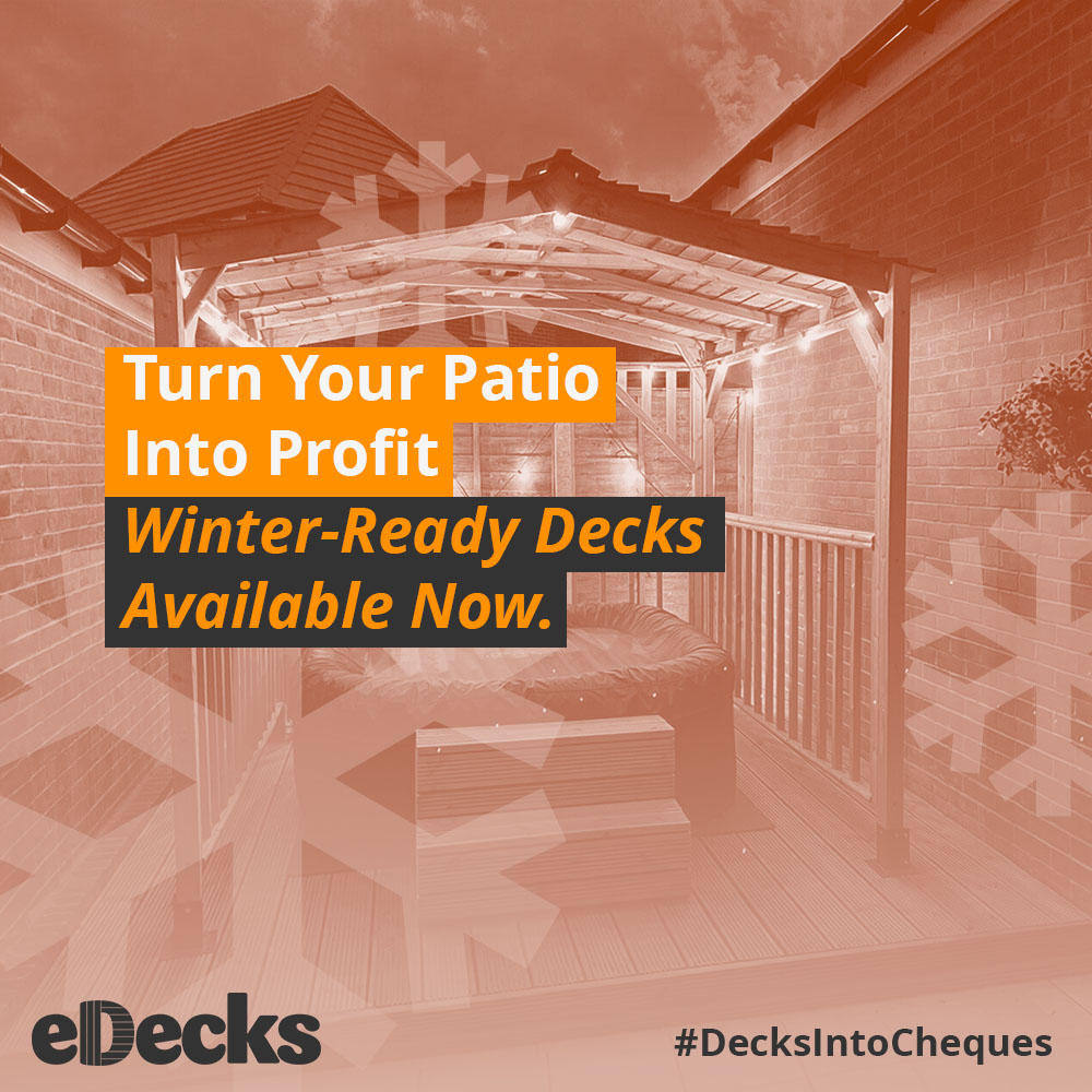
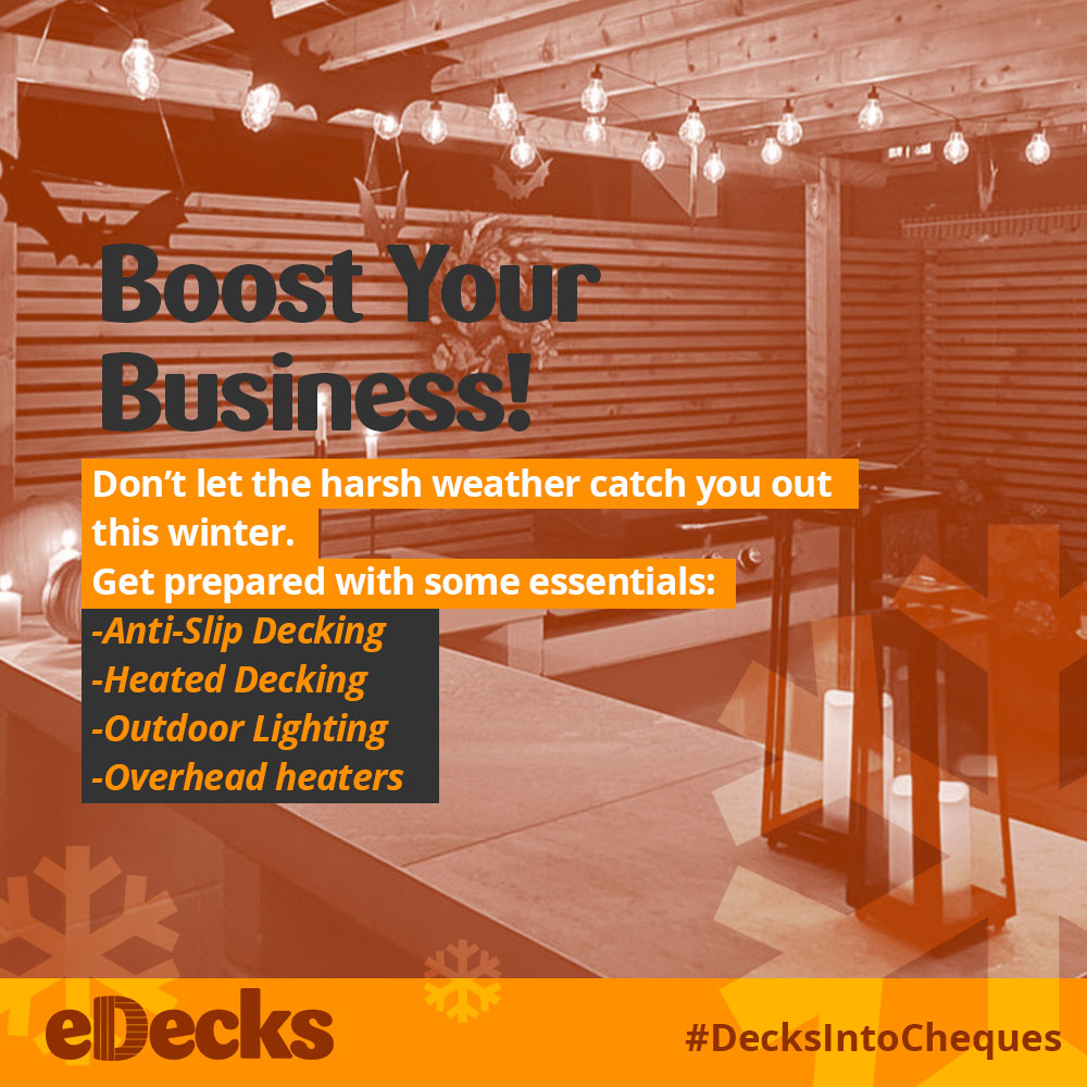
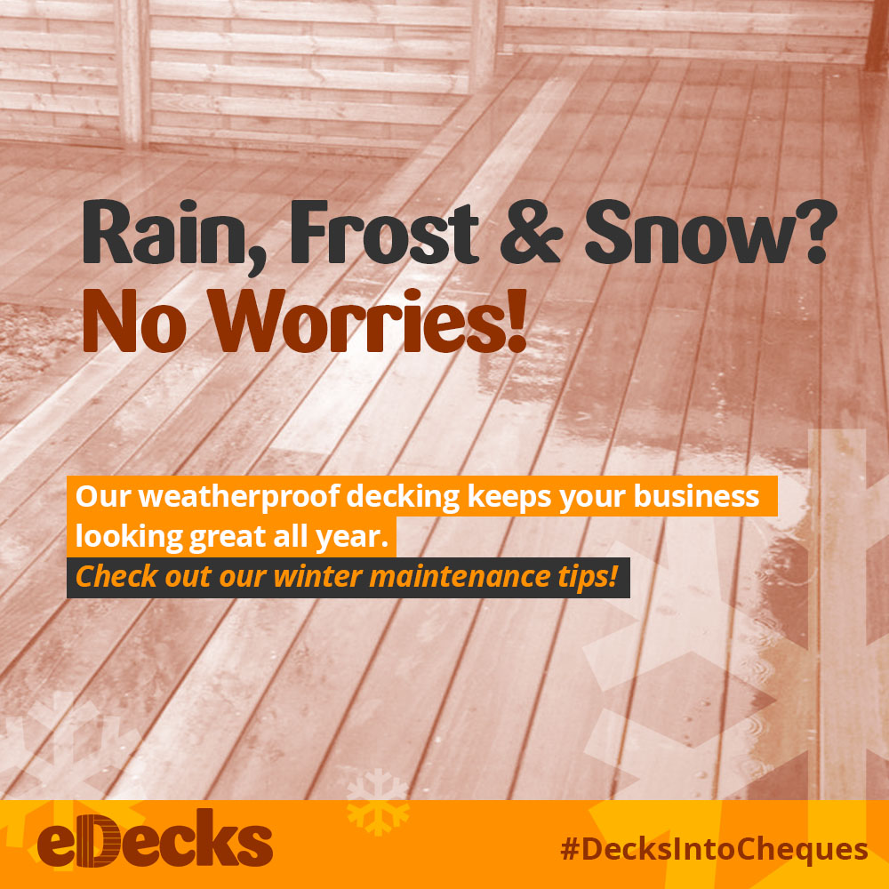
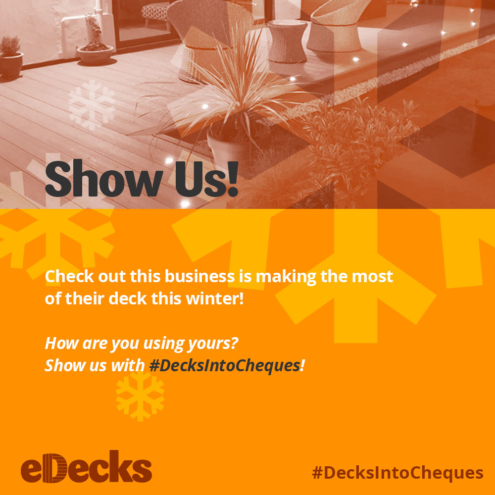
The campaign proposed to us was called ‘Decks Into Cheques’, which niched down on the initial brief given to us by Kennings, and this was a result of collaboration with the marketing group, with a revised idea and audience to better tackle the initial problem of boosting winter sales. This new campaign would be paired with a refreshed visual social media and ad strategy to further promote winter sales, which is focused on promoting outdoor services and products to small businesses with the incentive of improving their winter revenue simultaneously.
eDecks’ current target audience, which has been provided by the business itself, consists of homeowners, gardeners, hobbyists and small-scale landscapers, which looks directly at the business-to-consumer model that they currently use. Whilst looking at the target audience, it was also important to look at the competitors to gain a clearer understanding of their winter strategies and target audience. Looking at B&Q due to their similarities within the industry and product range, ‘It really is an incredibly broad audience. From first-time buyers, to families renovating and even to those renting their homes. B&Q connect with so many different types of homes.’ They share a very similar demographic with eDecks. Whilst working with the marketing group and the campaign ‘Decks into Cheques’, the target audience had been narrowed down to business owners, managers, and hospitality leaders to help promote the eDecks services and products to more businesses nationwide.
Relevant Design History- Include at least three examples related to your Live Design Brief and analyse them. How have they influenced your final presentation?
I further explored competitors and brands within a similar industry, such as B&Q, Screwfix, Wickes and Homebase to look at how their social plays an impact on the brand perception, which may also in turn boost sales and revenue.
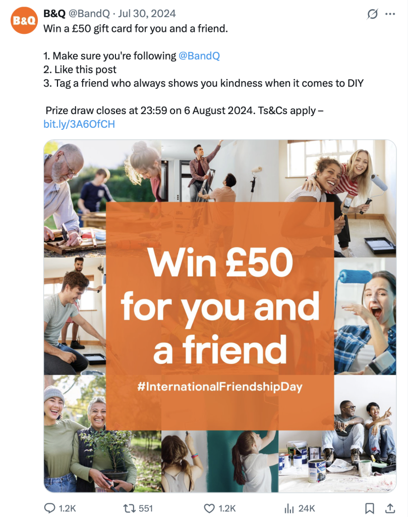
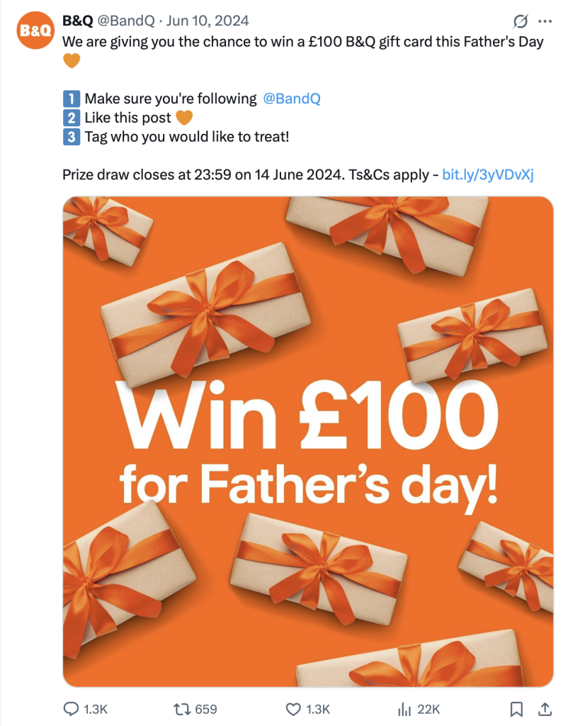
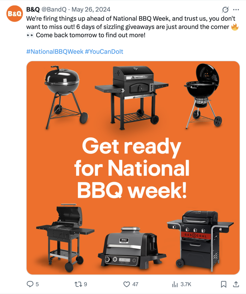
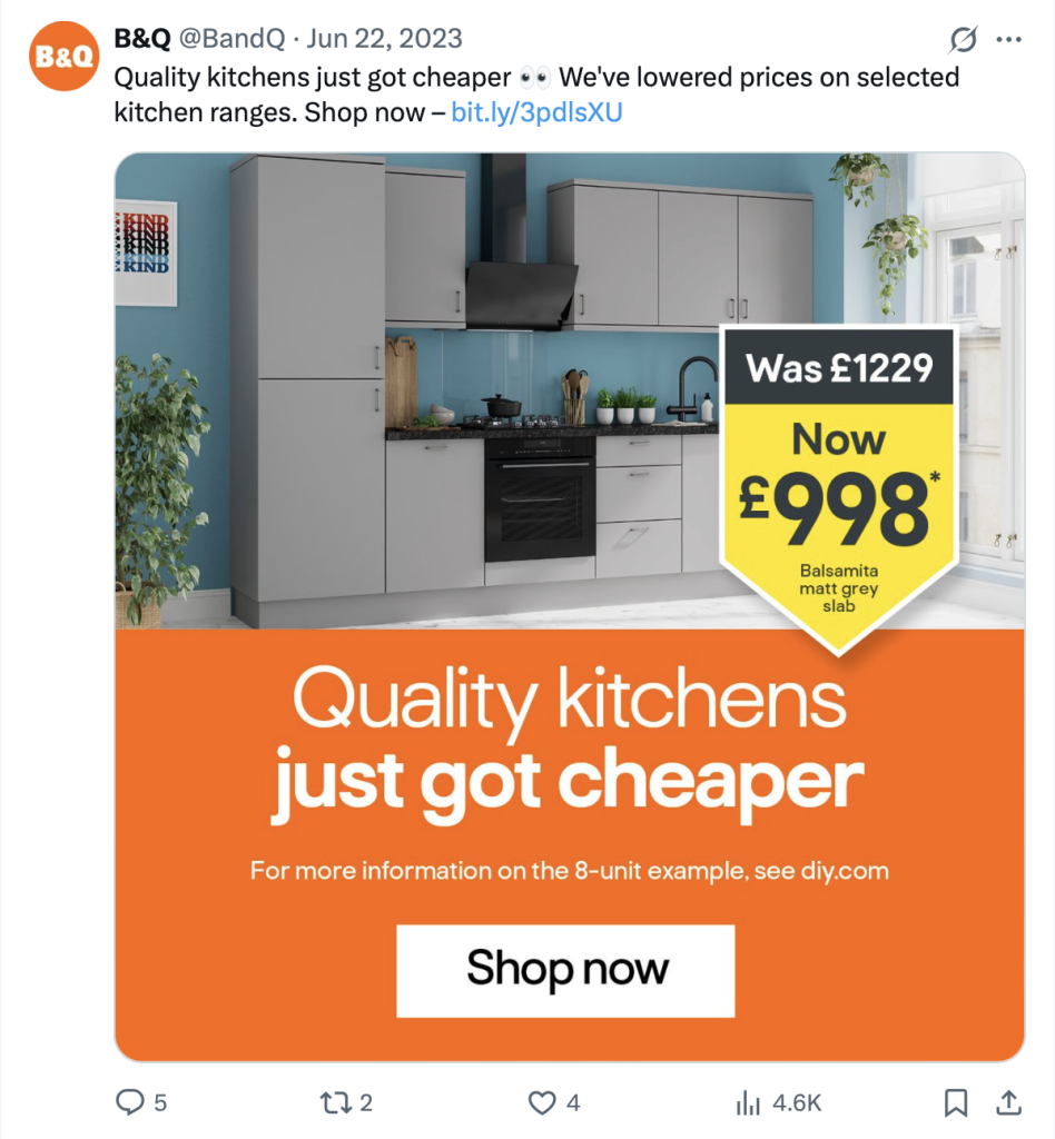
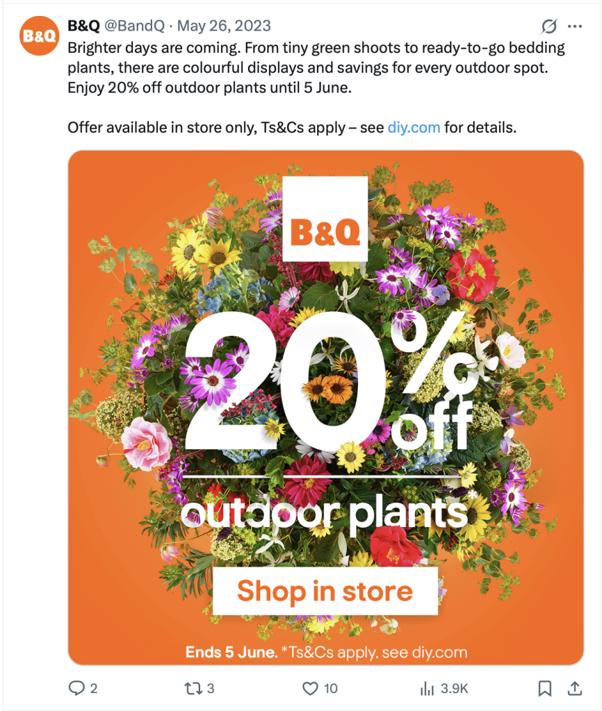
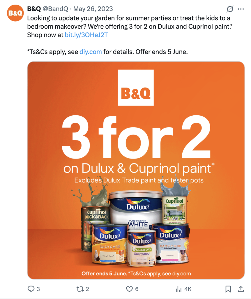
One of the things that stands out within the B&Q social media posts is the continuity between them, each post uses brand elements to create a cohesive series of posts. Below shows just 6 examples out of many, and these span a year, showing the longevity of their brand presence. The striking warm orange is a signature colour used in their logo and shop front and has been cleverly utilised within their social posts to create bold posts that draw the viewer’s eye, leading to more clicks and website visits. B&Q’s use of their brand colour, their brand typeface and appropriate imagery work seamlessly together to create an engaging and successful social media presence; which is something that will heavily influence the ‘decks into cheques’ social media campaign for eDecks, by utilising the pre existing brand guidelines to create a cohesive startegy that works across different social media posts and promotional videos.
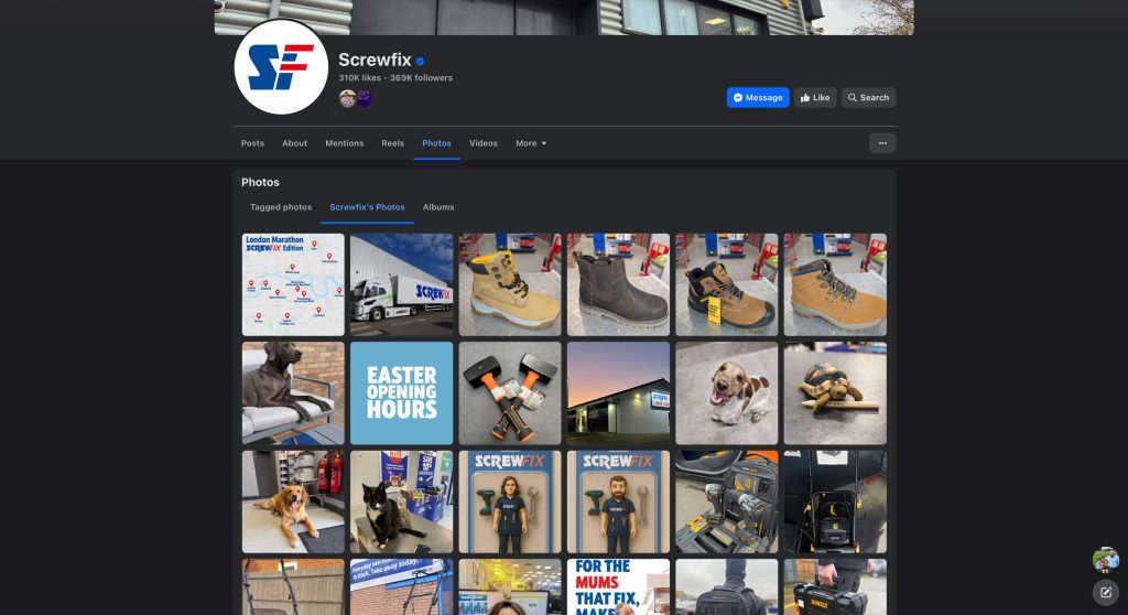
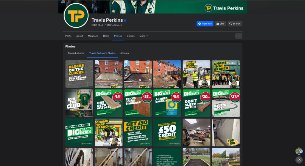
Another example of relevant design in which these same principles stood out was looking at the social media content for two of the largest competitors in the DIY and home improvement industry for eDecks, which were Screwfix and Travis Perkins and highlighting the differences within their online social media presence.
When looking at the social media post grid above for each company, it is directly visible that Travis Perkins has a much more professional approach to their marketing strategy, emphasising a good use of the brand’s style, incorporating brand colours, type, consistent similarities in composition and layout, paired with appropriate imagery. Screwfix showcase a series of posts which do not correlate with each other; if these posts were to be seen on a social media timeline, there would be no clear evidence for the audience to determine the company that it was posted by, although travis perkins do not showcase their logo in the social media posts, the use of brand style across all posts allow them to be identified as a part of a larger visual ecosystem, allowing the audience to distinguish the brand from a single post.
‘A cohesive brand identity helps differentiate your brand from competitors. By presenting a unified image and message, you create a strong, recognisable presence that resonates with your target audience.'(Contagious, 2021) The previous evidence suggests that B&Q and Travis Perkins utilise a cohesive brand identity to create a sense of familiarity amongst their target audience, making their social media posts and other marketing strategies immediately recognisable.
Project Development- Document your group’s developing design work and what you contributed
During the development process for the eDeck’s marketing campaign, something that became very apparent early on was that a large portion of the campaign for eDeck’s was focused on strategy rather than visuals in the early stages to ensure that the final visuals made are in aligmnent with the campaigns objective and they correctly reach the appropriate target audience, this will also help to improve cohesiveness across the campaign and overall brand by ensuring that the campaign is built upon an effective and unified plan.
One of the first things that was looked at as a part of the development process was design proposals and understanding the process, which would help my design group to understand what was required from the marketing group, right through to creating the final visuals for the campaign.
‘A design proposal is a document that outlines the goals, scope, and approach of a design project. Think of it as a tool to communicate your ideas to clients and eventually gain their buy-in for a project.'(Lyssna, 2024) although we wasn’t trying to ‘gain their buy-in’ due to the structure of the project, a large goal that my design group discussed was to handle the project in a professional manor that would align with issues and procedures we would take in a real world situation, to better improve client relationship skills.
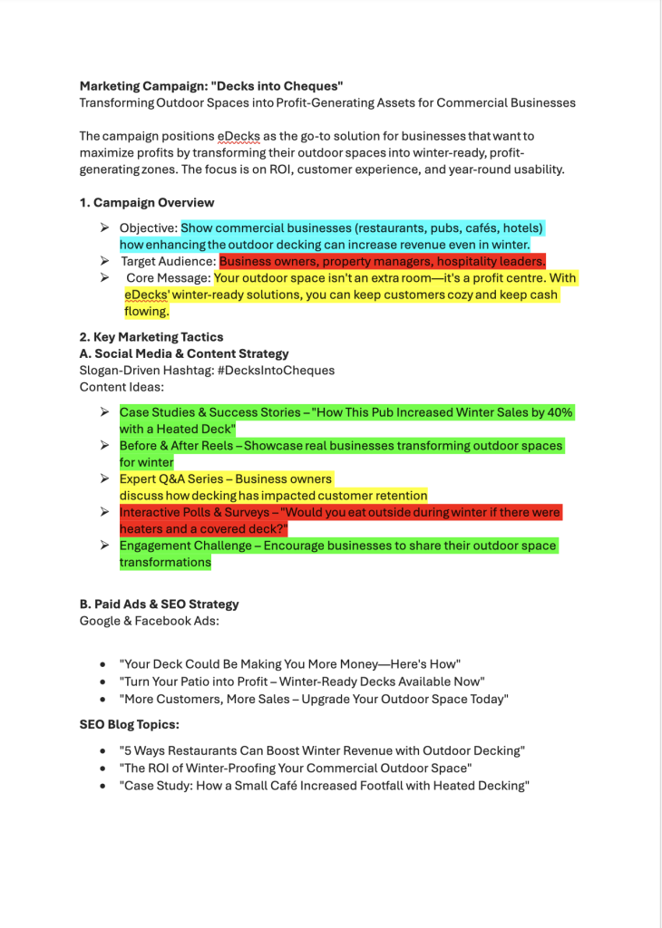
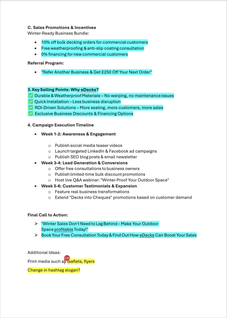
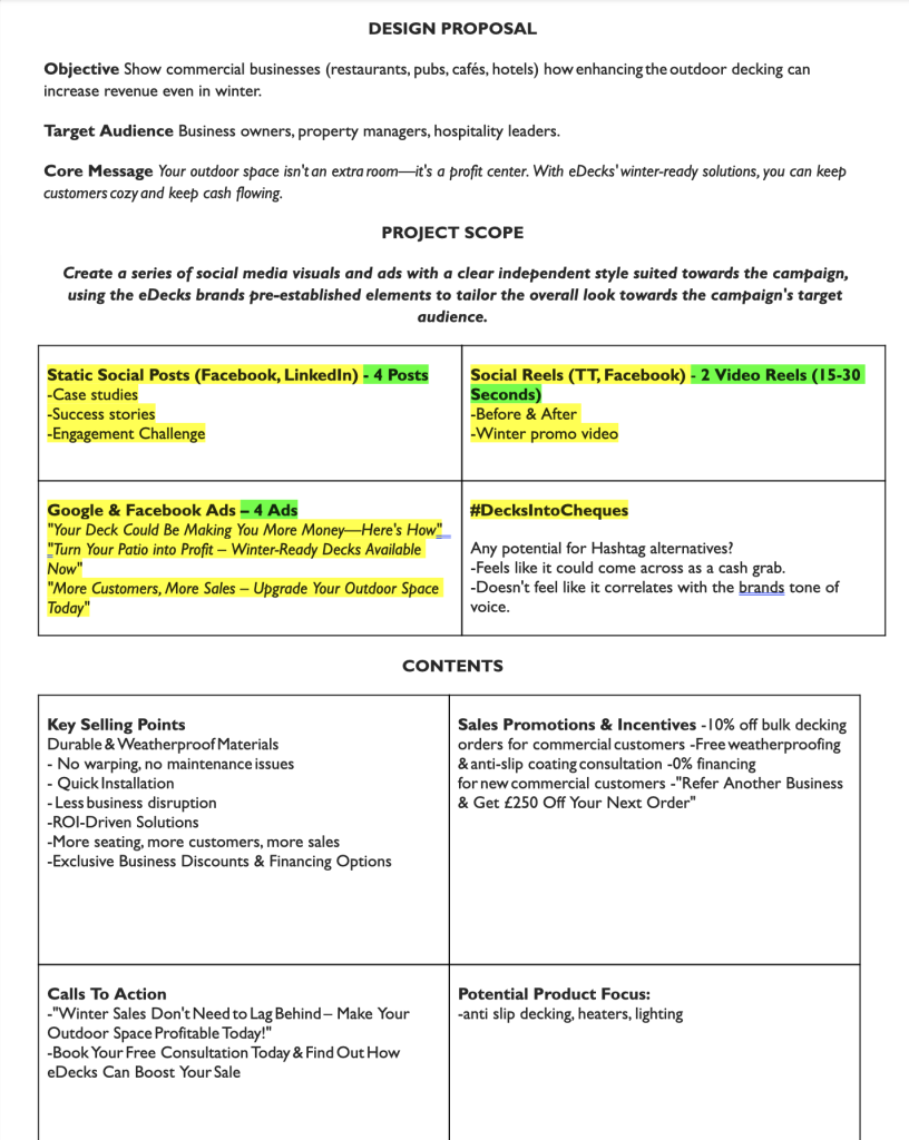
The documents shown are the initial marketing idea sent to us by the marketing group, which detailed their whole marketing idea that they would present to eDecks. It was our job to then take that information and determine where we could use graphic design knowledge to further push their marketing campaign. The marketing document(images 1 & 2) looked at a general campaign overview, the key marketing tactics that they planned to focus on, promotions and incentives to further push the campaign and also a structured timeline of how the campaign would be launched; from this, we broke down their document and colour coded different pieces of information, blue highlights being key information, green highlights being the work that would be prioritised, yellow being the things that would be looked at if time allowed. Once our design group had broken the marketing campaign down, we were able to create a document that detailed our role in the campaign with a project scope detailing what we would create, and the information content that would be displayed to help the marketing group execute the social media, content strategy and paid advertisements parts of their overall campaign. This development was a crucial piece of communication that allowed both parties to clearly understand what was expected and what work would be created, resulting in fewer complications down the line.
One of the issues that my design group had initially was that before we had a meeting with the marketers and eDecks, we had done initial background research about eDecks and had pre conceived ideas surrounding the companies logos, colours typography choice and website design; once we had the edecks meeting we soon came to realise that these are things eDecks did not want to address which left us in a situation that we had a set of brand colours and assets that were problematic to work with. Some of the steps I took to combat this issue were to make some slight adjustments to the initial brand identity, as there was not a lot I was able to change, I made adjustments to the logo and palette seen below. My updated palette does not change much, but the brown is given a darker orange hue, the reason for this is to create a slightly warmer, cosier feeling, helping the brand cater more towards the winter period sales, directly targeting the purpose of the campaign. One of the assets that was slightly changed was the main eDecks logo colours, which is because of the texture and patterns they use within their logo.
The ‘D’ in eDecks is shown with a brown decking texture, whilst the rest of the text is in black, meaning that when paired with all of the brand’s colour palette(apart from white), it caused readability issues. The approach I took to this was simple yet effective, and that was to use the whole logo with a single colour, which had a higher contrast with the brand’s other colours, whilst looking more professional, improving readability and not straying too far away from eDecks’ original material.


Teamworking- Include Rob’s Psychometric Test results, and explain your role and experiences while working within your groups
Throughout the eDecks marketing project, teamwork played a crucial role, whether that was working alongside other designers or working with the marketing group and new people. There were benefits and downsides to this, which we had to overcome. One of the obstacles that we had to overcome early on in the development process was losing a team member, going from a trio to a duo, which meant that we had to change some of the approaches that we took, instead of each team member playing a different role. Josh and I approached all aspects of the project together up until the end of the design proposal, once we had agreed on the scope of the project with the marketing group and sent across the design proposal, the route we took was to each create a unique set of visuals to aid the social media and ad strategy, so although we had the same initial planning we took an alternative route leading us to completely different sets of visuals for the marketing campaign.
One of the other large issues that Josh and I encountered during the eDecks projects was with the marketing groups; when we first started this project, we were acting as designers for 2 individual marketing groups, whilst one of the groups was great to work with. With great communication, a clear idea, and clear deadlines, the ther marketing group were the complete opposite, we reached out on numerous occasions with updates as to where we are at with the deadline steadily approaching, with either no replies at all or the replies we did get detailing that they would send us their initial ideas over, which never ended up happening; We acted professionally and tried numerous times through this process and one of how we handled this was to explain that they had been given multiple opportunities to work with us and with the deadline steadily approaching there was not much we could do to help them at such short notice when they still hadn’t replied a day before the deadline.
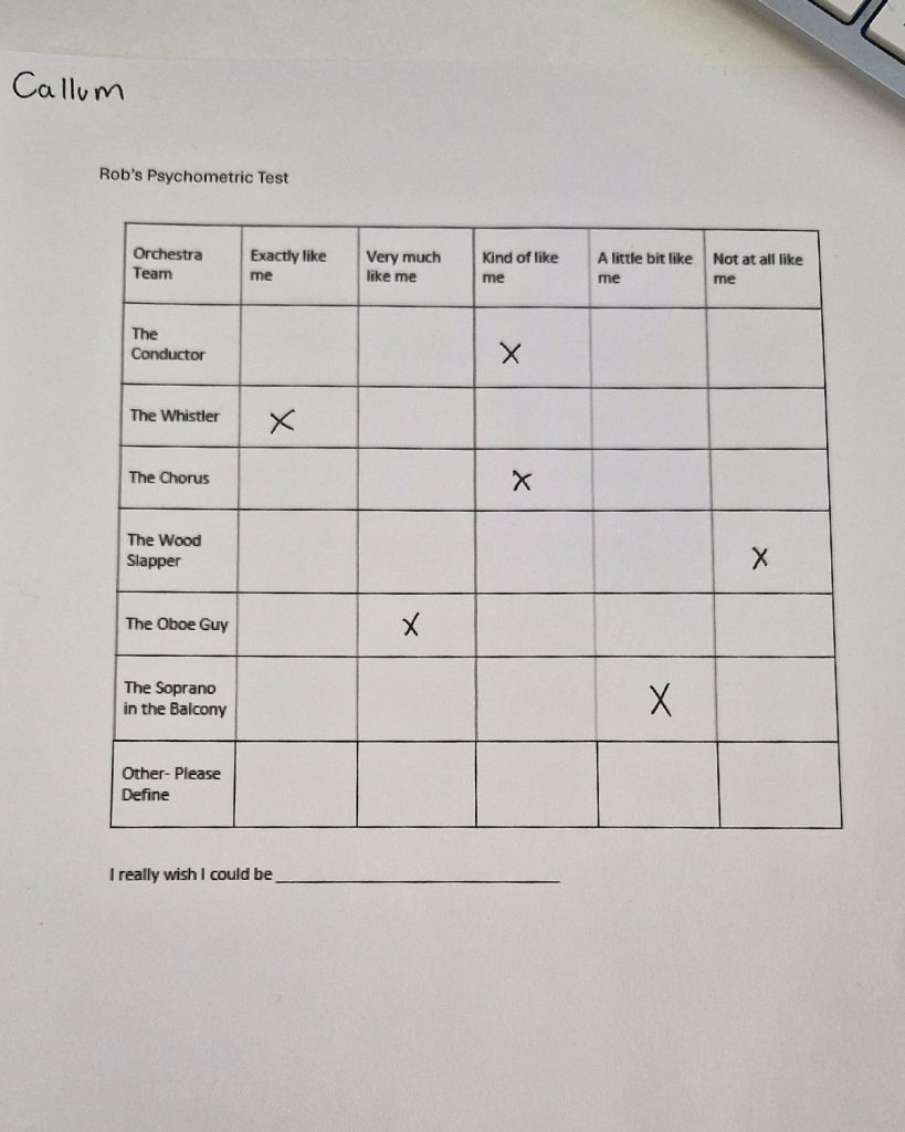
Looking at the early psychometric testing we did for this assignment and how it has had an impact on the role I played within my group, as well as self-reflection on the project, has led me to determine where I would place myself. The early psychometric testing, I was unsure about how I would portray a conductor role, but as the project timeline went on, I found myself taking a more creative director role, having the idea to document the proposal process and stand as the point of contact with both marketing groups, and making certain design decisions and steering the direction of the project. I found that I also resonated highly with the whistler in the orchestra, the way that they stand centre stage and have a large presence, similar to the role a lead designer would play.
Live Design Brief Portfolio Video
References
Contagious, 2021. The insight & strategy behind B&Q’s Build a Life brand campaign by Uncommon. [online] Contagious. Available at: https://www.contagious.com/news-and-views/insight-strategy-behind-B&Q-build-a-life-brand-campaign-Uncommon [Accessed 28 April 2025].
Made Outside, 2023. The power of consistency: how cohesive branding across channels drives success. [online] Made Outside. Available at: https://madeoutside.com/the-power-of-consistency-how-cohesive-branding-across-channels-drives-success/ [Accessed 28 April 2025].
Lyssna, 2024. How to write a design proposal (with template and examples). [online] Lyssna. Available at: https://www.lyssna.com/blog/design-proposal/ [Accessed 1 May 2025].