Initial planning phase, including project goals and initial sketches.
Building upon the foundation established by the LNK proposal, which provided a stable structure for development, exploring future directions for the Lives Not Knives (LNK) brand began with an analysis of its past successes. Among the organisation’s numerous campaigns, two stood out prominently: the 2007 LNK T-shirt campaign and the 2021 campaign, which coincided with the brand’s rebrand and new logo.
Although the current logo and T-shirt designs were well-received and posed no critical issues, the goal of a new rebrand would be to push the boundaries further. This rebrand aimed to seamlessly integrate into both real-world and digital contexts while delivering a fresh, clear message that would strengthen the brand’s identity and impact.

The process began with developing a strong marketing campaign aimed at reaching new audiences and directly engaging individuals to steer them away from knife crime and gang culture. Starting with a mind map, ideas were generated for various aspects of the campaign and its potential extensions. These included merchandise, such as T-shirts and hoodies; digital platforms like websites and social media, with banners, promotional videos, and advertisements; and physical marketing applications, such as posters and billboards.
One focus of the brainstorming process involved leveraging the organisation’s London location. The concept of a real-world marketing campaign was explored, including potential advertisements in iconic spaces like Piccadilly Circus, a global advertising hotspot renowned for elevating campaigns through its world-class digital screens.
Another avenue examined was the use of Transport for London (TFL) services as a platform for the campaign. Advertising on buses, trains, the underground, and other transport systems could significantly increase reach, ensuring the campaign connects with a broader audience, including those within the organisation’s target demographic.
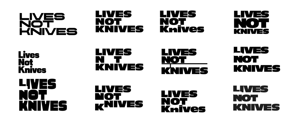
Following the initial ideas, the process began with breaking down the current site and gathering information about Lives Not Knives. This involved identifying keywords related to the LNK organisation, its mission, and its goals. These keywords served as a foundation for brainstorming and sketching different ideas to convey key messages through the new logo and branding. Among the keywords, “Speak” was particularly impactful, prompting the exploration of sketches centred around this concept.
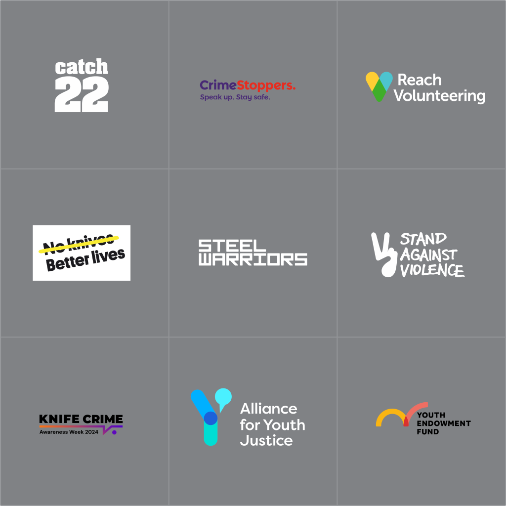
Whilst sketching I also took the opportunity to research some of similar organisations whose main focuses are youth violence, knife crime and crime prevention to see how impactful and effective their logos were. A common theme across the organisations is bold, legible type. The majority are displayed in a modern sans-serif typeface which helps to convey a sense of trust. Two of the similar organisations had a logo with iconography representing speaking/talking, similar to the direction that the LNK rebrand was heading, but the LNK rebrand had enough clarity to work well on its own while conveying a strong message of speaking up.
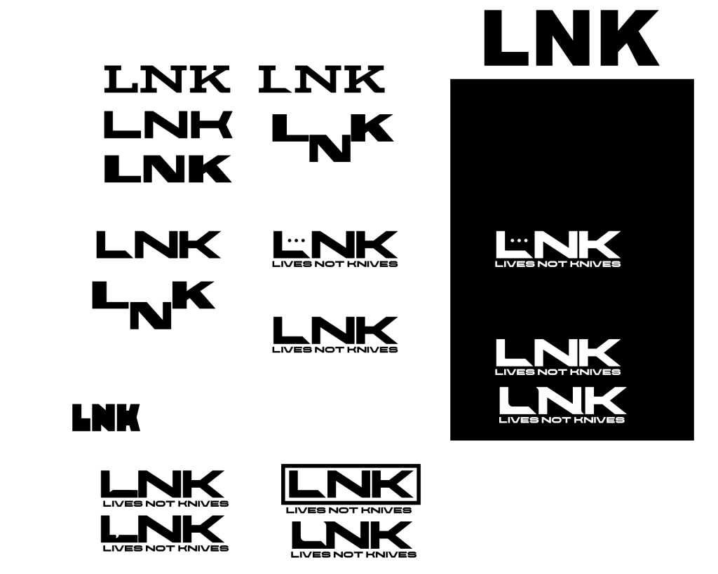
After a few initial sketches based on the “speak” concepts, the process was moved over to Illustrator to further explore different options with type and form and to take the design to the next level. Experimenting with sans-serif typefaces and different ways an icon could be implemented through the use of negative space. The digital process began with looking at the form of multiple typefaces and testing the speech mark concept to see how I could make that work with the LNK anacronym; moving and editing letterforms allowed me to creatively put a speech box within the negative space although each variation did not seem appropriate or suitable to the brand’s style. The approach with the least subtle speech box was the top centre using the slab serif typeface, Aviano Slab Bold, to contain the box creating a very prominent icon. The issue with this was that a slab serif typeface was not suitable for the brand.
The next step taken after this was to explore another typeface which was extended like Aviano Slab as the space between the L and the N allowed for the experimentation of the inclusion of the speech box. Using Chaney, an extended sans serif font with a modern look to it, a series of logos were made to create negative space marks between the L and N but there was a struggle to make the icon stand out to a first-time viewer, several approaches were taken such as the adding a border and corners to enclose the shape helping it stand out, another approach of moving the tail of the speech mark to make it clearer, yet the approaches were still too subtle.
After some more advancements and looking at the effective design solutions and problems that arose during the early stages of digital development, the project started to steer towards what would be the final logo. The image above shows the development from the top left to the bottom right and the steps taken to come up with a final concept.
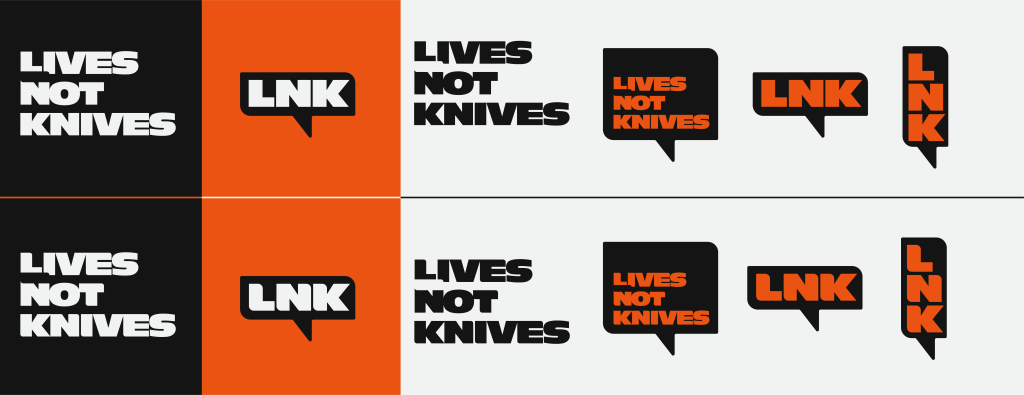
The above image shows 2 logo sets created from the development with multiple versions to work across a series of mediums, with the 2 left versions serving as a primary and secondary logo. The set of logos evolved off of the subtle speech box within the left stacked type logo, which then led to the other variations. A version with LNK horizontal which is ideal to be read at smaller sizes like in a menu bar of a website or favicon, whilst the bold type stacked variations would work well on large billboards, advertisements and clothing and the logotype could even be swapped out for motivational messages relating to a broader campaign.
Some feedback received from my peers related to the two logo sets created In the above image, a comment was made that the typography with the sharp edges was fitting due to the organisations theme, which in turn led to the conclusion that the logo with the rounded edges was more suitable as it was more in tune with the core message of the organisation and steered away from any knife iconography, whilst also creating a logo that feels more unique and inviting.
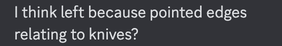
The colour choices for the new rebrand do not stray too far away from the original branding, with white, black and orange as an accent colour, but some slight changes have been made. The orange used is much more vibrant and has a higher contrast against the black and white whilst being used to help elements stand out on a page and draw the viewer’s eye. Due to the nature and importance of the message that LNK want to get across, and the large amount of information and text across the current LNK website, a strong contrast was needed to make sure that the site maintains a high level of readability.
Once the logo and branding elements started to come together, it wasn’t long until some ideas surrounding potential campaigns started. Although the brand has only 3 colours and 1 primary shape, it was able to work well in a variety of different applications, and due to its boldness, it was able to work at multiple sizes, meaning the campaign could potentially be shown across a wide variety of mediums from leaflets to billboards and vehicles. The text box shape with 2 opposite rounded edges also served as a bold element to portray strong campaign messages while also allowing viewers to instantly identify the brand due to the cohesive elements.
LNK have a wide range of groups within their target audience such as:
- Local communities.
- Parents of children who need steering away or families who have been affected by an act of violence.
- Young school children to teach them about the dangers of knife crime and gang violence.
- Under 25’s from Black, Asian and minority ethnic backgrounds.
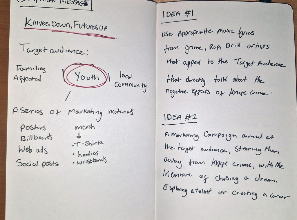
The ideal next step would be to develop a marketing campaign which would effectively spread a message about the LNK cause, the initial planning that was made for the rebrand did take into consideration that the campaign would be solely based on speaking out and speaking to a certain demographic, within the target audience, without being too ‘cheesy’, meaning the campaign had to be relatable to the specific demographic, narrowing down on who the campaign message is being sent to, will create a more effective outcome.
The 2 main ideas that were considered were:
Idea #1 – To create a series of typographic messages inspired by appropriate and relatable music lyrics from genres such as grime, rap and drill, that appeal directly to the target audience. Lyrics from songs about the negative effects of knife crime and gang culture, and lyrics for empowering songs.
Idea #2 – A series of typographic messages and imagery across multimedia, appealing to the best interests of the target audience which will allow self-growth and self-improvement by persuading them to invest in their talents, dreams or a career.
Both campaign ideas would be run across the web and the real world by showcasing messages and solutions within the LNK website, having an online newsletter which will also promote activities and workshops, and a series of online advertisements and social media posts; whilst also utilising prime advertising hotspots in London such as the Picadilly lights and public transport, and also across a series of T-shirts and hoodies, all being brought together with the new rebrand to give the whole campaign a cohesive look and feel.
Web design
After looking at the branding and campaign ideas, it was time to explore how the website could be redesigned to communicate a stronger message with the new brand direction. The development process of the web design began with looking at the current LNK website to see what worked well and what didn’t. Some of the negatives which were considered were the use of white space and although it is an effective design principle to use, the LNK site overuses it, with a lot of blank space on a lot of the web pages. Another negative which was considered as the navigation menu, the lack of a ‘home’ button within the menu, instead the logo worked as a home button yet it was not clear to a first-time user; another negative is the lack of a CTA button, there is, in fact, a contact page but it does not stand out or serve as a CTA, as well as a ‘donate’ button in the page footer but at first glance is easy to miss.

instead of opting to jump straight into a digital design program such as Figma, I began some low-fidelity sketching with pen and paper, it allowed the process to flow better as it is a much more effective way of getting ideas into a clear visual; just laying out rough ideas of a header image, a menu bar which would be horizontal instead of vertical, and how content would be laid out with text on different pages, and even a CTA on the header on the home page, these are just some of the ideas explored in the low fidelity wireframes.
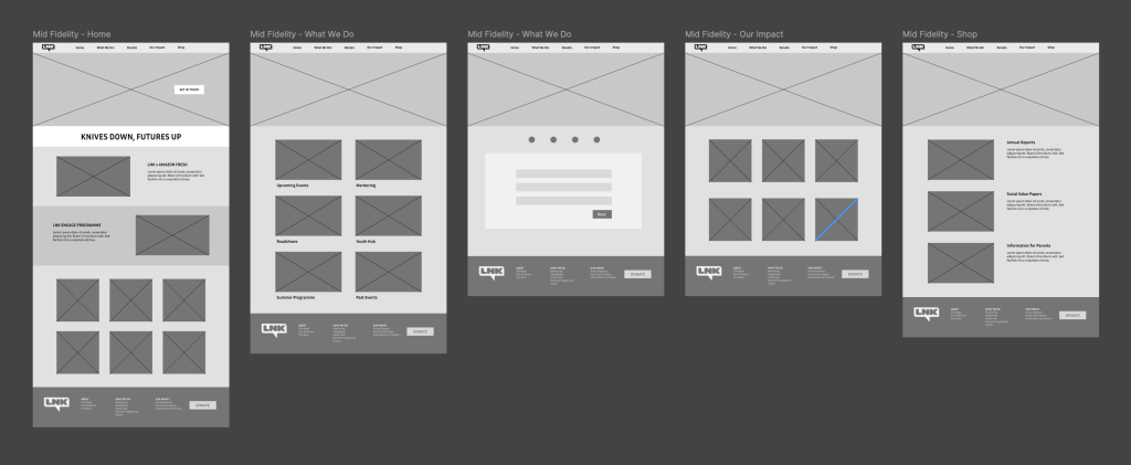
Moving on to the mid-fidelity wireframes and expanding on the rough ideas sketched in the previous step was made easier by using Figma. The mid-fidelity wireframes further shaped how the website was going to look and how different content would be laid out to create an interesting and engaging site. Including the header menu with the logo helps to visualise how a standard centralised menu would look and improves upon the original LNK’s site of the vertical menu. The inclusion of a footer menu which was not included on the low fidelity has also been added, which brings a secondary navigation menu to the site instead of just the main nav bar at the top of the page. The mid-fidelity also stands out with its 2 clear CTA buttons, one located on the hero image on the main page and another on the footer, this would be paired with the orange accent colour used within the branding to help the CTA stand out against the background, using the Von Restorff effect to make the buttons visually distinct.
The new web presence begins to take full form in high-fidelity wireframes, thanks to the integration of imagery, content, and branding elements. These enhancements bring a finished and cohesive look to the design while establishing a strong visual identity for the website. A 12-column grid system is used to organize elements, creating a structured layout that guides the reader’s eye naturally. This alignment not only enhances the overall aesthetic but also ensures the content is easy to navigate and comprehend.
The use of contrast in high-fidelity wireframes serves multiple purposes. Contrast in colour is employed to divide different sections of the page, keeping the design visually engaging and preventing viewer fatigue. Key messages, titles, and calls to action are made more prominent through bold colour choices and strategic placement, ensuring that critical information is easily noticed. Additionally, size contrast is used to emphasize important elements, such as headings and key messages, making the hierarchy of information clear and intuitive.
These design choices, coupled with the refined structure and visual clarity, elevate the web presence significantly. The result is a professional, engaging, and user-friendly design that effectively communicates the brand’s mission and values.

One of the issues faced when creating the menu and the web page was where to include the CTA. All of the call-to-action buttons across the site share the same visual style, the orange speech box icon from the branding elements paired with white type in the Antique Olive Nord D typeface used for the rest of the logo and branding. Although there are 2 different CTA buttons, the shared style allows them to stand out more effectively. The first issue, was that the menu didn’t initially have a CTA due to placing it within the header image on the homepage, the problem with this is that there was no CTA on the other web pages that would follow, the solution to this was adding multiple buttons. This led to the evolution of the menu bar seen below, the logo colour needed to be changed as the orange logo didn’t allow the CTA to be seen as effectively.
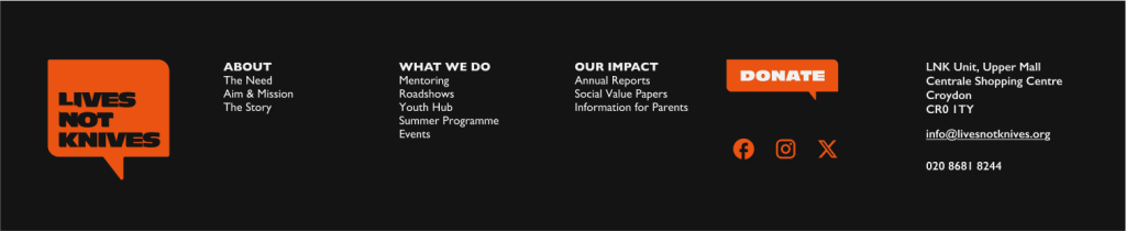
The site also uses the main branding speech box shape to show images, break up the web page, and show headings and important messages, which further builds brand recognition and will help a full campaign come together.
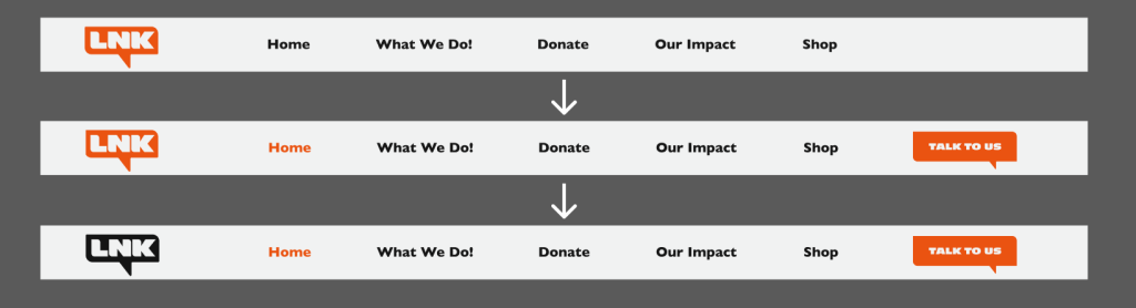
Contrast in colour is used again effectively in the footer menu to help the key elements stand out, the social media links, secondary logo and the ‘donate’ call to action in the orange directly draw the viewer’s eye. Initially, the header menu included the ‘donate’ CTA but due to the theme of speaking up, the ‘talk to us’ CTA felt more appropriate as it directly addresses the viewer and LNK’s primary goal is to steer the youth away from knife crime rather than raising money. The footer is also used as a secondary source of navigation across the site, with some additional information such as contact information.
Ethical Design and Sustainability
The new Lives Not Knives web design introduces several sustainable and ethical improvements over the current site. One significant change is the addition of a dark mode option, enabling users to opt for a more eco-friendly browsing experience. Dark pixels, particularly on LED screens, consume less power, making this an effective feature for reducing energy consumption. However, white text on dark backgrounds can be harder to read for some users, which is why the main site retains the option for a light background with dark text. This thoughtful design gives users the choice to prioritize either lower energy consumption or improved readability, catering to diverse preferences and needs.
Another major improvement lies in the structure of the site. The current LNK website features a large number of menu options and pages, which can be overwhelming for users to manage. The redesign prioritizes key information, significantly reducing the number of pages. For example, instead of dedicating a separate page for contact information, the redesign integrates this into the footer. This approach eliminates unnecessary pages while keeping important details accessible. By simplifying the menu and reducing page count, the redesign enhances user experience and sustainability. Less content means faster loading times, which reduces the energy required to load the site and improves accessibility by simplifying navigation.
The improved navigation and site structure also encourage more efficient browsing. Users can locate the information they need quickly and with fewer clicks, reducing the time spent on the site and the energy consumption associated with prolonged use. This aligns with both ethical and sustainable design principles, respecting the user’s time and minimizing the environmental impact.
Overall, the redesign strikes a balance between sustainability, functionality, and usability. It incorporates features like dark mode for energy efficiency, reduces content to optimize performance, and prioritizes accessibility to ensure the site remains inclusive.
References
Ocean Outdoor, n.d. Piccadilly Lights. [online] Available at: https://oceanoutdoor.com/ooh-site/piccadilly-lights/[Accessed 4 December 2024].
6Maze, n.d. UX Laws. [online] Available at: https://maze.co/collections/ux-ui-design/ux-laws/ [Accessed December 2024].
Transport for London (TfL), n.d. Advertising. [online] Available at: https://tfl.gov.uk/info-for/business-and-advertisers/advertising [Accessed 4 December 2024].