This portfolio will fully showcase a refreshed take on the Lives Not Knives non-profit youth organisation. Combining the initial research and development log to craft a timeless brand for LNK alongside a new website tied together by the ‘Knives Down, Futures Up’ campaign. A key part of the design process has been to look at what LNK has been doing previously and determine what works well, and what needs improving upon; with a clear set of brand values, and a defined tone of voice, the Lives Not Knives brand has been designed to have a more impactful message.
The brand values are chosen: Resilient, Empowering and Bold capture everything LNK stands for as an organisation. Resilience reflects the passion to push through hard times, to show that you can bounce back from what life throws your way! Empowering builds a sense of strength and confidence. To be bold? well that’s to assure that LNK’s message stands out against the noise.
An important part of the redesign was to ensure that the brand’s tone of voice was captured, the first step to this was to determine what the LNK tone was. Enough research was done within the proposal and development stage, that the tone of voice was easily identifiable for the brand, summarising it within 3 words: Empathetic, welcoming and inspirational, which speaks to the more vulnerable side of the audience, creating not just a sense of education but bringing some warmth to the brand and its community.
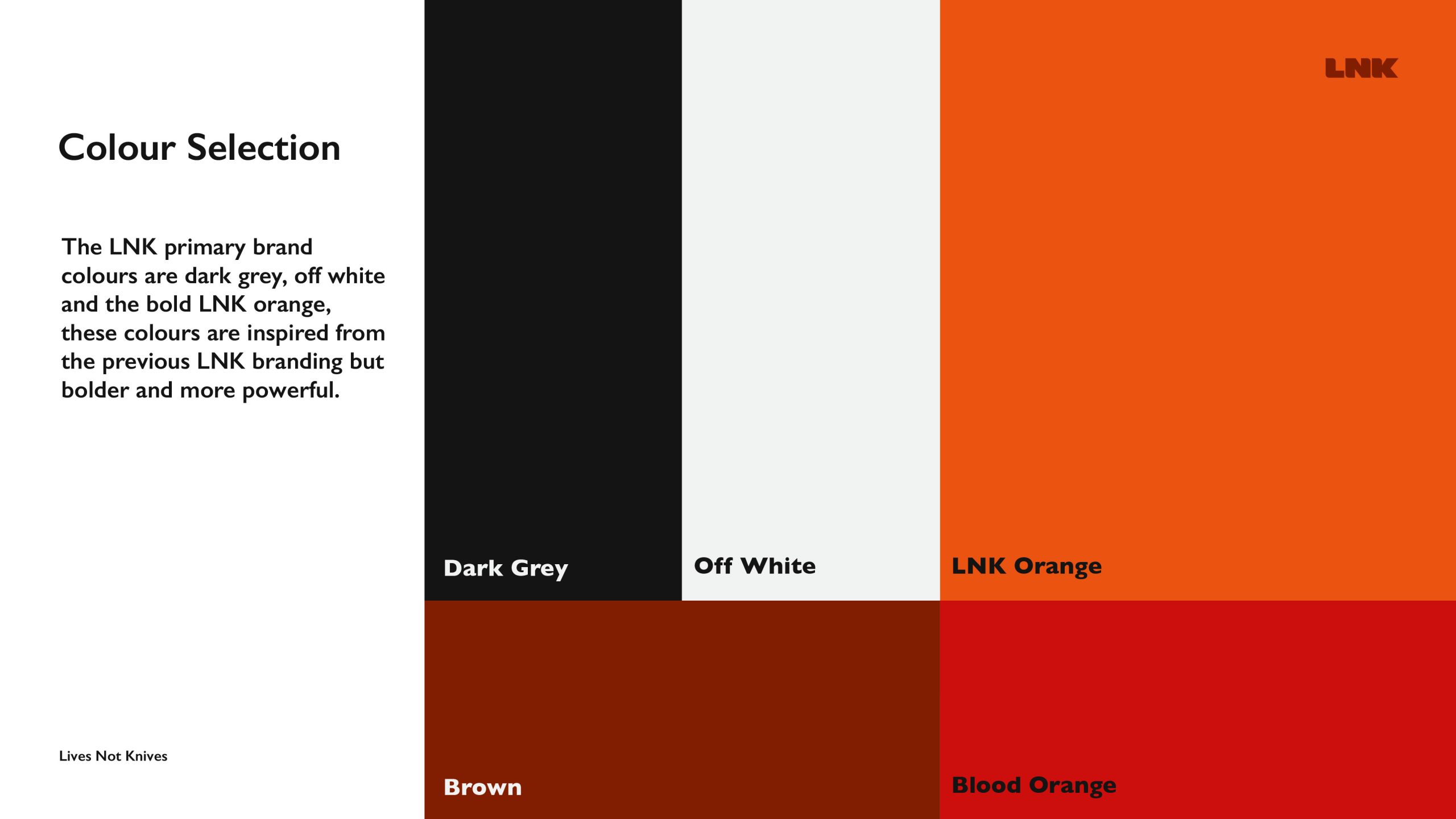
The initial branding seen within the development log has slightly evolved into the final product which is shown within this portfolio. The logo and brand assets such as the speech mark, have all stayed the same. Some design decisions have been made within the brand guidelines which were done initially to ensure that the campaign would have a consistent look and feel throughout. Design decisions made that have been updated were colour selection and typography choices. The initial colour choices were orange, black and white, this was based on the previous palette from the LNK site, the white and black colours were slightly to deter them from being overpowering on large empty spaces, the orange colour that has been chosen in the redesign has added warmth allowing the palette to feel more welcoming, which directly relates to the intended tone of voice for the LNK brand. One of the issues with the colour choices was a lack of range, although the 3 colours had a good contrast against each other, it was vital that some secondary colours were present to help with designs for the brand moving forward, 2 secondary colours were chosen were a brown and darker orange, these colours continued with the warmth of the orange/red tones but gave an extra high contrast alternative when used against the black, white and orange primary colours.
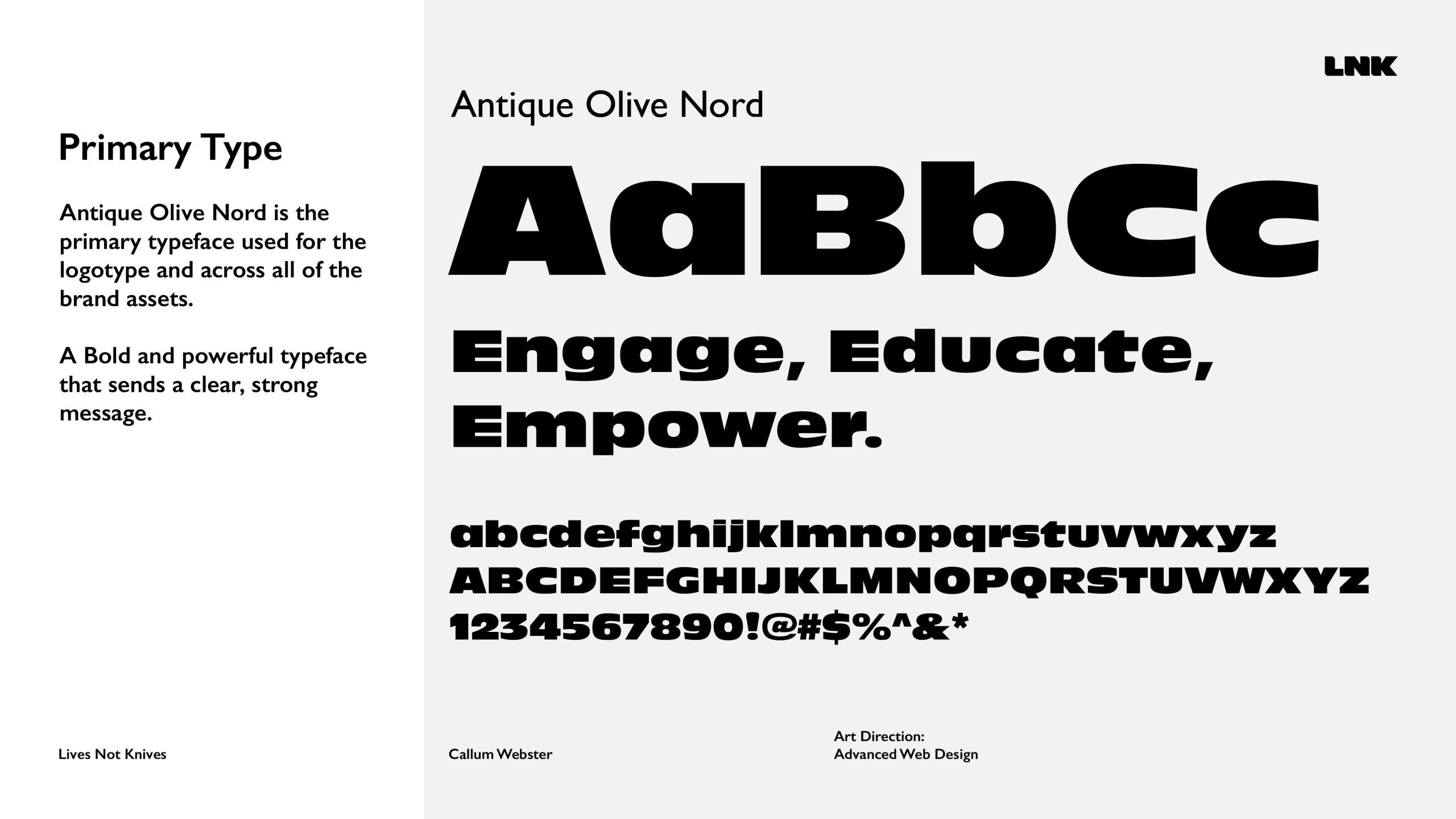
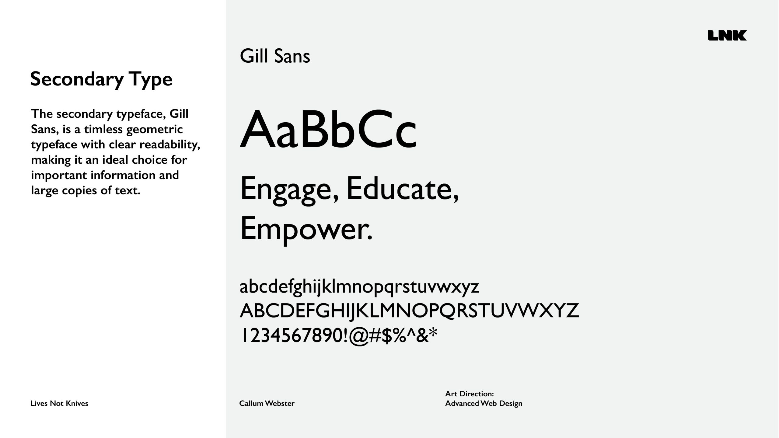
The 2 chosen typefaces were Antique Olive Nord as the primary typeface, and Gill Sans as a secondary typeface. Antique Olive Nord is a bold typeface used for the brand’s logo and marketing material to send a powerful message, reinforcing the brand’s values; paired with this is Gill Sans, acting as a secondary typeface for the brand, a timeless geometric typeface with clear readability making it an ideal choice for large copies of text and key information. The pairing works well together due to the high contrast in weight while keeping a high level of legibility at either size.
The ‘Knives Down, Futures Up’ campaign is marketed towards the Lives Not Knives target audience through utilising a multi-channel marketing approach, taking advantage of a variety of different marketing strategies to ensure the campaign maximises engagement with the youth. The campaign is run across the web, using a new website, and social media outlets such as Instagram and Facebook, with vertical marketing videos ideal for phone video platforms like Instagram reels, YouTube shorts and TikTok; the campaign also spreads into the physical world with billboards, posters and merchandise to send a strong persuasive message to the youth.
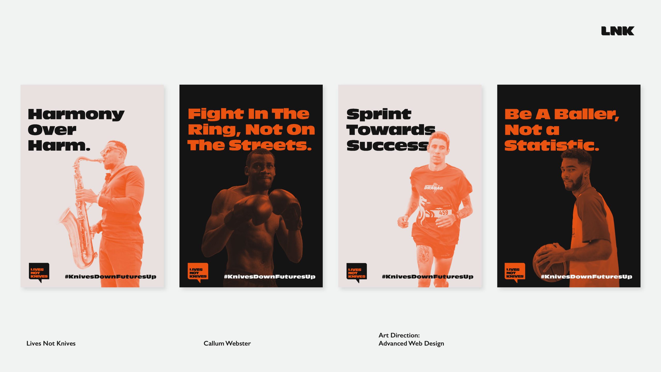
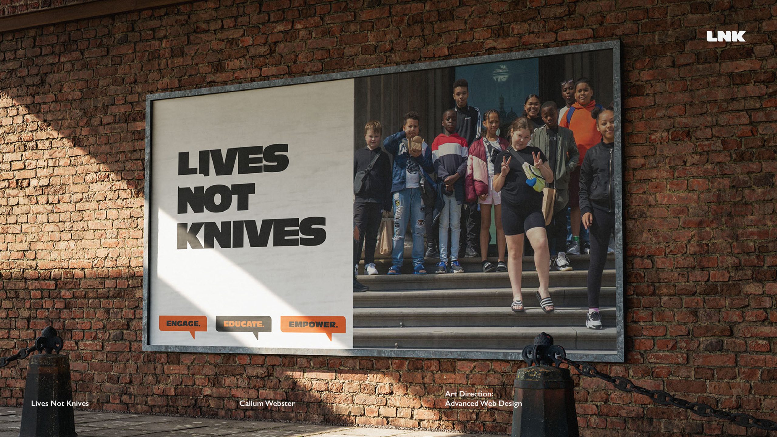
One of the initial pieces of marketing materials designed for the campaign was a series of posters. A big aim for the ‘Knives Down, Futures Up’ campaign was to reach out to individuals to show them that there are alternative life routes to take to avoid knife crime and that their time would be better suited to acquiring or utilising skills and talents. Each poster uses the imagery of a unique skill or profession paired alongside conceptual taglines referencing a life away from knife crime, the LNK logo and the campaign hashtag; all of these elements along with a basic grid system tie each poster together.
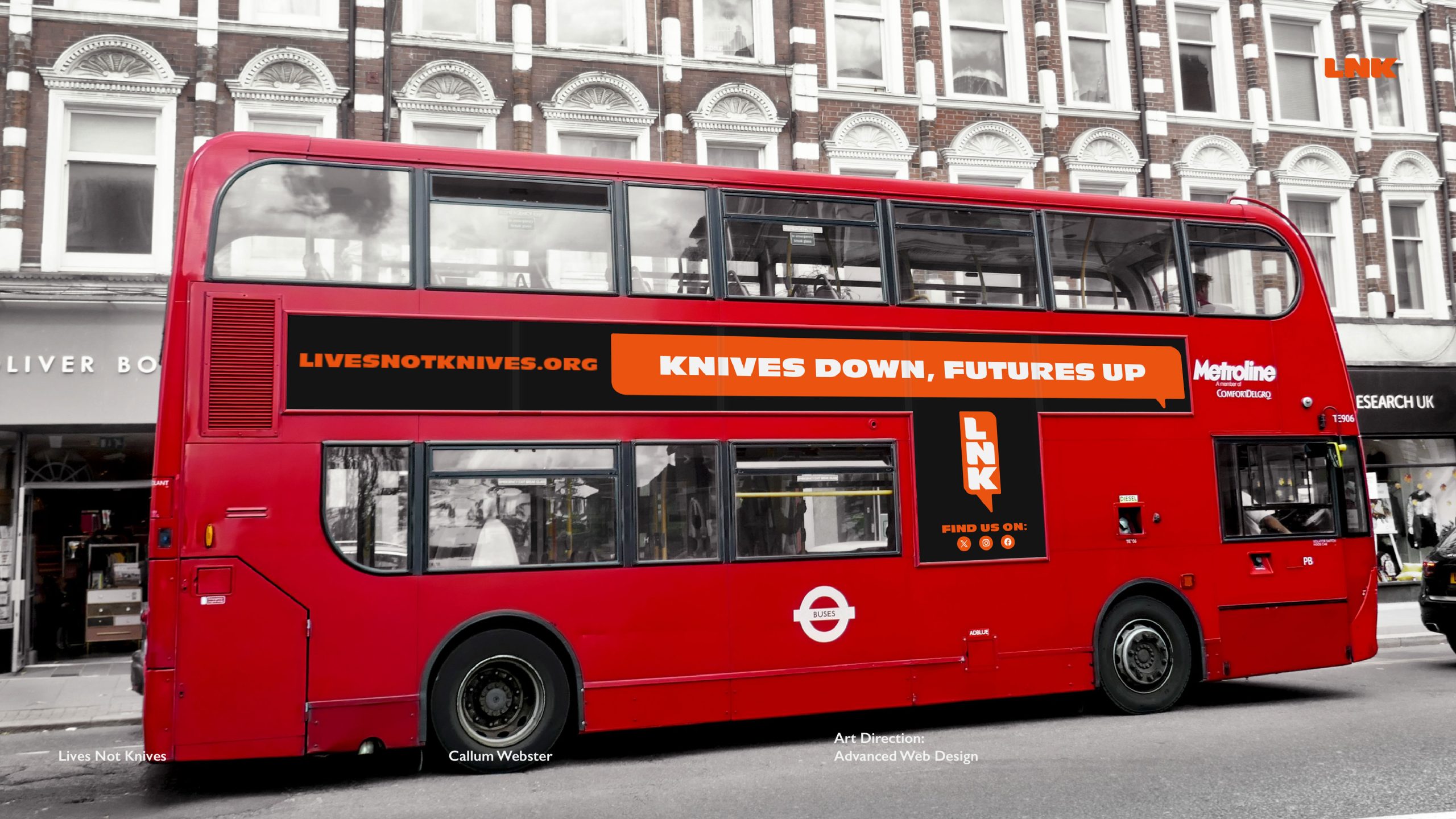
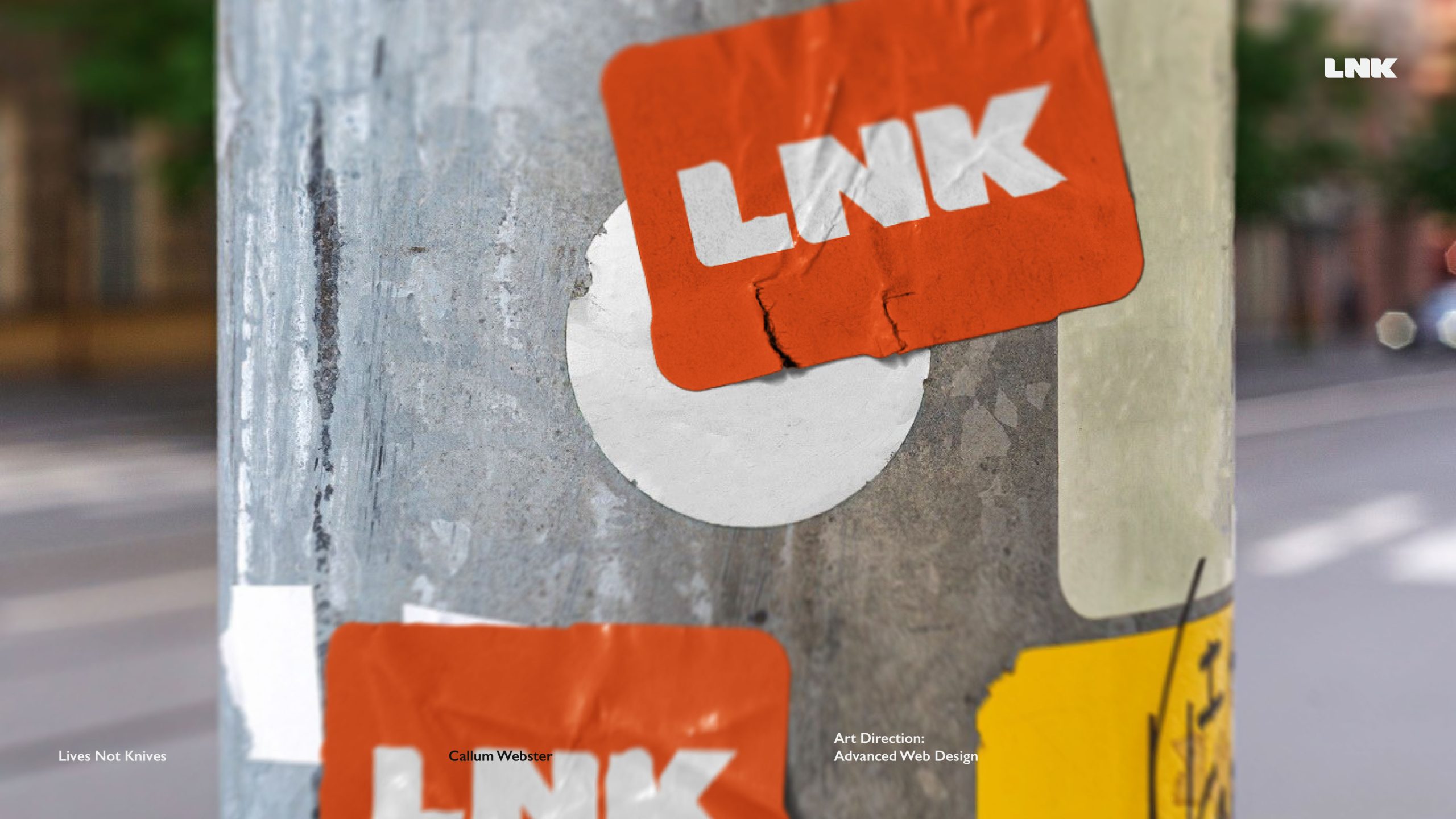
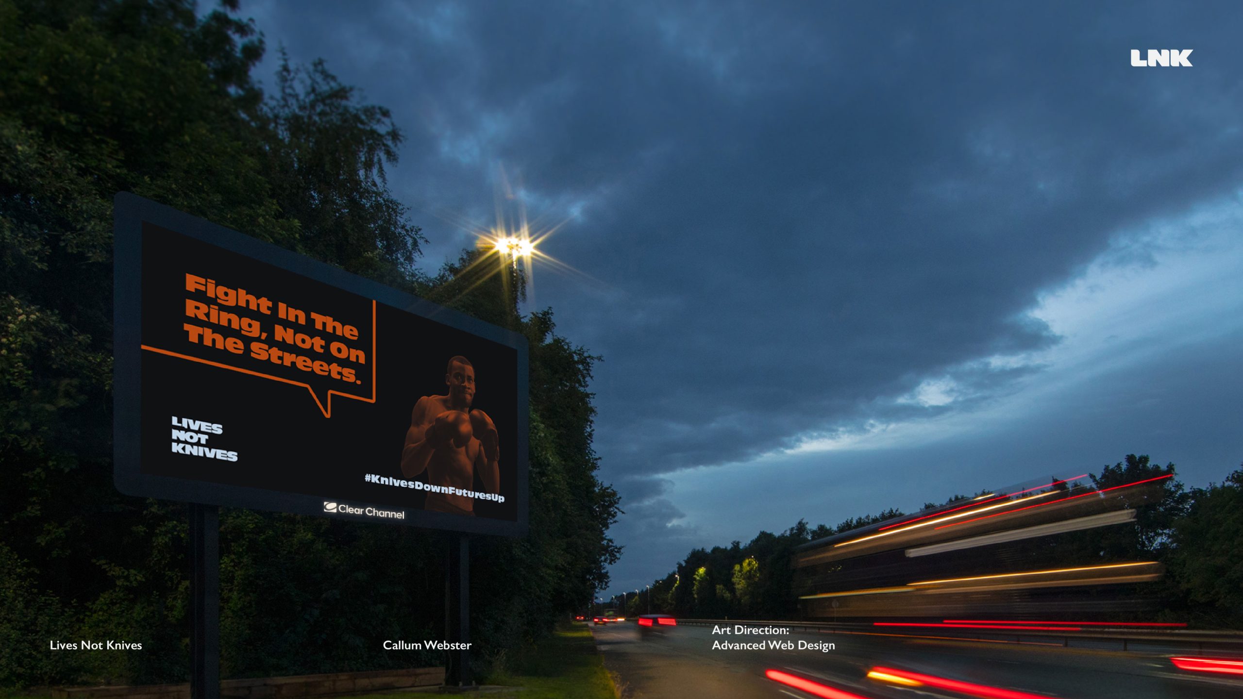
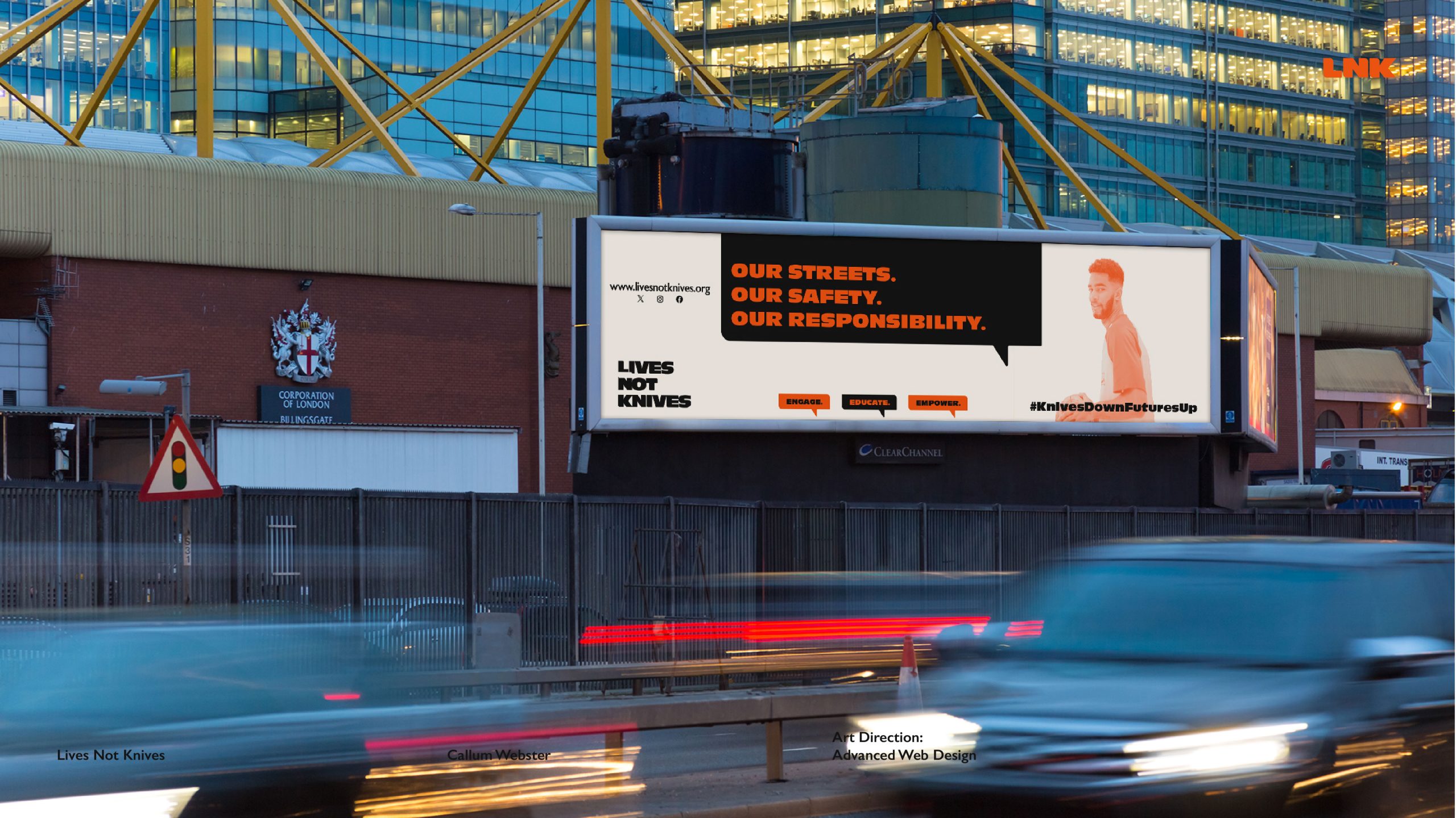
Below is a series of promotional materials in specific environments, it is imperative to showcase these locations due to the nature of the LNK organisation.
The mockups used below really help to visualise what this brand and campaign will look like in the real world, with Lives Not Knives being a London/city-based organisation which speaks primarily to the youth, the location of marketing materials must be taken into consideration; for example, the side of a London bus will have a large outreach due it not being in a singular location, the sticker on the lampost also encaptures an urban city lampost, so to see a LNK sticker pasted on there would be an efficient way to use guerilla marketing to push the brand to more people.
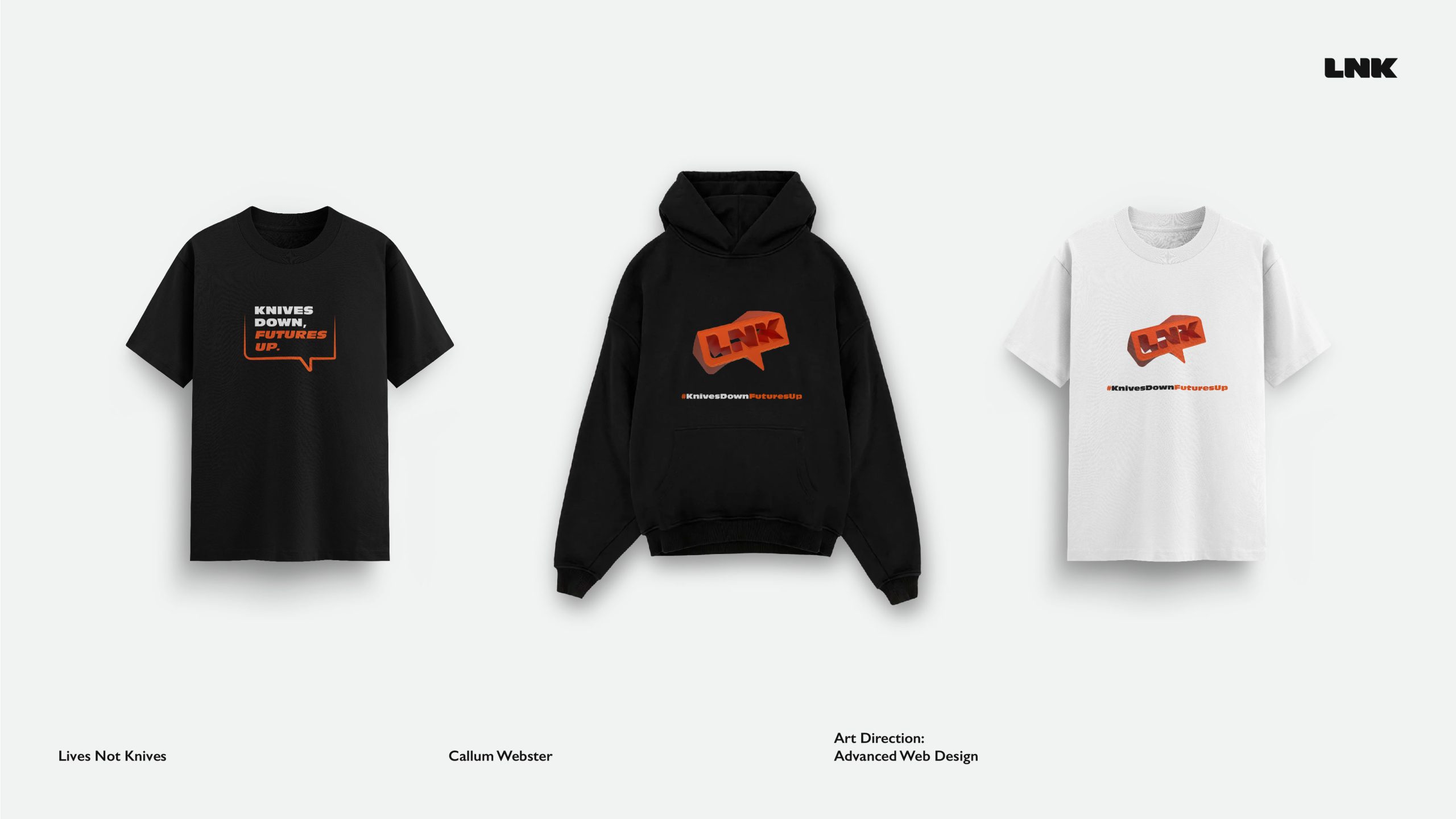
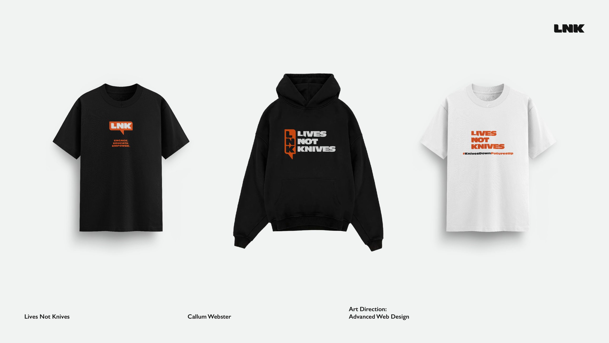
One of the approaches explored within the development log was to look at the previous campaigns that had been run by the Lives Not Knives organisation, one of them being how they used a T-shirt campaign to further spread awareness about their cause and their message. This was done on two occasions, the first time being a viral campaign in 2008 and followed by a 2021 campaign with their latest rebrand. With this in mind, an extension of this campaign was to incorporate merchandise into this, so a series of hoodies and T-shirts were designed inspired by the new brand but with an even stronger message.
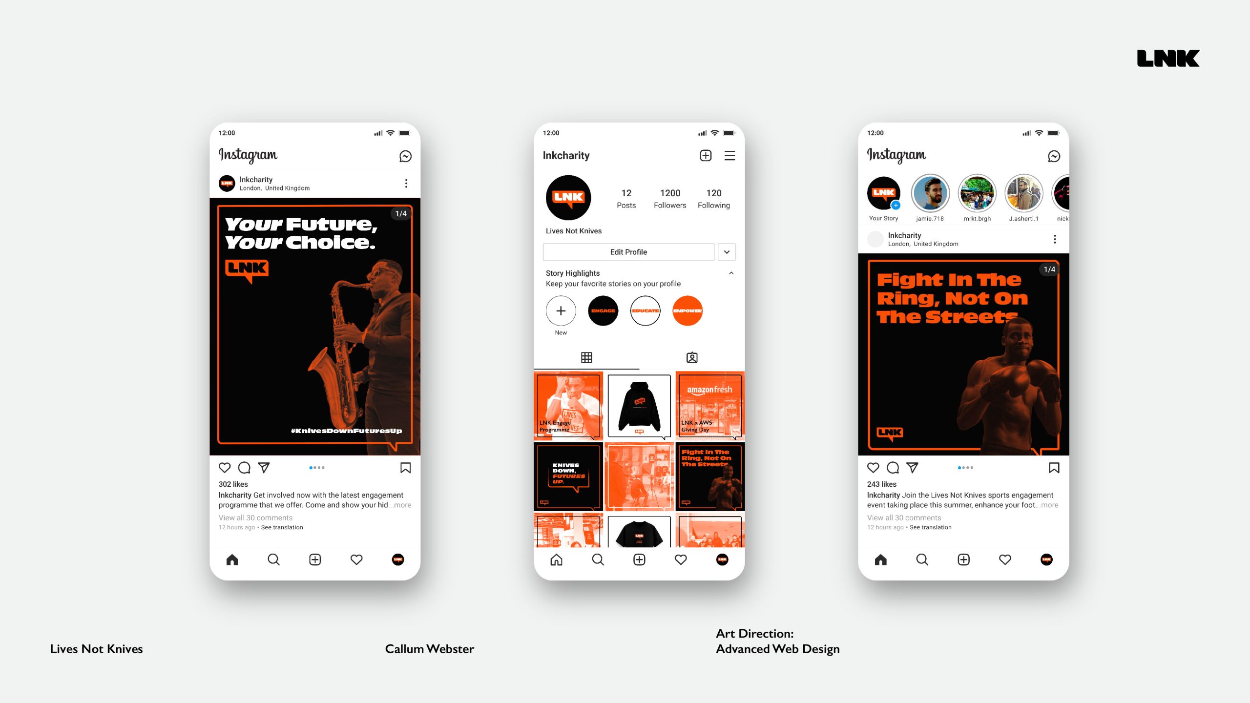
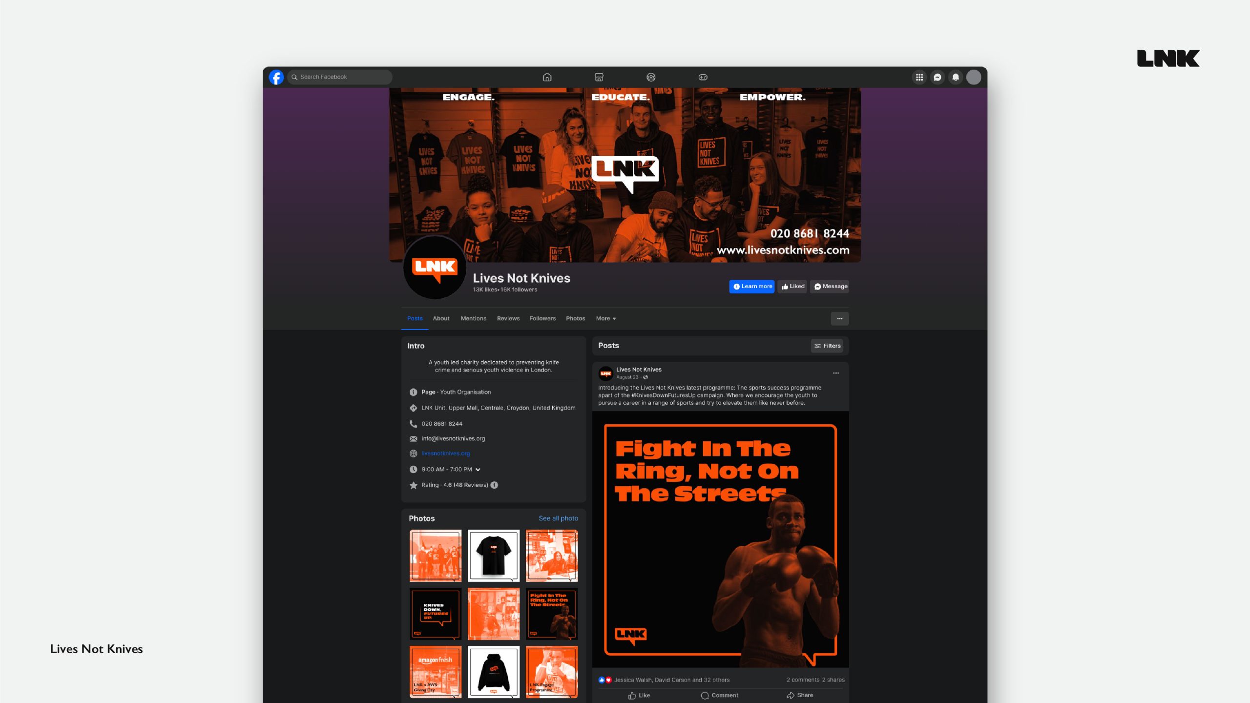
After this, there was an exploration of how the new brand and campaign would sit within a digital space. The two primary social media platforms that LNK currently uses for outreach and updates are Facebook and Instagram. It was essential to utilise these platforms due to the large role they play in LNK’s outreach.
Firstly looking at how the brand presence can be shown through social media so that it stands out amongst the crowd, one of the ways this was achieved was a series of posts that have a structure to them; for example, informative posts use the Gill Sans typeface for information due to its clear legibility, whilst Antique Olive Nord was used on the posts that are made to inspire the youth, with bold type that empowers the audience. A second example of how the posts allow the brand to stand out is due to each post being framed by the outlined speech box which can be seen across the brand, this frames the post and highlights key information whilst also standing out against other brands and allowing each post to feel like its part of something larger. The header on the LNK Facebook page also follows the pattern of using an orange gradient map overlayed on the imagery, this is a common theme across the identity and the campaign; The colour, typography, imagery and design choices help bring the social media platforms together and significantly improves the brand recognizability due to consistency across channels.
One of the largest parts of the rebrand and campaign was the website and the ways it has been improved from the current LNK site. The number of pages has been reduced meaning information is easier to find, improved navigation and a centralised layout with a 12 grid system. Upon entering the site you are met with a hero section which includes welcoming imagery of the team which reinforces the brand values, along with a summary of who LNK are and what they’re all about accompanied with a call to action button.
LNK are all about educating, so the time it takes to reach the information you need has been reduced by reducing the number of pages; although each page has more information, which was a concerning factor for sustainability, it was counteracted by using optimized images which would result in speedier loading times. One of the other issues caused by excess information on web pages is how engaging it would be to the viewer, this has been counteracted by having visually interesting imagery across a 12-column grid, along with page breaks which were designed in the brand speech bubble, again reinforcing brand consistency while serving as visual break via the use of white space.
The site contains 2 navigation bars; the first is a header navigation menu consisting of the brand logo in black, the different web pages, the primary call to action button and a toggle button to switch between a light mode and a dark mode. This navigation bar is fixed, meaning it moves with the page when the user scrolls, this results in having a CTA button, other pages and a dark/light mode toggle always present on the screen readily available. the dark mode toggle button at the top of the page is ideal for giving the user the choice to easily switch between, a light mode option would be less energy efficient due to white pixels causing more energy consumption, but a user might opt for this as black type on a white background is easier on the eyes, and improves legibility.
References(Imagery and Stock Video)
Lives Not Knives (n.d.) Lives Not Knives. Available at: https://www.livesnotknives.org (Accessed: 7 December 2024).
Pixabay (n.d.) Pixabay – Free images and videos. Available at: https://www.pixabay.com (Accessed: 18 December 2024).
Pexels (n.d.) Pexels – Free stock photos and videos. Available at: https://www.pexels.com (Accessed: 18 December 2024).
References(Mockups)
Good Mockups (n.d.) Free London bus vehicle branding mockup PSD. Available at: https://goodmockups.com/free-london-bus-vehicle-branding-mockup-psd/ (Accessed: 21 December 2024).
Behance (2024) Free mockup – Oversize hoodie. Available at: https://www.behance.net/gallery/200567735/FREE-MOCKUP-OVERSIZE-HOODIE?tracking_source=search_projects|free+hoodie+mockup&l=1 (Accessed: 21 December 2024).
Sachanati (n.d.) Free urban poster mockup. Available at: https://www.sachanati.com/mockups/free-urban-poster-mockup(Accessed: 22 December 2024).
Behance (2022) Phone 14 Pro screen mockup. Available at: https://www.behance.net/gallery/157622483/Phone-14-Pro-Screen-Mockup?tracking_source=search_projects|hand+iphone+14+pro&l=5 (Accessed: 22 December 2024).
Clear Channel (n.d.) Mockup templates. Available at: https://www.clearchannel.co.uk/resources/mockup-templates(Accessed: 22 December 2024).
Dekgrafis (n.d.) Free regular t-shirt thick collar 01. Available at: https://dekgrafis.com/products/free-regular-t-shirt-thick-collar-01?variant=49478952911169 (Accessed: 1 January 2025).