1.) Conceptual Design Idea (metamorphosis) and Research
The first step taken in the design process was to create a brand name and concept for my chosen project, which was an energy drink brand targeted toward consumers over the age of 60. Establishing a clear brand direction was essential, as it would allow me to develop a conceptual idea that aligns with the core identity and messaging of the brand. The brand was named ‘Ancient Power’—a pre-workout energy drink designed specifically for elderly gym-goers, with a thematic focus on mythology and astrology. The concept aimed to challenge conventional perceptions of ageing by promoting strength, vitality, and wisdom.
The primary direction for the project was to create an animation serving as a promotional advertisement for the brand. This animation would draw inspiration from existing promotional materials produced by well-known competitors in the industry, such as Red Bull and Monster Energy. These brands have successfully used dynamic motion graphics, layering techniques, and high-energy visuals to engage their audiences. I planned to incorporate similar techniques while adding a unique twist that aligns with the themes of mythology and celestial power. A key focus was on breaking down the main vessel for my energy drink, a 500ml can, into its most basic 2D components—a circle and a rectangle. Exploring how these shapes could be connected within the animation would help reinforce brand identity while allowing for visually compelling transformations.
The overarching concept of ‘Ancient Power’ revolves around reinterpreting age as a source of empowerment rather than decline. With this in mind, I delved into various mythological references, drawing inspiration from ancient gods, mystical powers, and celestial imagery. This research led to the decision to incorporate visual elements such as planets, stars, and constellations into the animation, reinforcing the connection between strength and timeless wisdom. One specific idea that emerged was the transformation of the circular aerial view of the can into a celestial body, creating a seamless metamorphosis between product and brand imagery. This approach would help establish a strong visual identity while adding a layer of symbolic depth to the animation.
Additionally, I explored the historical and architectural elements of ancient mythology, particularly ancient Rome. The use of iconic Roman columns became a key visual motif in the design process. Given their cylindrical form, they presented an excellent opportunity to create a metamorphosis sequence in which multiple cans seamlessly transition into towering Roman columns. This transformation would further emphasise the brand’s themes of strength, endurance, and legacy, reinforcing the idea that ageing does not equate to weakness but rather to a deeper power.
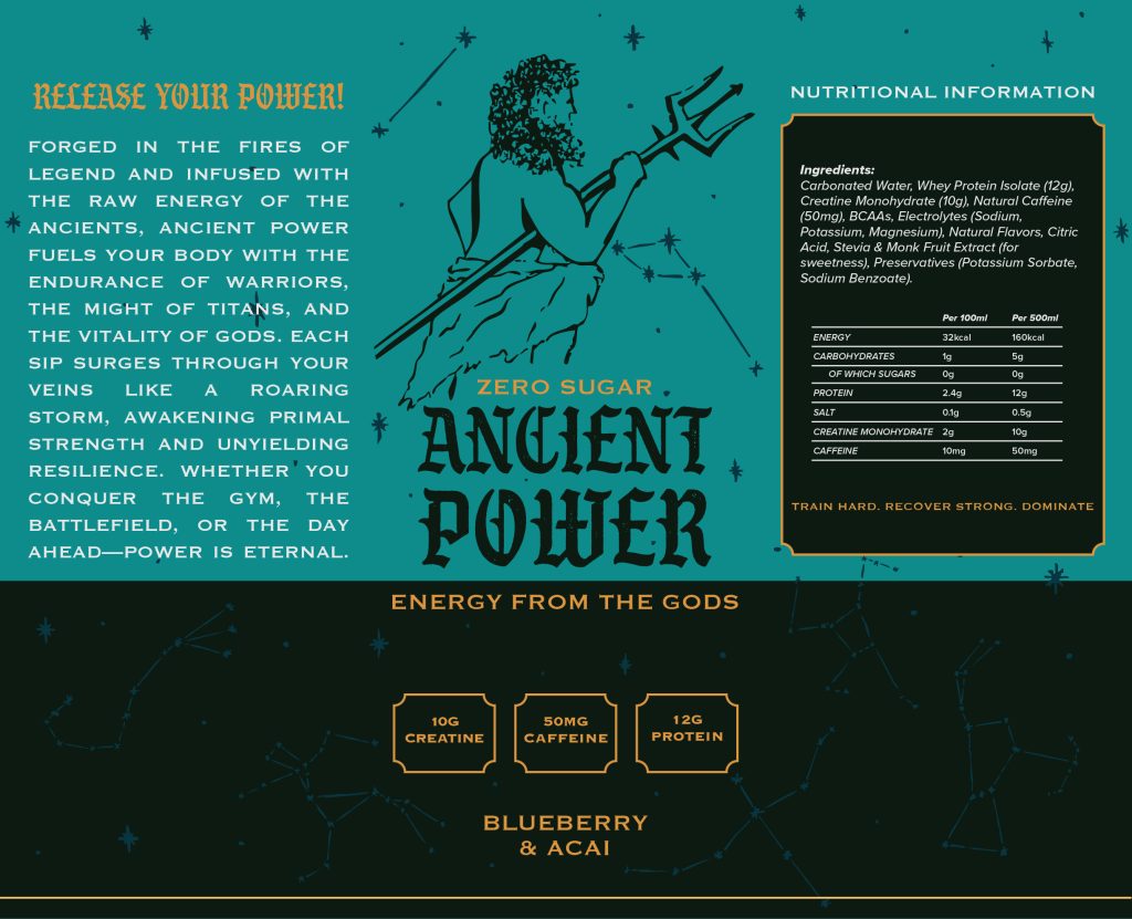
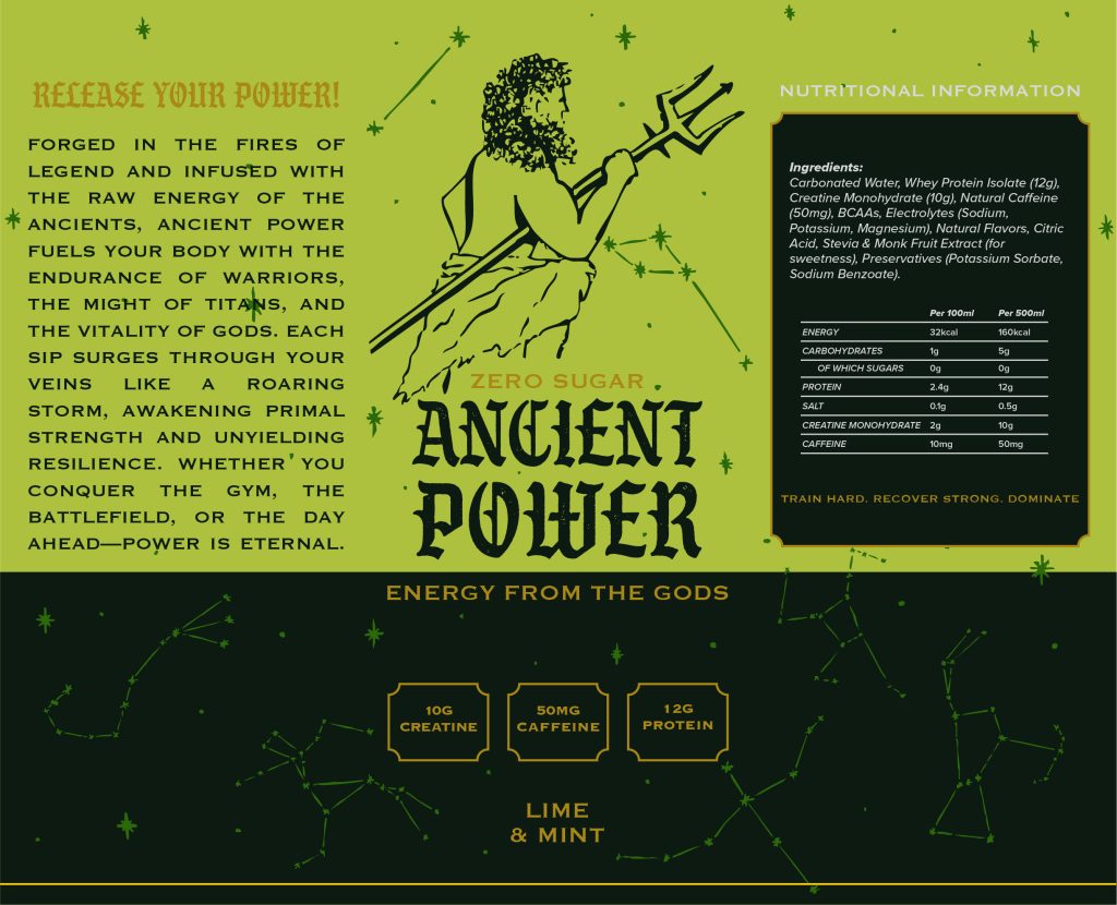

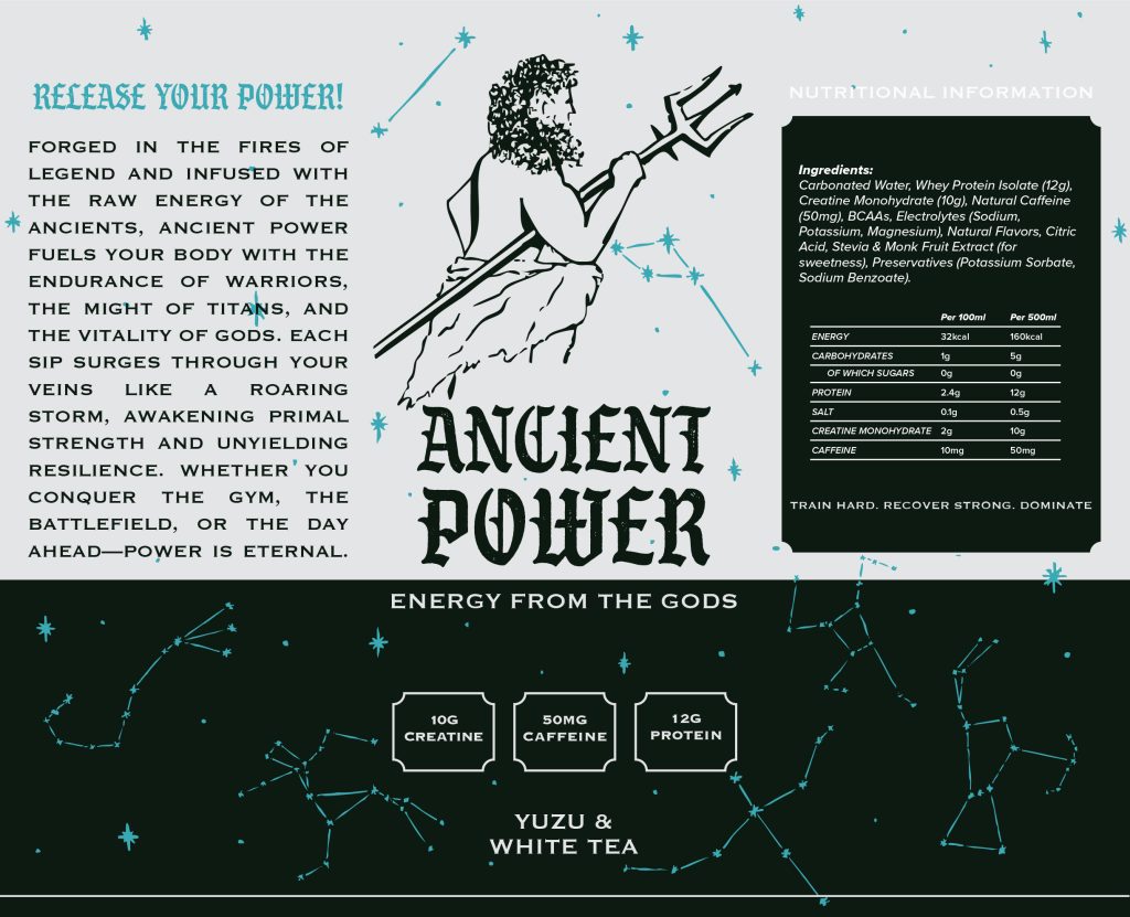
Once the brand name, concept, and visual direction were established, I began developing a series of labels for different flavour variations of the energy drink. Showcasing multiple flavours within the animation would help reinforce the idea of the project functioning as a full promotional campaign rather than a standalone animation. Each flavour variant was designed with unique colour schemes while maintaining a cohesive brand identity. By integrating these elements into the animation, I aimed to create an engaging and memorable visual experience that not only promoted the product but also resonated with the target audience.
One of the things I would like to look at moving forward is the incorporation of different gods to represent different flavours, to create a unique and strong brand identity.
2.) Animation Storyboard
The storyboard shows 9 different steps across a 30-second animation in the style of a promotional video. Board 1 begins the scene by showing a bright circular sun, lighting the entire screen by emitting a soft orange glow, moving along to board 2 which introduces a second slightly smaller circular figure, this time completely dark, moving from left to right, which leads into board 3 creating a solar eclipse using layering of one entity in front of the other also creating a change to the scene from being completely lit to a dark scene with a bright ring in the centre made from the eclipse. These first 3 boards start to bring together the circular elements mentioned within the conceptual idea post, and will approximately take around 8-10 seconds of the animation and the first stage of the metamorphosis.
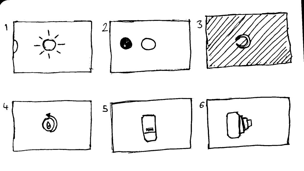
The 4th board will continue to show an aerial view of the can spinning whilst using light to emphasise the lip of the can to better help it blend into the initial eclipse idea. Board 5 changes to board 4 via a camera tilt to reframe the shot from an aerial view to a front shot of the can, there will be a slight pause to show the brand and can design. Board 6 depicts another camera movement with the camera panning around the subject revealing a series of layered cans behind the initial can to showcase the variety of flavours of Ancient Power across 4 cans, making them the focus of the shot, as each can spins to face the new camera angle. This concludes the second part of the animation, with the 3 boards aiming to take around an additional 10 seconds.
Board 7 goes onto a camera shot showing all of the flavours of the energy drink whilst spinning so the front of the can design follows the camera angle, with the end shot focusing on all of the flavour variations for a few seconds. Once the product variations have been shown for a few seconds board 8A shows the second metamorphism which takes place within the animation. Using smoke in the 3D software to come up and cover the cans so that they can no longer be seen leading into the final board, board 9A which is a lonely can that emerges from the smoke to show the final shot of the energy drink.

This concludes the initial storyboard but after developing the concept some more and learning the 3D software, I slowly began to adapt my storyboard. Creating board 8B, which showcases the metamorphism takes place with a rising sun to match the initial sun at the beginning of the animation as I did not have the technical skills to create smoke. Initially, I was unsure how I wanted the animation to end, as I wanted to emphasise the brand more and create a rounded advertisement feel to it, board 9B still shows the product emerging but this time from the rising sun, finished off with a title shot using 3-dimensional typography to match the brand.
3.) Visual Design Treatment- How will you incorporate Edward Tufte’s five theories into your work?
After considering my initial conceptual ideas and storyboard process, the main theory I want to focus on during my animation is Tufte’s theory of layering and separation. This theory is all about organising information and design elements in a way that they do not clash with one another allowing for concise and clutter-free visual communication. ‘Among the most powerful devices for reducing noise and enriching the content of displays is the technique of layering and separation, visually stratifying various aspects of the data.’(Tufte, 1990, p. 53) I will incorporate this theory into my animation by using the use of similar shape objects, layering the eclipse above the circular top view of the can, and also in the middle part of the animation bringing focus from a singular can to the other flavour variations that begin to appear from behind the initial camera shot.
Tufte’s theory surrounding narratives of space and time looks directly at how information is shown in space, along a timeframe and how this can affect the clarity in which a viewer receives this information. Implementing Tufte’s theory into the animation will allow me to guide the viewers through a visual story with changes to the position of the can and the camera, and the timing of the eclipse allows the moon to cover the sun creating an eclipse, as shown in the board 1 to board 3 of the storyboard.
‘Our understanding of the aesthetics of information is enriched by examining dance narratives and their visual texture’(Tufte, 1990, p. 115) looking at the dance diagram Tufte speaks about how the musical timeline moves with the dancers helped while creating the storyboard as it allowed me to create diagrams with information allowing a seamless process between storyboard and building the final animation.
(Envisioning Information, p. 115)
In the initial ideation phase, the goal was clear I wanted to achieve a realistic-looking animation to fit the purpose of serving as an advertisement, one of the ways this will be achieved is by applying Tufte’s theory of micro/macro readings for the 3D modelling when modelling the can, it is vital to make sure all of the micro details: the folds, bends and shapes share a likeliness to a real-world can, this will be achieved by taking the time to inspect a can and ensuring that the micro visual elements all match leading to the overall macro 3D model looking more accurate to the reference can that I will be using.

(Envisioning Information, p. 91)
Another of Tufte’s theories which will be applied to the animation is the use of colour, one of the key things mentioned within Envisioning Information, referring to the use of colour, was the phrase ‘visual metaphor'(Tufte, 1990, p. 91) Tufte goes on to explain how different colours along with their saturations, hues and values have been used in an infographic and different variations were used to show different data. This will be applied in a slightly different approach within the 3D animation in 2 ways; the first is using different colours to represent the different flavours presented in the animation, each label colour working as a ‘visual metaphor’ to portray the flavour within, with an orange can for the orange and turmeric flavour, white can for white tea and yuzu, green for the lime and mint, and finishing with the blue for the blueberry flavour. The second way in which the animation will use colour as a ‘visual metaphor’ is colour use of the sun/star and the choice to have a bright yellow/orange colour to it; as a sphere is such a vague shape and could have numerous meanings, the orange used and the glow emitted will allow for more visual clarity and an easier understanding to the viewer that they are looking at a sun.
4.) Final Design- How did you incorporate Tufte’s five theories into your work?
During the process of creating the final animation, the first step taken was to utilise the Maya software, I found that Maya was the best solution for modelling my can model, it was a very tedious process to fully execute the minute details to the level that I wanted to achieve yet I found it to be the most appropriate software; following this I came to the task of animating and texturing my can, which I soon found that I preferred the alternative software blender, leading to switch between software and finishing the rest of the animation in blender. From this, I was able to learn some of the fundamentals of 3D and animation and was not limited to one software, this created a steep learning curve for myself but resulted in an enjoyable process of creativity and learning.
One of the key issues I found when trying to incorporate Tufte’s five theories into the animation was that it was difficult to separate Tufte’s theories surrounding data and apply them to the context of an animation, this was overcome once I looked at each element of the animation as a piece of information, and I was able to understand that this information needed to be shown with full clarity to create a compelling visual story. Although I had these challenges throughout the process I was able to implement all of the theories that I had planned to within post 3. Looking at the use of layers and separation with the aerial view of the can layering with the eclipse to create a metamorphosis, the use of colour on the flavours and the sun as well as the addition of the glow which the sun emitted in the last scene creating a harmonious and warming glow to the final shot, the animation also showcase effective use of narratives in space and time via the slow opening eclipse creating suspense and building tension along with use of camera shots panning and tilting to create a visually engaging animation. The use of micro and macro allows the small details to be defined creating a sense of realism which all work to create the bigger picture.
The final design fully executes the initial storyboard by using Tufte’s theories to showcase visual information with a high level of clarity whilst also being true to the initial design concept and stylizing the animation in such a way that it empowers and energies whilst capturing the themes of mythology and celestial power, creating a unique and fresh take on an elderly energy drink
5.) 3D Metamorphosis Animation
References
Tufte, E.R. (1990) Envisioning information. Cheshire, CT: Graphics Press.(Tufte, 1990, pp. 53, 91, 115)
Cruen (n.d.) Raw Power. Available at: https://uppbeat.io/track/cruen/raw-power (Accessed: 5 March 2025).