To begin wireframe prototype I started by referring back to competitor research and landing pages that were looked at in the early design prototyping stage to understand the elements that would need to be included on the webpage, such as a hero image and sign up box, a call to action, a navigation method and the visual identity. The low fidelity sketches shown below were experimentations with how these elements could be strategically place on the page to allow easy navigation, a high level of legibility and engaging imagery. The main goal of this webpage was to create a intuitive design with a clear set of functions and information whilst being true to the EcoFuture brand values of being innovative and organic.
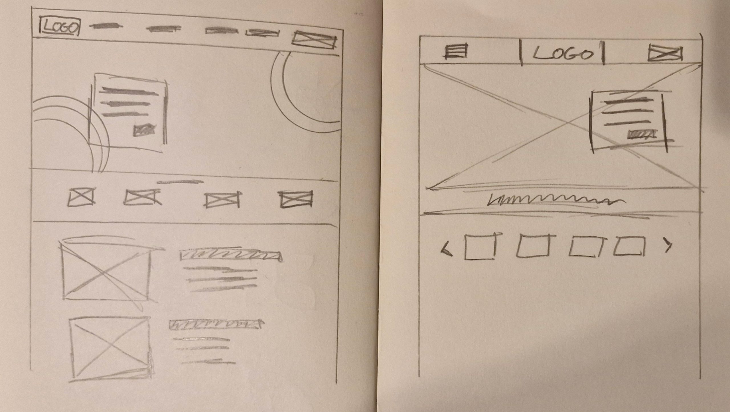
Moving over to Figma allowed me to better refine how elements would be display out on the webpage to create an interesting composition which would guide the viewers eye to key element via the use of contrast in size and white space, so the viewer doesn’t become overwhelmed with a busy web page. The first design would have a large background hero image which spans the full width of the webpage showing a family setting just to reinforce EcoFuture natural and organic side whilst also being professional, where as the right side would use the brand shapes seen in the banners and advertising video to mask images of the services that they provide, two different approaches with alternate layout but both reinforcing the EcoFuture values and tone of voice.
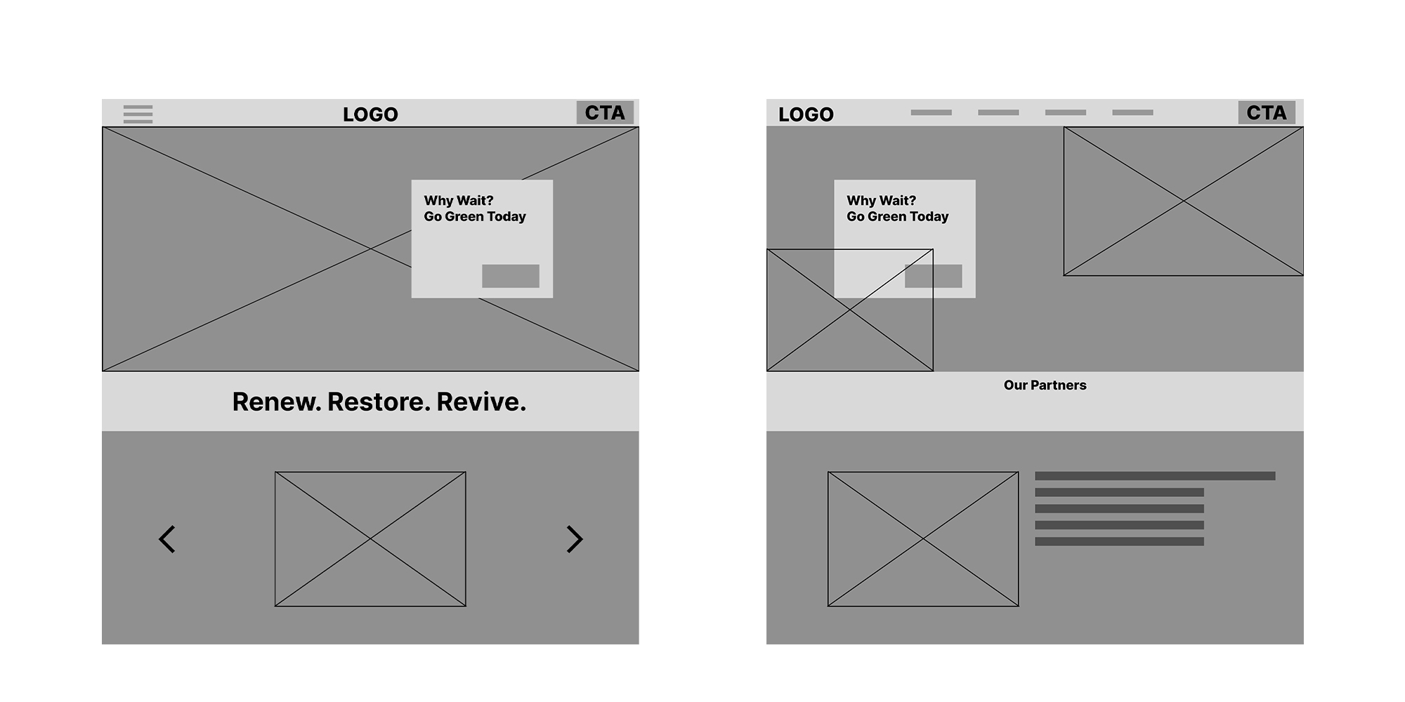
Moving onto the higher fidelity prototype is where the home page starts to come together, with the addition of the brand elements such as the eco friendly green colour palette, the modern and geometric brand typeface, the green rings from the logo, and the logo itself, creating a harmonious design with a an appropriate visual design matching the initial mood board and style scape. When a user lands on the webpage they are greeted with imagery related to the brand, and the same rhetorical question hook from the online video which immediately causes the user to think about their actions. Upon landing they are also greeted with 2 call to action buttons in a bright green with a clear contrast from the dark green background, this allows them to be one of the most prominent elements on the page, if a user wants to sign up get involved they can see the CTA immediately Another design decision was for the sites main background colour to be the dark green, with the site being a dark theme it creates a more sustainable site which uses less energy.
