Defining The Festival
My Festival Idea:
Tank Games Festival is a gaming E-sports event aimed to bring the online gaming world into a single place, A diverse range of hobbyists and professionals come together to share their love of gaming. Based at ExCel in London, spanning 3 days, The event will use multiple convention halls to showcase many different areas of the gaming industry including Content creators and guests, LAN parties, E-sports and upcoming games and tech from industry-leading developers.
The Problem Spacing:
Using the UX process model I was able to assess competitors sites and apps to discover their strengths and weaknesses, which I then used to define my problem space. From looking at these several problems arise that need to be targeted beforehand, such as:
- How do the different sub-genres of the gaming industry all come together
- What guest speakers will be appearing?
- Where to buy tickets?
- Being able to look at future events on the app
- The inclusion of an online interactive mapping system, to find your way to the event and to help navigate the event.
The overall goal of the festival is to allow new gamers to explore new games and experience the huge community that they are a part of. Upon inspection of the 2 main competitors’ (www.EGX.net and www.isomniagamingfestival.com) websites and apps, there is minimal information on what will be showcased at upcoming events. Each competitor also does a poor job of showing navigation to the event, this is something that should be included on the website. The companion app could differ by showing more interactive options for a live map, allowing navigation to and from specific stalls and stages within the festival.
Requirements Gathering & Analysis
Target Audience:
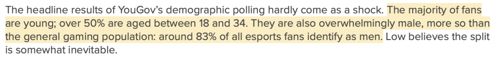
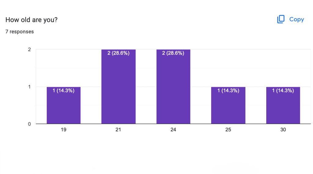
Although the festival is a broad gaming festival, it is mainly focused on the E-sports industry, which helps to determine that the primary target audience will be males between the ages of 18-34. Due to the scale of the gaming industry, there would be many smaller groups of target audiences but this demographic would be the primary user.
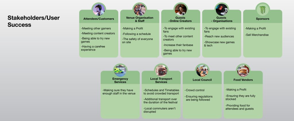
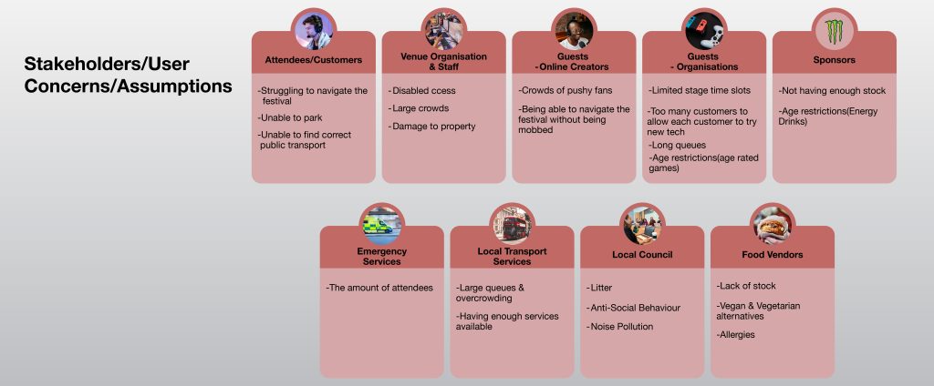
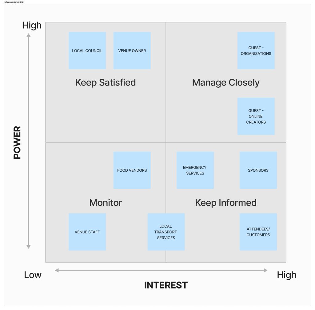
The stakeholders are the groups of individuals or organisations that have a stake in the festival, which consists of an interest or influence on the direction the festival takes. The stakeholder’s concerns and goals need to be taken into consideration to create a more effective user experience for all parties involved. Below is some information on the success and and concerns of each type of stakeholder involved and the power and influence they have on a project which determines the decisions that should be made when designing.
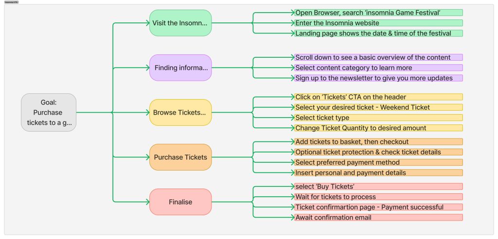
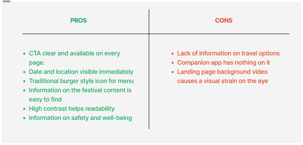
The main competitor of the festival is Insomnia Gaming Festival, who use a very functional website which has been specially designed with accessibility in mind, the below hierarchal task analysis shows how streamlining the website(www.insomniagamingfestival.com) works to reach the user’s goal, along with some pros and cons of how effective the site is to the user.
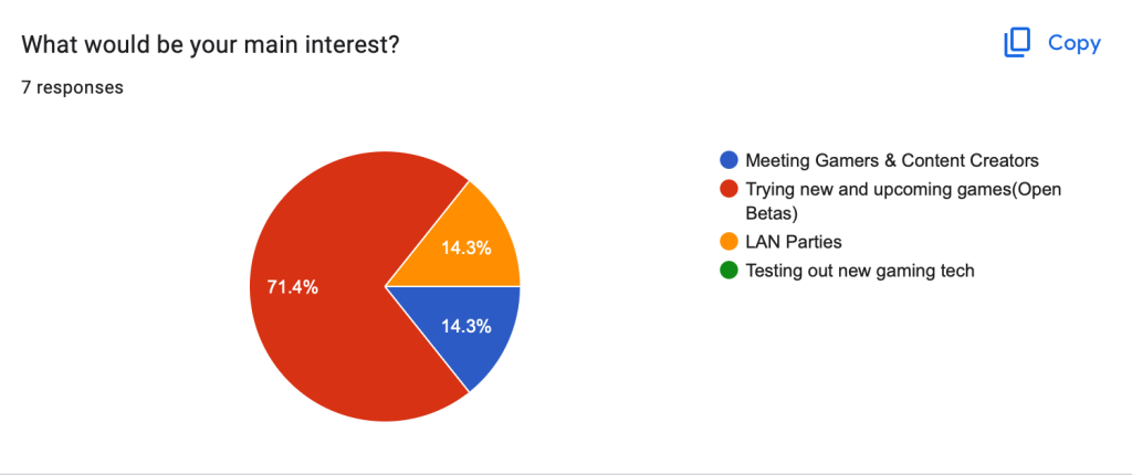
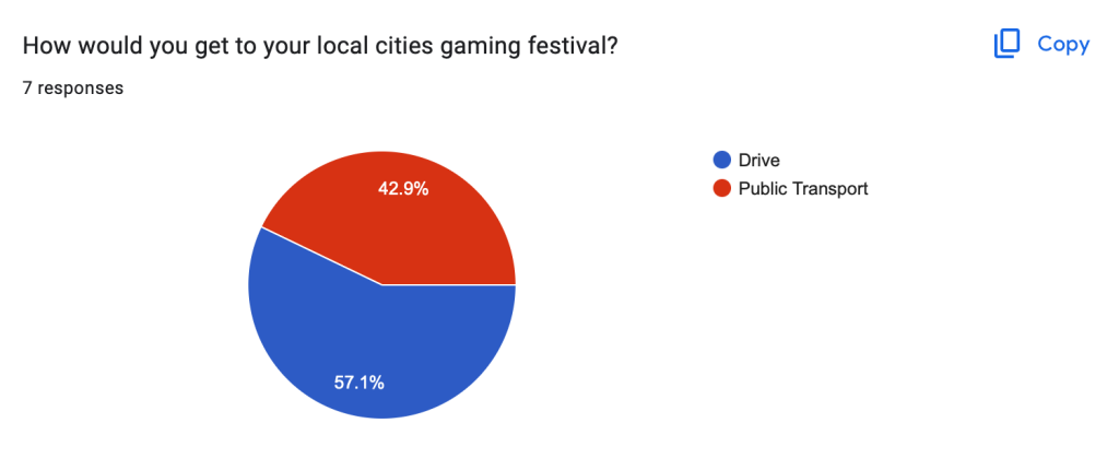

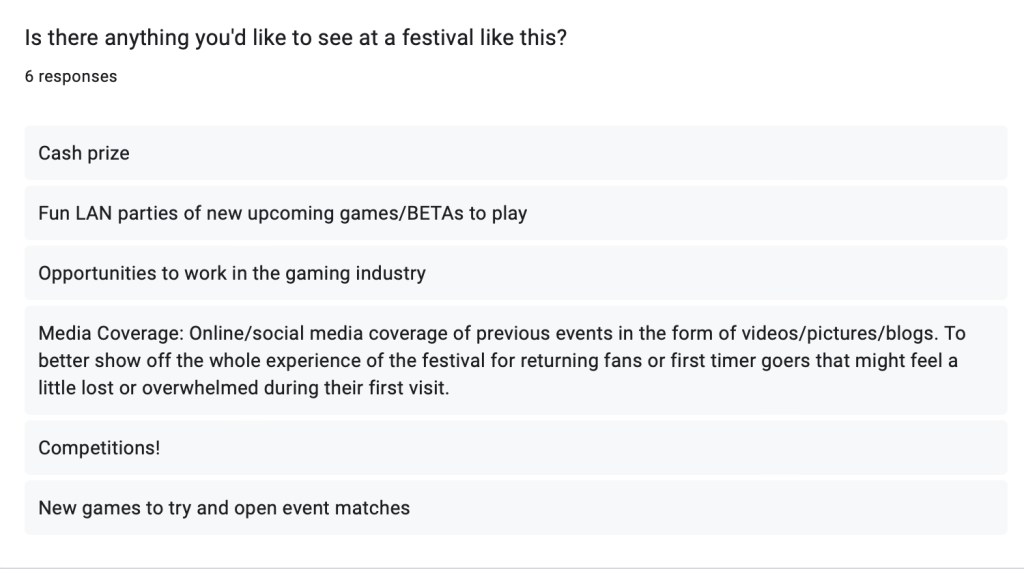
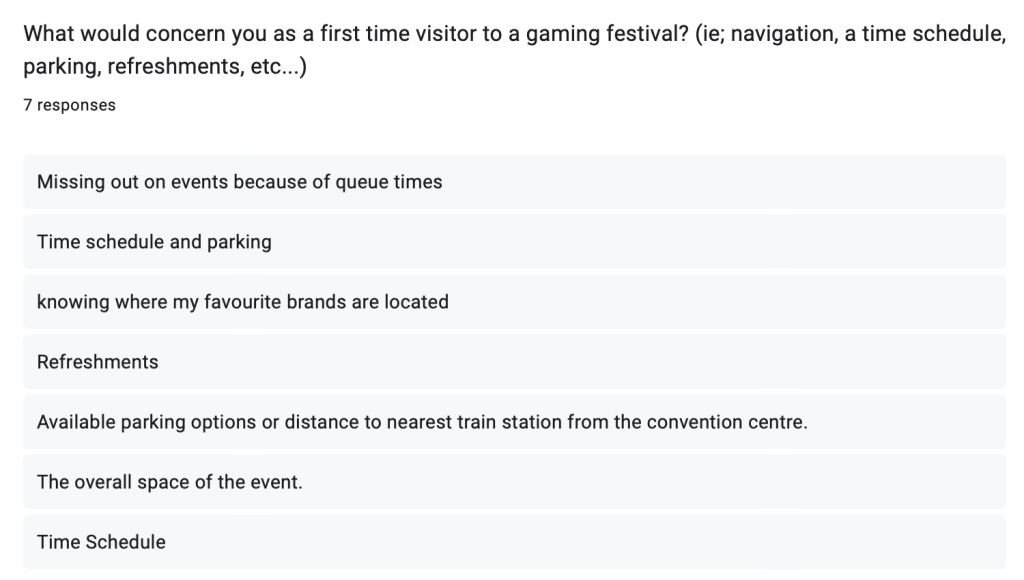
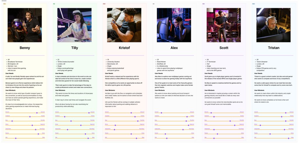
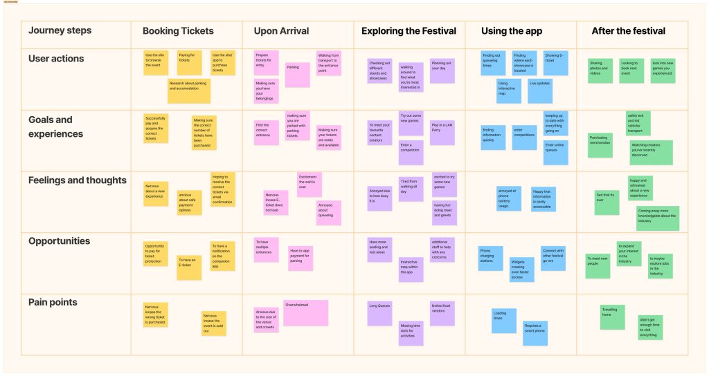
Secondary feedback forms were used to compile information on users which led to the creation of 6 personas. The personas allow the design team to put themselves in the position of the user to create an appropriate and concise design solution, by tackling any accessibility concerns and defining any concerns and assumptions surrounding the festival.
The accessibility concerns assumptions are an important way of tackling problems early on by highlighting them so they can be correctly approached in later stages.
Some accessibility concerns about the festival are:
-Low contrast colours within the app.
-Flashing lights within the festival space.
-Speech input options for search bars.
-Text-to-audio options for visually impaired users.
Some assumptions about the festival would be:
-The venue will have free parking.
-The venue will have guest Wi-Fi.
-The queue times will be low.
Success for the final designs will be determined by how effectively they use the data from personas, user journey mapping, concerns and assumptions to create a clear and concise website and companion app with successful usability and accessibility.
UI Principles to be Applied
Design laws are vital rules that should be followed to create an effective and compelling user experience and keep the user engaged. One of the most important design rules being implemented into the festival design is Jacob’s Law, this will allow the festival site and app to follow similar design patterns as its competitors, and this will help keep the user engaged due to its familiarity.
Hick’s Law is another vital UX/UI law that will be used in the design, it states that the more options that a user is presented with, the longer it will take them to reach a decision, too many buttons in a singular space may lead the user to lose focus and stray from the site, resulting in a poor experience and less ticket sales.
The CTA(Call To Action) on the festival site will be in the banner at the top of the page with high contrast in a separate colour from the other buttons. This is called the Von Restorff Effect, by making differences in colour and size to make the CTA more memorable.
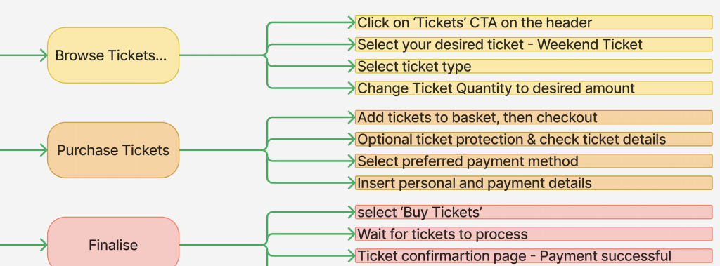
Upon revisiting the HTA for the Insomnia Gaming Festival from the previous post, the decision has been made for the CTA to follow a similar amount of steps, as the overall outcome is similar, 10-12 steps from the homepage to the end goal of purchasing a ticket, which will be broken down into sections. The Goal-Gradient Effect will be used to break down these sections to help users track which stage of the purchasing process they are currently on with a visual representation. By applying these laws and rules to the user interface it helps reach the usability goals of engagement, user satisfaction and consistency.
The app will have an interface for festival attendees, and a separate interface for guest speakers/organisations so that each stakeholder can have a more clear user experience oriented to their goals.
Rejected Prototype Designs
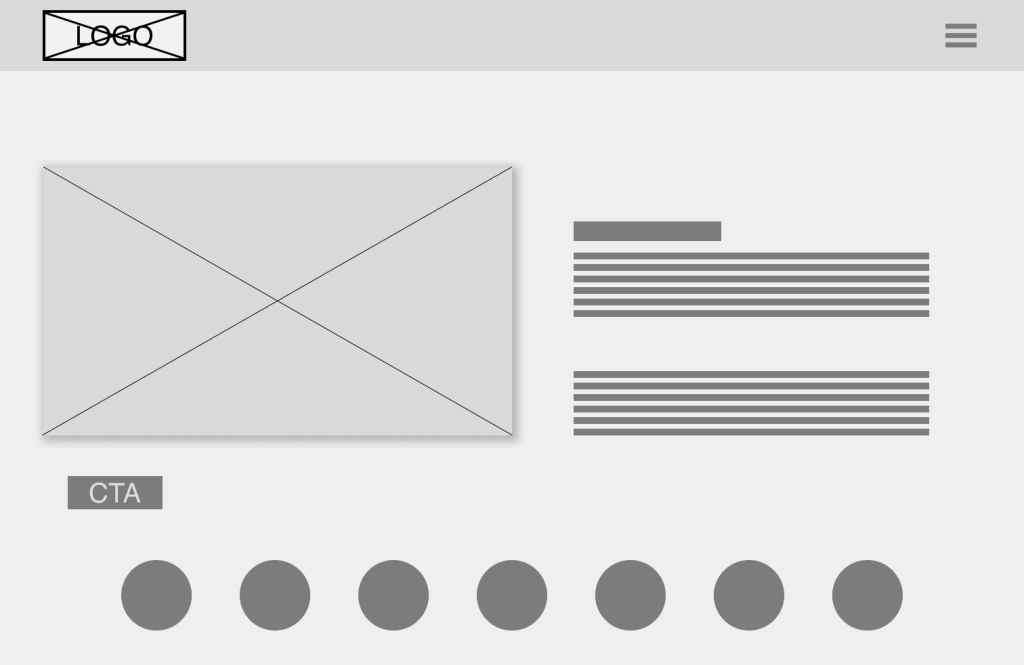

The initial designs with low-fidelity website concepts initial created for the festival were rejected due to their difficult usability. A hamburger menu icon allowed the header to be less cluttered, in turn, the drop-down menu it opened created a cluttered main layout and covered some important information. This type of drop-down menu would be more successful if the content had narrower margins so that any overlapping is avoided.
Another issue with this prototype is the lack of visual hierarchy created by size, placement and contrast. The elements are crowded and no white space is used to allow individual elements to breathe, this can result in the user becoming overwhelmed and losing any interest in the site or losing track of their goal.
The call to action button on this rejected design is poorly designed and positioned due to its size and contrast to other elements, it does not work as a clear indicator to help the user reach their goal. To make the CTA more effective, the Von Restorff Effect should be used to create a clear and concise button to improve the navigation of the overall site.
Low Fidelity Prototype
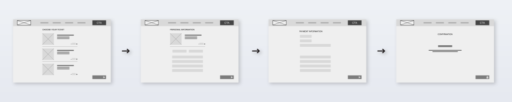
The low-fidelity user interface prototypes have been cleverly designed based on the research from the previous posts, with stakeholders and users in mind. The site uses design principles and laws to streamline the process and improve decision-making amongst the users, the largest and most prominent button on each page is the CTA on the top right side of the header, which is an example of the Von Restorff Effect. Having the header and CTA the same on each page ensures that an element of consistency is kept across the site.

The website enforces Jacob’s Law by taking inspiration from other festival sites, which creates a sense of familiarity when the user enters the site, there are menus and layouts that they are familiar which, in turn, improves the site navigation allowing the user to find the information they are looking for. The image below depicts the steps it takes to purchase tickets once the call to action button has been clicked, it is a simple four-step process from selecting the preferred tickets through to the confirmation of the tickets, there is an element of familiarity further enforcing Jacob’s Law.
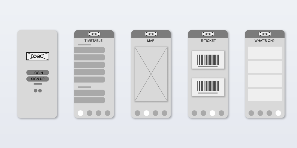
The app has taken a slightly different approach, it is intended for use once tickets have been purchased. Users will be greeted with a login interface for their account, and from there they can view their tickets, a timetable/schedule for the event, online tickets and information on what’s on, each one of these pages helps to tackle the initial problem space. There will be a variation for guest speakers and organisations so they can manage their schedules, can keep track of meet and greets and talks, to maximise efficiency.
References
Walker, P. (2023) The Story Mob and UKIE report analyses UK esports audiences and growth. Available Online: https://esportsinsider.com/2023/09/story-mob-ukie-uk-esports-report#:~:text=The%20majority%20of%20fans%20are,esports%20fans%20identify%20as%20men. [Accessed On 25/2/2024]
Memon, M. (2021) UX laws: 21 principles for creating winning designs. Available Online: https://maze.co/collections/ux-ui-design/ux-laws/ [Accessed on 28/02/2024]