The initial process of creating the Forceflix mobile prototype began with a set of duplicated UI wireframes as this provided the base skeletal structure of how the app would be laid out. Upon further research of the competitors, some elements were added and some were removed.
The initial design stages heavily relied on the colour palate created in the research phase, using grey and blue tones, making the app feel very Imperial. Moving on from the initial colour palette into blurred imagery being used for background images to create a more immersive feel.
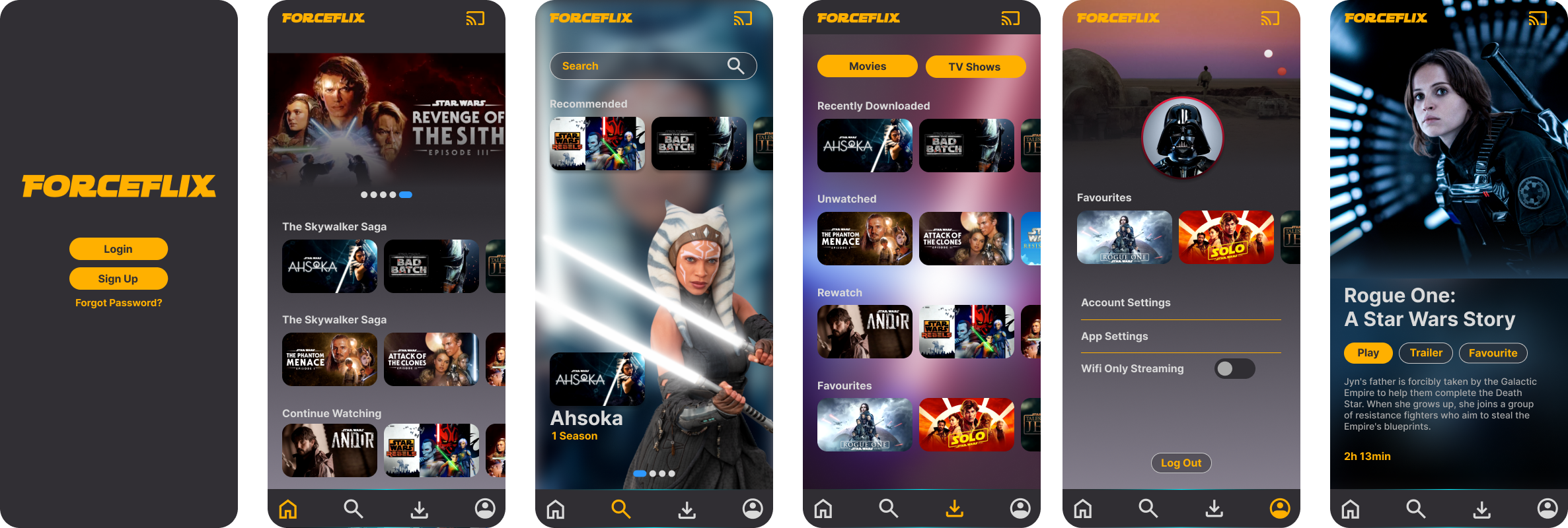
The signature Star Wars title card was used for reference and inspired the yellow colour used throughout the app, it also influenced the design choices surrounding the logo. Using Soloist, a Star Wars inspired display typeface with custom tweaks to create a wordmark suitable for a Star Wars streaming service. Yellow was used heavily as an accent colour throughout the whole app; bringing attention to action buttons, important information and the current page.
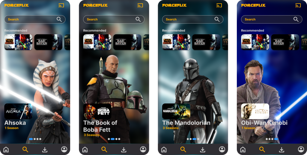
The initial design of the search page on UI wireframes has been changed upon the design of the mobile app; going from character icons which could be selected to filter by character, to an interactive four-slide page showcasing different series and heroes. The four variations of the component set each have a character that pops out, a blurred backing image and their series. There was an initial issue with the first stage of creating this animation, there was no way that a user would know that it is a swipeable animation, a subtle way this has been avoided is by the inclusion of a page indicator to show dots for pages and a longer dot showing current page, this eludes to the idea that there is more content without the use of arrows which would take away from the designs simplicity.
Figma: https://www.figma.com/design/DWHihSRWfbz7FSN5ZZ744F/Untitled?node-id=56%3A2902&t=JZrJjor7lYDd3F4Q-1
References(Imagery)
All Imagery – Disney(2024) Available Online: http://disneyplus.com[Accessed on 02/05/2024]