A Good Use of Typography
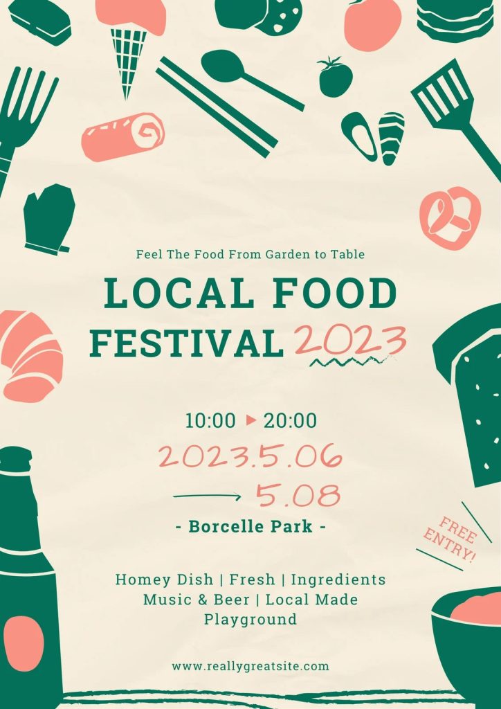
This poster manages to use typography effectively by using a slab serif font and a handwritten script font which have a very strong contrast to each other. there are only 2 fonts used and the variation is created by contrast in weight, colour and size.
The thin strokes of the handwritten script type complement the very bold lines of the main centre type and also help the type feel like it is in the same style as the poster’s hand-drawn illustrations. while also providing a homemade local feel to suit the purpose of the poster, so the viewer can tell that it is a local, friendly festival.
the contrast within the variation of the slab serif font used also serves as a visual guide to the eye. The heading ‘LOCAL FOOD FESTIVAL’ is in bold and uses all caps which makes it the main focal point of the poster and the first thing the eye sees.
the designer has also cleverly used size, colour and stroke weight to guide the eye from the event title to the date and time, and then to the location. With the smallest pieces of the type being the less important information and a small tagline.
“A visual hierarchy helps readers scan a text, knowing where to enter and exit and how to pick and choose among its offerings”(Lupton, E, Thinking With Type, p.132)
there is also a design decision that is made with the colour of the date in the middle, and the choice to have it be a salmon colour breaks up the green slab serif and keeps the reader intrigued while serving as a vital piece of information that jumps right out.
A Bad Use of Typography


The original festival poster design(left) is a visual mess, there is no structure, or hierarchy and has bad readability. Multiple design decisions have led to this, such as distorted type, poor contrast, lack of spacing and many more.
firstly, the chosen typeface used is comic sans, which has a stigma attached to it and does not read as professional but instead childish. this isn’t the main issue, there are several dishes advertised in this poster but they are laid out across the poster with no grid or structure leading to very poor readability. to follow on from this point, each piece of type is positioned at a different angle, some with an arched effect and others without. The type is also really badly arranged with the food truck logo in the bottom right covering some of the type so we are missing some information, and we have some of the type covering the illustration which again, leads to poor readability.
I have tried to take all of this into account when redesigning the poster. I salvaged what I could from the original poster and was able to rework the illustration into my redesign with a much more effective type.
The event title is now the main focal point of the poster, the bold dark type on the light background creates a strong contrast to draw the viewer in, so they know what the poster is for. We then get directed towards the secondary information, the event location then the date and time of the event. The redesign executes great use of type by providing the relevant information a viewer would need in the correct viewing order, and this is due to the contrast in colour and weight and the clear use of typography.
References
Local Food Festival(2023) – Available at – https://www.canva.com/p/templates/EAFA7W1PLwk-cozy-and-homey-japanese-local-food-festival-poster/ (accessed on 25 October 2023)
Hycinth Street Food Festival(2018) – Available at – https://twitter.com/hycinthkerala/status/956152783811444736 (accessed on 25 October 2023)
Lupton, E 2010. Thinking With Type 2nd Edition. Princeton Architectural Press, New York (p.132)