
My typographical word marks both consist of similar approaches, two logotypes inspired from my love of science fiction games, series and movies. Growing up being engrossed in a whole library of science fiction media, I soon realised how much of the graphic design elements within this media share certain tropes which have inspired my own creations. Skewed type, overhanging crossbars and tight lockups are the stereotypical sci-fi title card elements I wanted to include within the word marks.
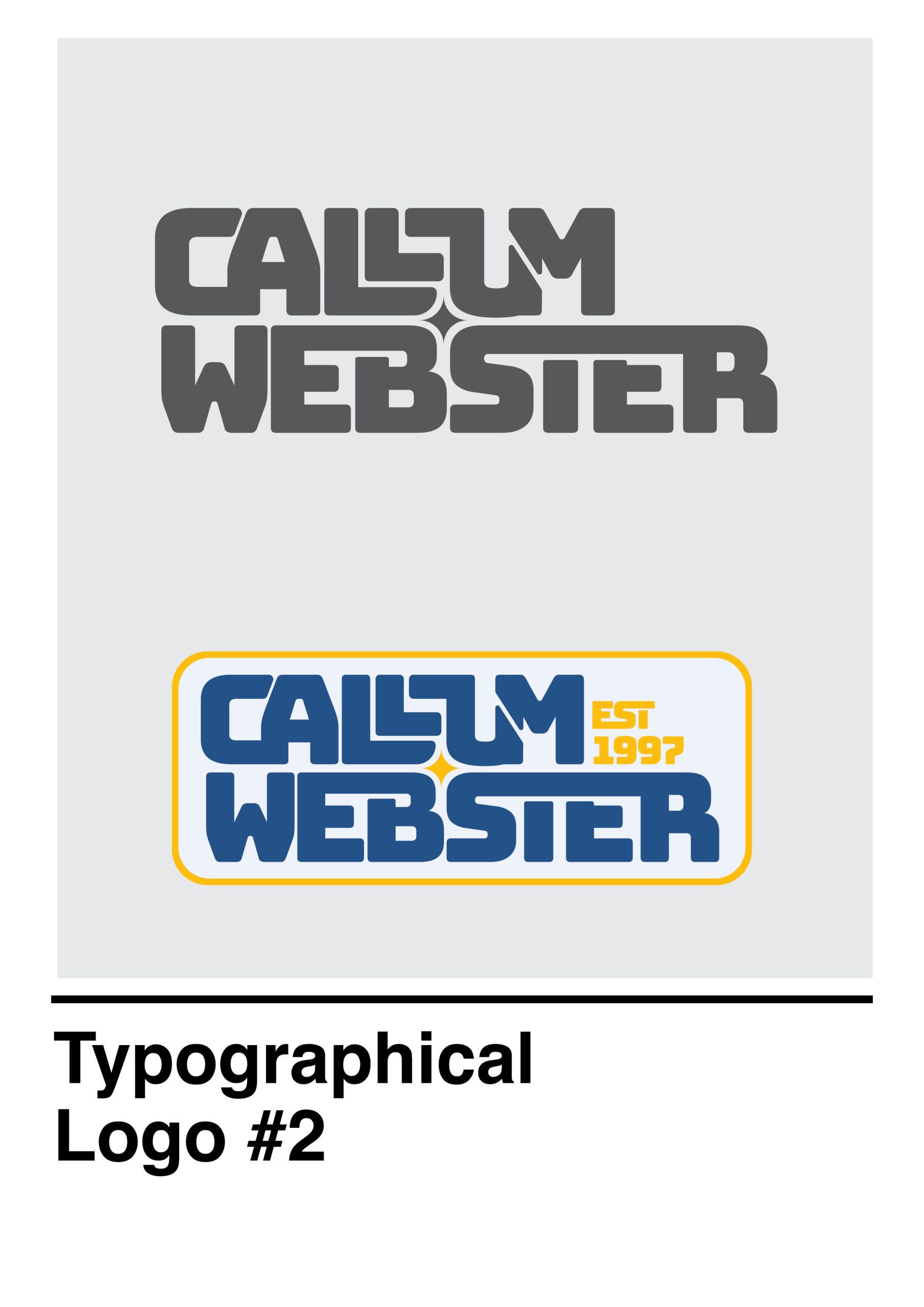
The approach I took with the first logo was to tighten the type by adjusting the tracking space between letters and then I was able to see how the letters worked with each other, making it clear which pieces of type I could use to fill negative space. The ‘LL’ in my first name left two large pieces of negative space which did not suit the futuristic sci-fi style I was aiming for so I was able to stack them to fill the space and tighten the lockup while maintaining legibility.
Whilst trying to achieve a tight lockup on the second typographical logo, I found an interesting star shape between the ‘B’ and ‘S’ and was able to make some adjustments to add a cosmic star, further enforcing my interest in astrology and strengthening the sci-fi feel I was going for.
Initially I went with a blue monochromatic palette, which was chosen to represent a personal favourite colour while also feeling like the correct choice for the sci-fi style. This palette then expanded in the second logo by introducing a piercing yellow to represent the star which also complimented the blues.
Although the first word mark accurately achieves the style I was hoping to achieve based on personal interests, the second does it in a much more effective way and has evolved in a way that feels like a more appropriate approach to identifying myself.