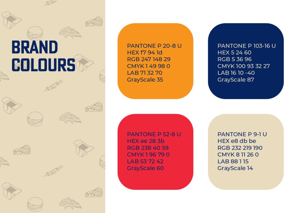
My typographical graphic standards were the very first thing I started when approaching the project. I was certain that this would be the most crucial thing that I would need to reflect upon throughout the project when creating other elements to make sure that the rest of the project stayed on brand. My graphic standards clearly and effectively break down the use of the logo, brand colours, typography and appropriate illustrations, this would then allow another design to work on the brand further down the line without having any issues in regards to the style of the brand.
‘The guidelines should offer a full picture of the brand identity for both internal and external use – and especially in the case of those created for new startups, should be concise and clear'(Malinic, R, 2019. Page 118)
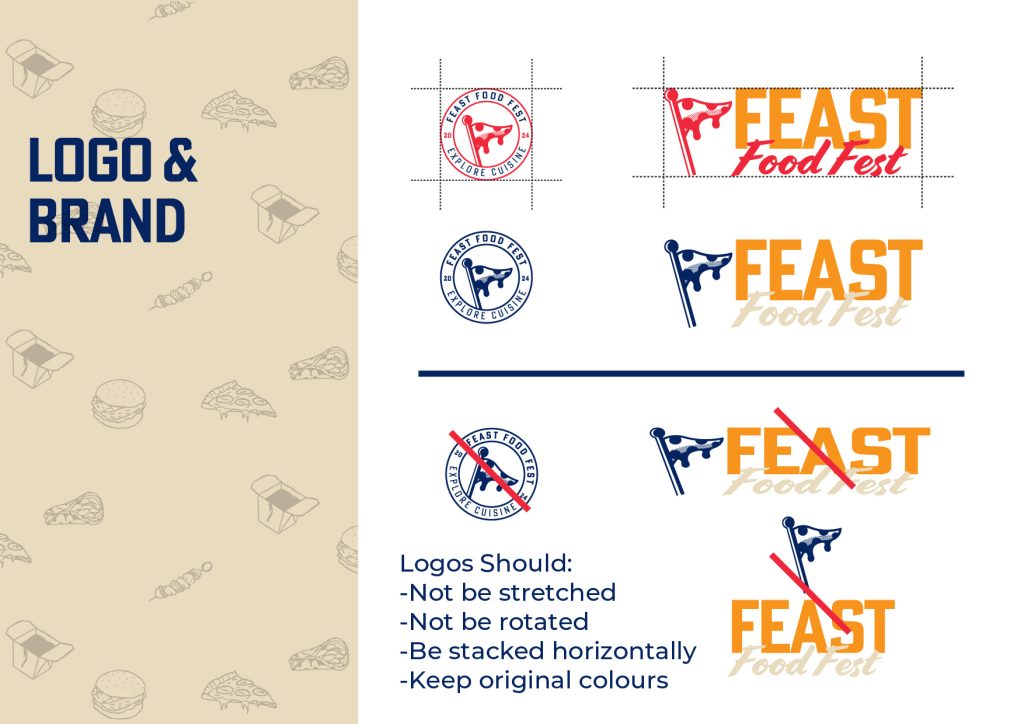
Throughout the whole project I altered my graphic standards a number of times based on other design decisions within the editorial spreads and cover designs, they were constantly evolving over the duration of the assignment. When creating the layout of the Typographical graphic standards, I opted to use a white as the main background so that all colours and assets are easily visible, although white is not used anywhere else within the cover designs or editorial design, it serves as a clear palette so that the reader can have a clear understanding of what the guidelines include.
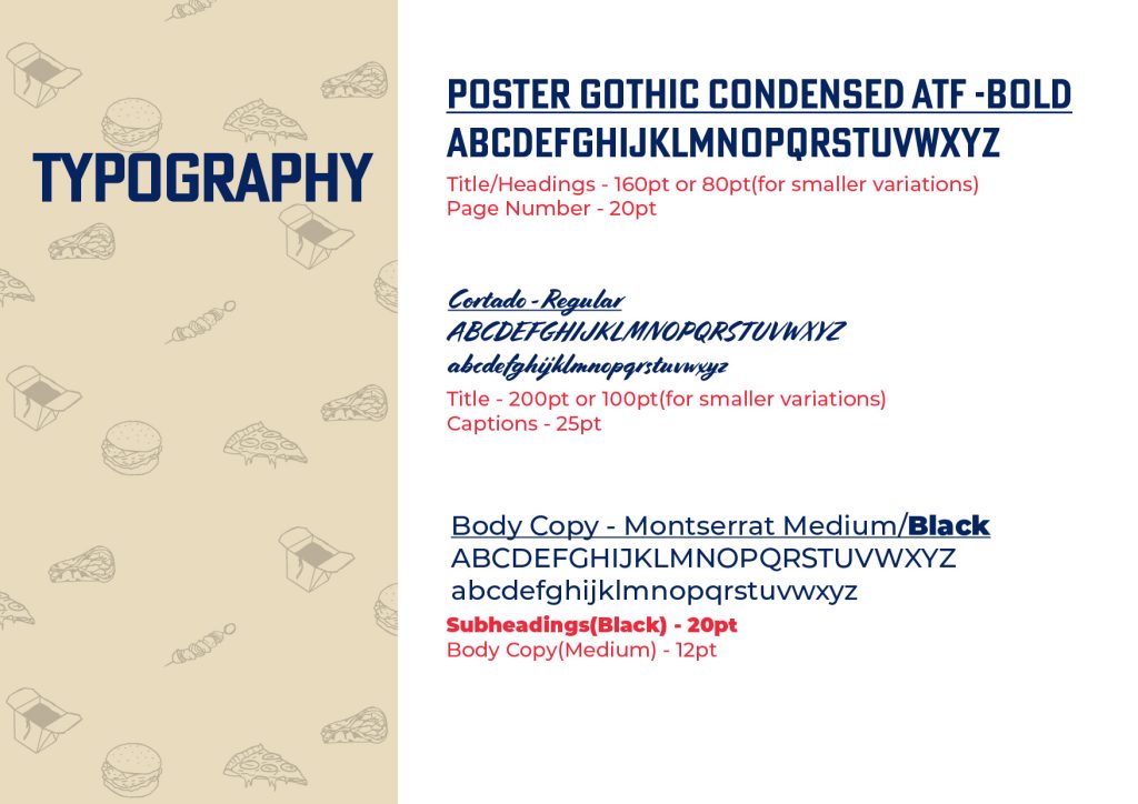
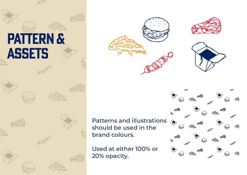
Initially I had created 3 pages of typographical standards, logo, colours and typography. Upon researching editorial design and looking at examples, I decided I wanted something else to bring the whole brand together. Up to this point every piece of the brand looked very tidy and minimal with the exception of ‘Cortado’ typeface with its playful brush strokes, this led me to creating 5 hand drawn food illustrations. I was able to then create a pattern with these hand drawn illustrations which works well with the brush typeface and compliments the overall brand.
The primary colour choices for the brand were red and yellow, after looking at food brands and how a yellow and red combination is synonymous with fast food, I decided to use these as my primary colours, I then looked towards some secondary colours, a tan colour which was very reminiscent of a food menu, which I then followed up with a menu style design for one of my cover designs.’Red and yellow are both warm colours which readily attract attention and generate stimulation…These two primary colours, while being uplifting and positive, also promote quick turnover at fast food restaurants.’ (Hambly, B, 2023).
Each page of my typographic graphic standards have been included with sets of instructions on how the logo, type, colours and illustrations should be used and that to stray away from any of these instructions or colour codes would create a piece of design work that feels slightly off and doesn’t fall into the brand of Feast Food Festival.
References
Malinic, R. (2019) Book of Branding. London: Brand Nu Limited
Hambly, B. (2023) Ketchup & Mustard Theory. Colour Studies. Available online: https://www.colourstudies.com/blog/2019/2/21/ketchup-amp-mustard-theory [Accessed on 01/01/2024].