I took a vastly different approach when creating my promotional posters, they felt as if they were a culmination of all of the other prescribed exercises. I am constantly on a mission of self-improvement which is my goal was for me to one up my previous posts by using motion to capture to promote myself.
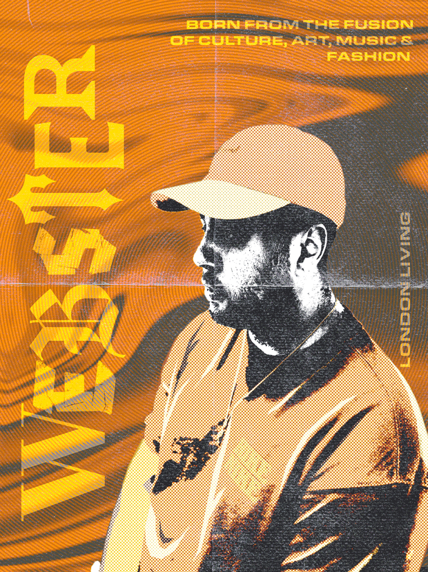
I created two completely different posters which strongly represent myself. Starting with colour, a common theme throughout my posts for this assignment has been the use of orange and blue which are personal favourites of mine, hence why I have chosen to do a poster in each of those colours. My main goal in the poster was to utilise the motion to portray self-growth and and represent my home city of London and how it is constantly changing.
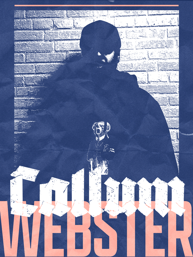
The promotional poster on the left was the first one I created and solely showcases my forename, in a gritty blackletter type, and my surname in a bold sans-serif; along with the image of myself growing brighter and brighter. After creating my first poster, I couldn’t backtrack into a still poster so I further one upped myself. I was able to use my illustrated self portrait along with the reference photo I used to make it to create a series of photoshop and illustrator self portraits of myself going through different changes. I also took the type ‘Webster’ in a mixture of typefaces from my photoshop self portrait and expanded on the idea of each letter being its own diverse entity, I expanded on this but creating a series of word marks that my poster used to match the different changes of my self-portrait. I have also added some information around the margins of the poster which could help a first time viewer to understand what my promotional poster is about.
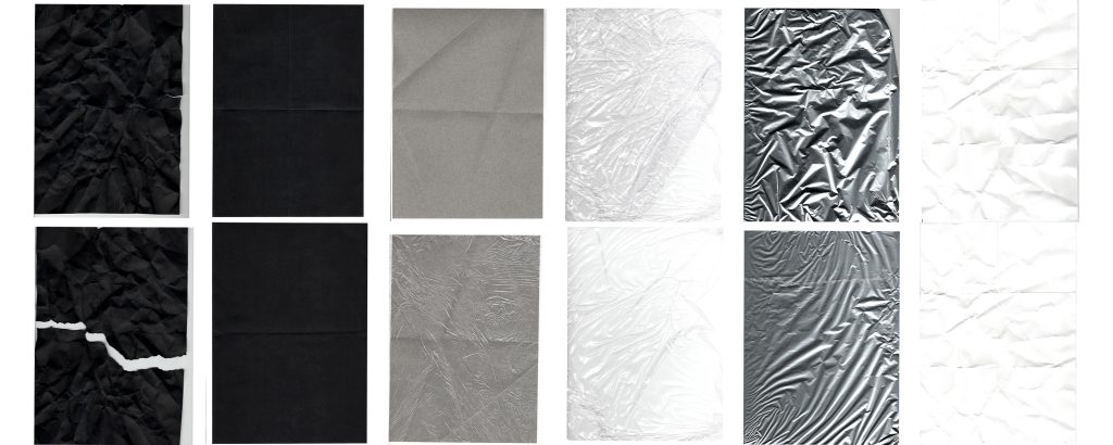
All of this were finished off with textures which I created from everyday materials and a scanner, I was then able to play around with photoshop effects and blending modes to reach the gritty, rigid feel which matched the desired the fast paced, urban feel which I need to capture the essence of the city.