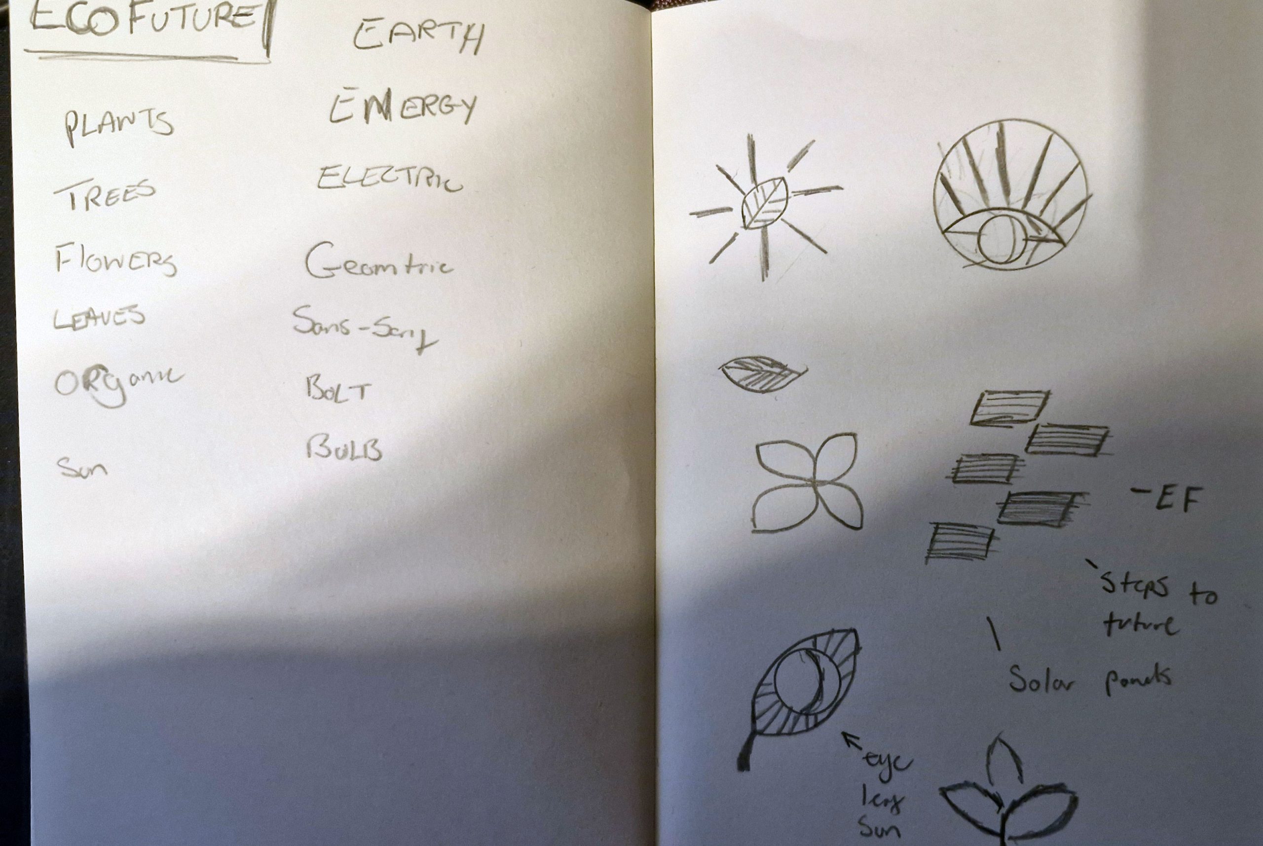
The logo design process began followed on from my early design prototyping with sketching and word association in my sketchbook, looking at a series of words that felt suitable for the brand and how I could turn them into some initial concept sketches, although there were only a few sketches it allowed me to get initial thoughts and ideas into a clear visual before jumping straight into digital software. While I was in the process of sketching ideas, I constantly referred to the previously created EcoFuture style scape to make sure I stayed on brand, I could visualise the direction that the brand was headed. I felt the appropriate direction would be to have an icon paired with a sans serif type.
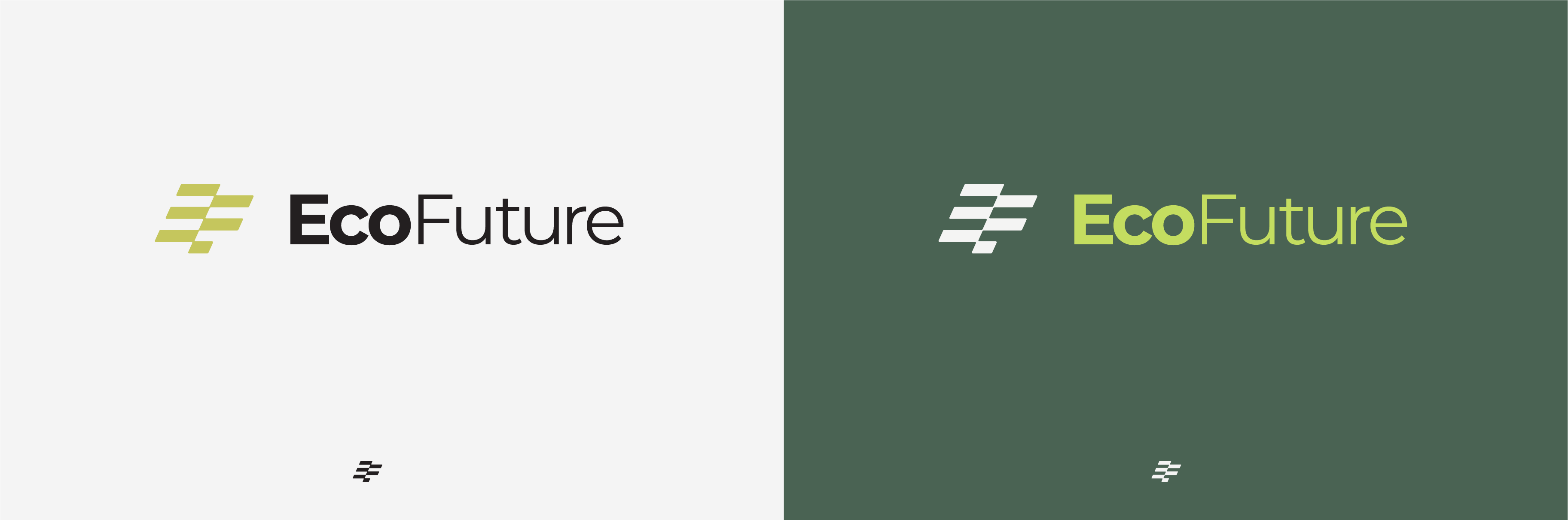
tThe first logo was a conceptual design where I have tried to combine different ideas. A unique logo mark inspired by solar panels and how I could design them in a way that also worked as an acronym of EcoFuture, with the subtle ‘EF’ mark created out of the angled panels. The mark is futuristic and geometric, whilst also depicting a key source of energy; this being paired with the Montserrat sans serif typeface as it is organic, bold and modern, following a similar theme depicted in the style scape. The choice to have the accomponying type in a mixture of weights is used to split the brand name down the middle so that ‘Eco’ stood out more prominently. One of the reasons this logo was not selected was due to the sharpness and straight lines of the logo, creating a very rigid looking logo which did not suit the brand style but instead looks like it would be found in the automative industry.
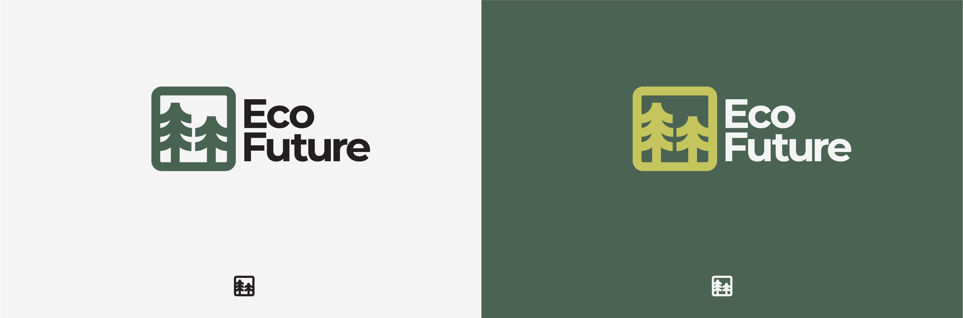
The second logo created was not inspired by any of the sketches but was the result of experimenting within the software whilst trying other ideas out, a happy accident, I looked at the idea of using nature to symbolise the brand due to their goal and reinforcing sustainability. With bold lines to emphasise power and importance, and geometric shapes allowing it to sit alongside the competitors.
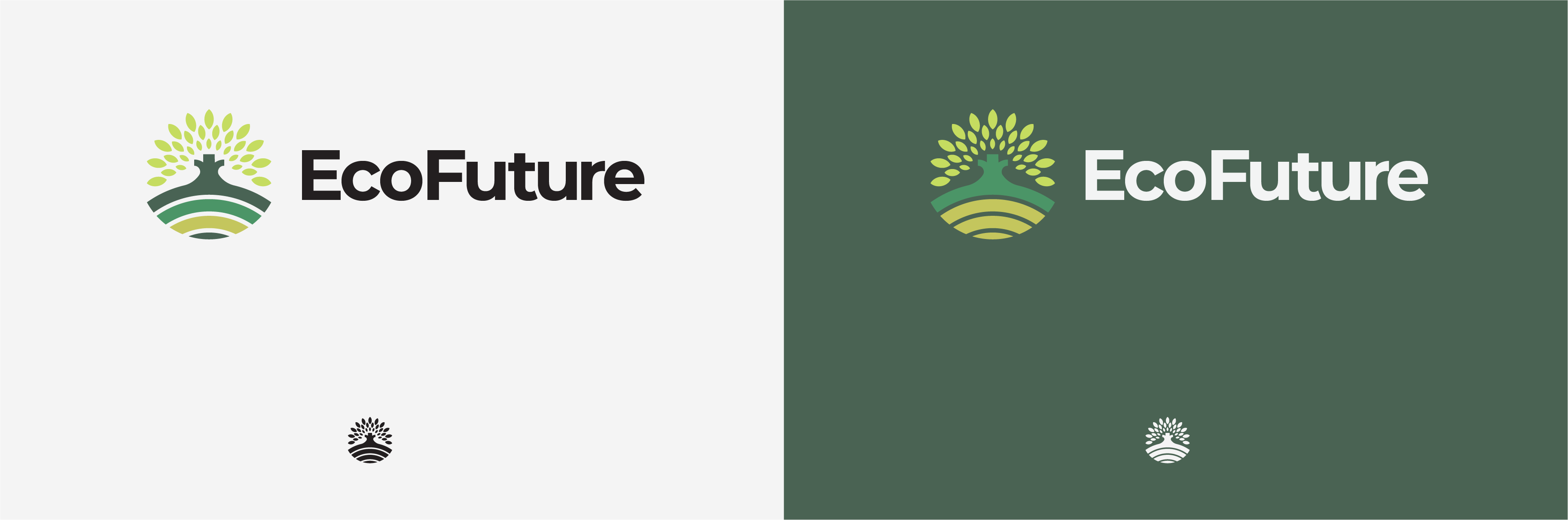
The final logo I created was the one that felt the most appropriate for the EcoFuture brand. The logo features a unique icon with multiple conceptual meanings; including the layered bold lines symbolising the earth and a tree growing from it to reinforce sustainability and growth, with the leaves shining outwards direction like the rays of the sun, to be a symbol for clean energy. All of these elements paired with the geometric shapes and bold lines really help to create an individual and suitable logo mark. The geometric circular shape also represents a sense of unity whilst the chosen palette works effectively to show growth via a gradient effect.