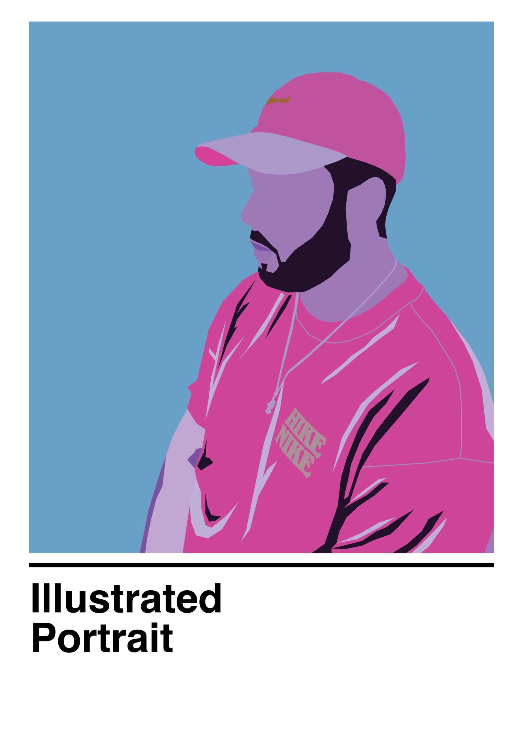
My illustrator self portraits consist of two complete different approaches, one is more natural and rigid and the other has taken a more flat geometric design. I chose to go with two different approaches as I planned to use one of the illustrations further ahead in my promotional poster which would then give me the opportunity to evolve my ideas.
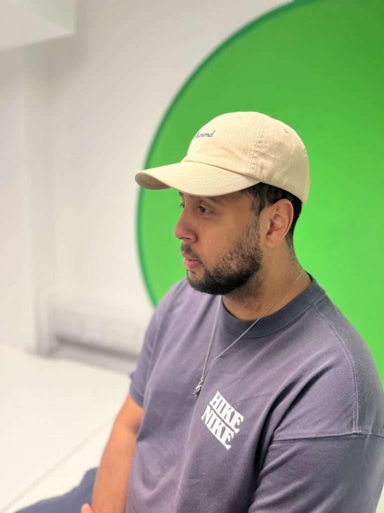
The first illustrator self portrait was approached by layering custom shapes which allowed me to progressively add certain details and capture my presence without adding specific facial features. Although this was a lengthy process, it allowed me to learn how effective layering can be in design, and how I could use layering and colours in my work to portray a sense of depth and perspective. The pink and blue work well together to create a vapourware style colour scheme which I’m a big fan of due to its mixture of sci-fi, futuristic and retro elements. The photograph I used for the self portrait was worked really well due to the highlights and shadow areas which allowed me to experiment with how to illustrate the flow of natural materials and fabrics.
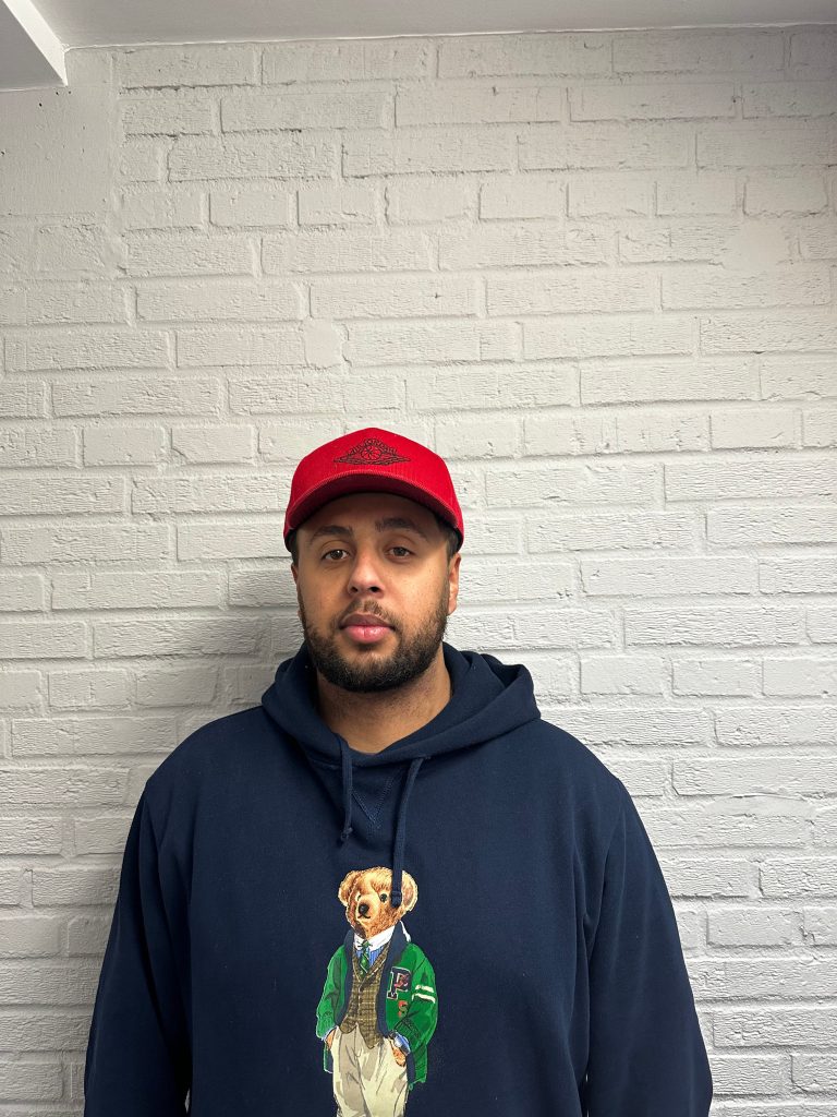
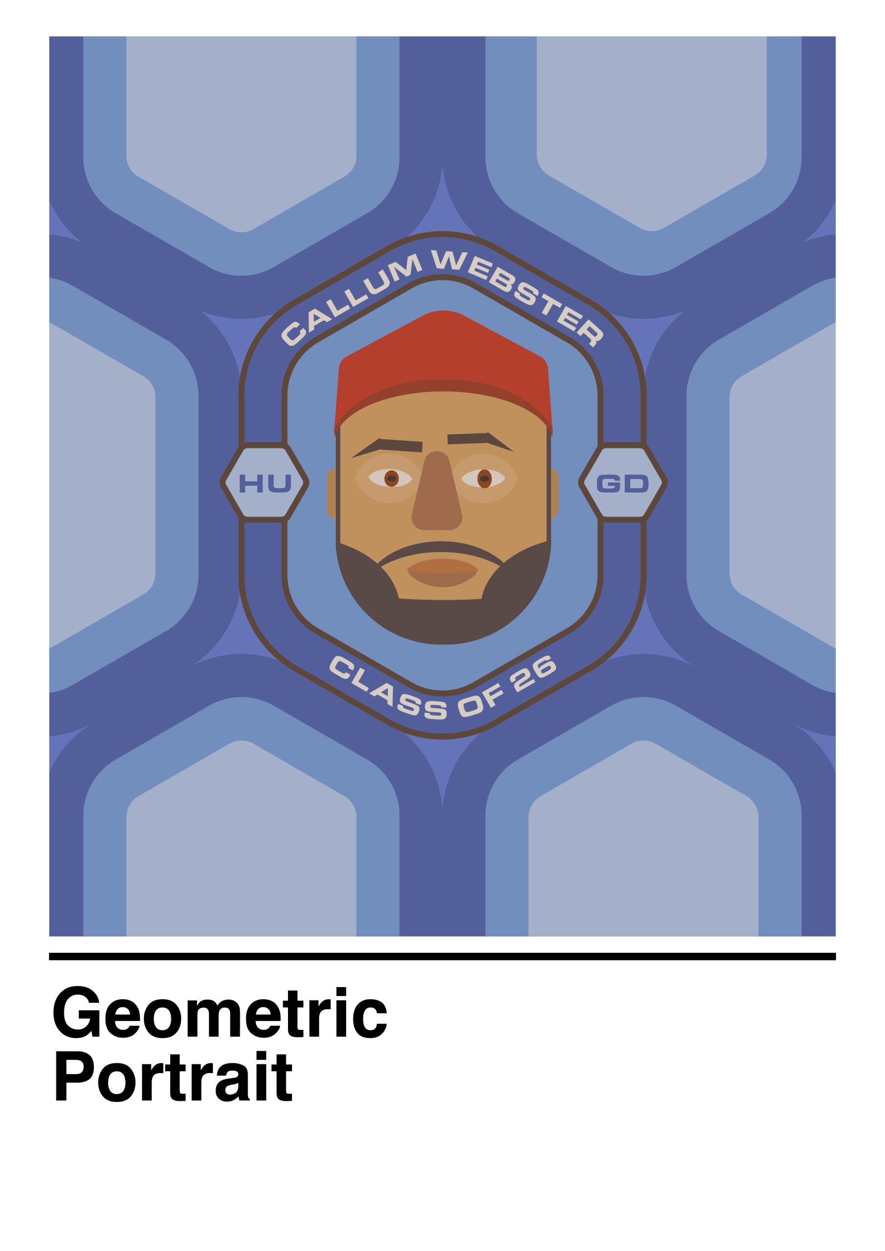
My second illustrator self portrait was made using a mixture of basic shapes and the pathfinder tool to turn them into more complex shapes. The initial shape of the illustration resembled a hexagonal shape due to the shape of my cap, so I expanded upon this to create a patch design, using bold type, thick lines and a monochromatic blue colour scheme, which also led to making a retro pattern from hexagons. I also looked at the asymmetry in my face and explored using a more natural positioning for the facial features. The positioning for the facial features played well against the overall geometric shapes within the self portrait.