The very first step I took to creating my double page spreads were to create small wireframes on pencil and paper, based on visual research from magazines, I created 2 different layouts for each of my DPS. Even though the final spreads don’t fully resemble my sketches, it allowed me to gain a basic understanding of where I was going to place certain key elements and how the I would build upon them.
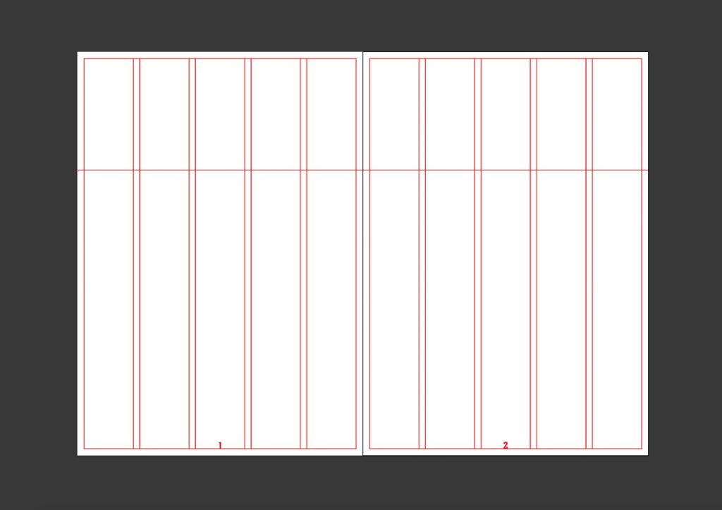
My double page spreads consists of 5 columns per page with margins allowing the content to be kept away from the edge of the pages, a consistent gutter is used between the columns and a flow line towards the top of the grid used to split the page horizontally by allowing a visual guide for title placement. This allows all of the double page spreads to be consistent with one another with enough white space so that the reader can easily find the important pieces of information at a glance.
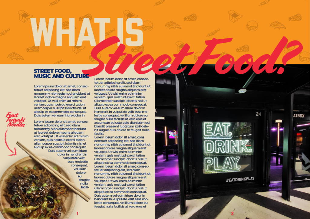
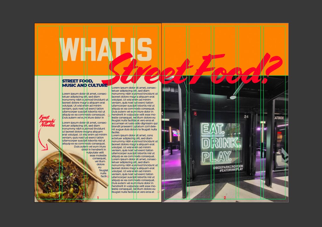
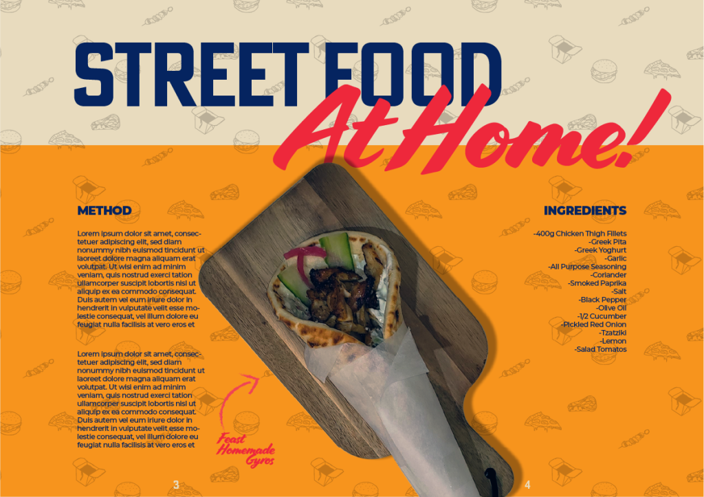
My first double page spread utilises the grid along with the elements from the typographic graphic standards. The left hand side is comprised of mostly body copy which is why I opted for a large scale image on the right to work as a visual barrier which helps to keep the attention of the reader. The imagery on the left side does the same while also breaking down the grid shapes by using the orientation of the chopsticks and the round plate, to allow for a more fluid look which guides the eye.
I have chosen to keep the body copy within the two inner columns across all of the double page spreads, this combined with the large upper banner created via the flow lines, allow the design to have white space which in turn gives each body of type and other design elements and chance to breathe and avoid being cluttered. I have used the first column on this double page spread to add a decorative caption for the dish that is being displayed.
Each double page spread follows the rule of avoiding the body copy in the outer columns, using them for imagery, captions or to allow some white space. Another common theme that is displayed throughout all the pages is the alignment of the body and copy and subheadings, they are all aligned to the left on the left pages and aligned to the right on the right pages, the symmetry creates a harmonic balance which allows the reader to easily break down the information without losing focus. The page numbers sit central on each page resting on the bottom margin, these are the only pieces of type that don’t follow the same rules but are consistent across each page.
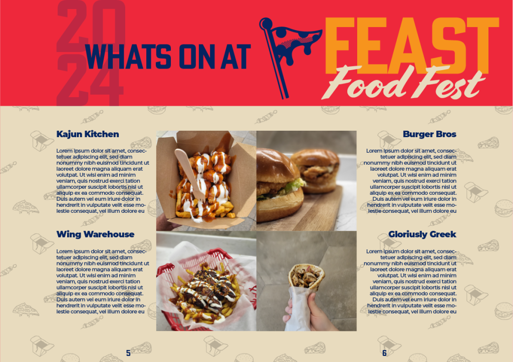
The rules set within the typographic graphic standards have allowed me to create 3 double page spreads consisting of alignment, hierarchy and a consistent style across the magazine by using the brand pattern, colours and typography and their matching point sizes. The last spreads layout slightly changes above the flow line as I wanted this page to stand out and showcase the contents of the festival. The year of the festival included at the top using the 20% to match the opacity of the brand pattern, the large logo across the right page and the smaller point size title to emphasise that this page was to showcase the festival, while still staying on brand and following my graphic standards.