Website Development
Mid-fidelity designs and prototypes were made for the festival’s website using feedback from the initial low-fidelity prototypes and extensive research into user interface trends and laws. One of the biggest flaws in the low-fidelity prototype is the lack of alignment, Implementing a 14-column grid allowed the design to look more cohesive across each webpage and create a visual harmony which will lead to a better overall outcome during the high-fidelity phase.
‘It also promotes structure and organization that helps users navigate easily and effortlessly. When things are organised, we can find them quicker – and when they are not, we can’t even see them.’ Using grids to help create a layout enforces invisible barriers which group certain elements, which in turn creates an easier experience for the user as they are less likely to get lost within the design.
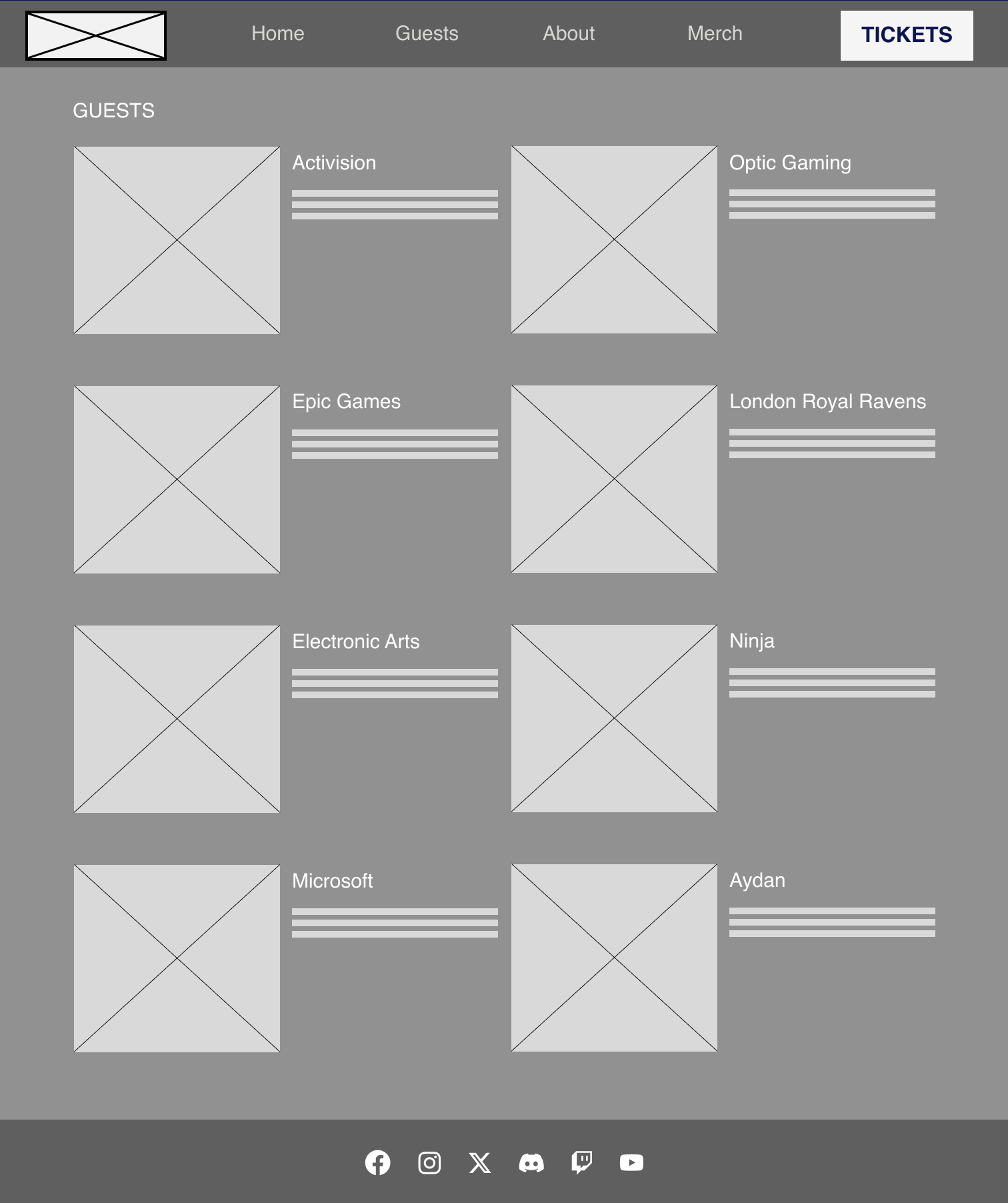
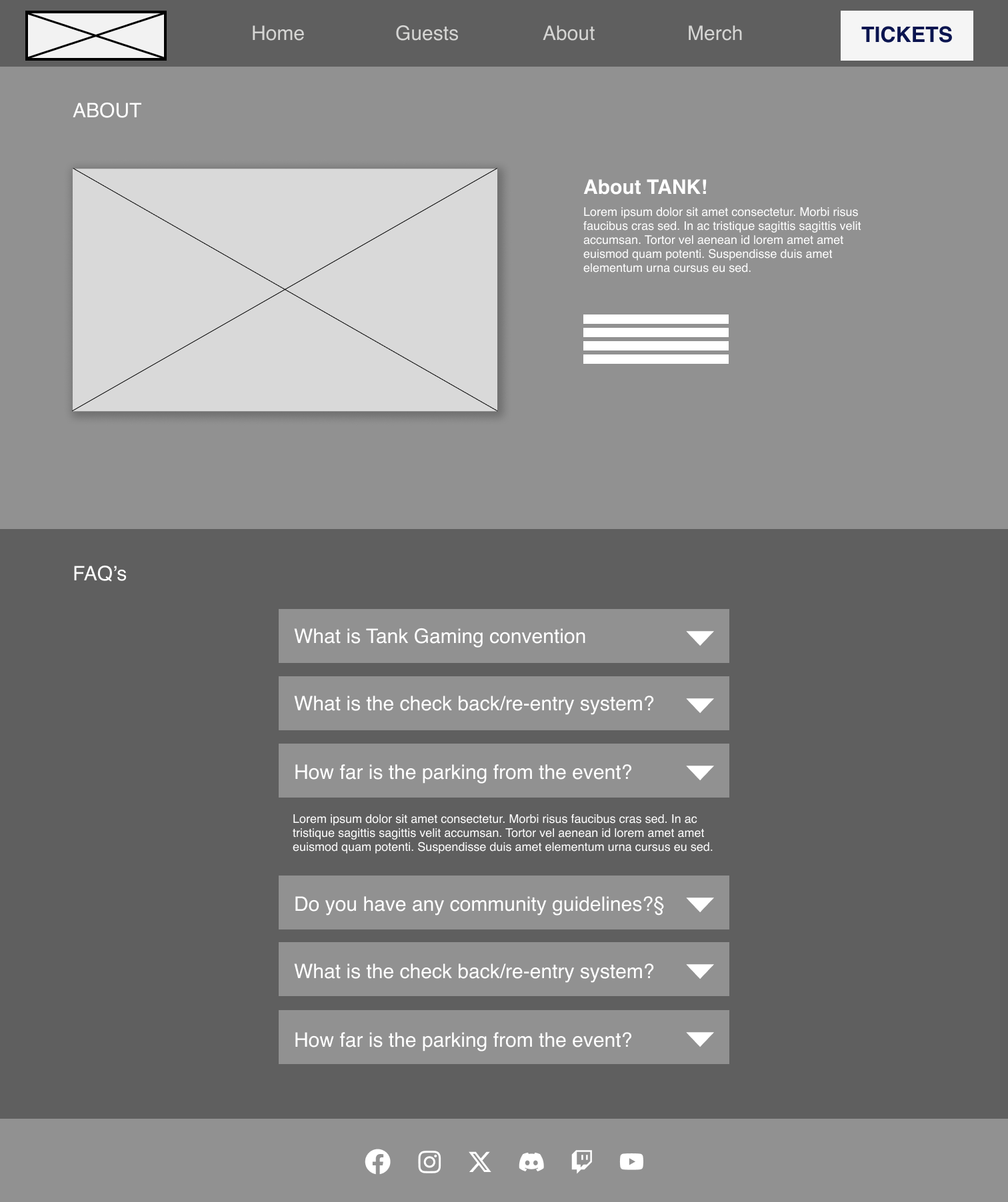
Another change between the low and mid-fidelity is the header bar menu options and content within the pages. One of the issues found was that there was no way to navigate back to a landing page, this was actioned and improved by the inclusion of a ‘home’ button within the header menu, while the ‘FAQ’ page has been added to the about page; this will improve the overall header so that there are not too many options, leaving the user overwhelmed. This is an example of how hicks law can be implemented to create a more streamlined experience for the user.
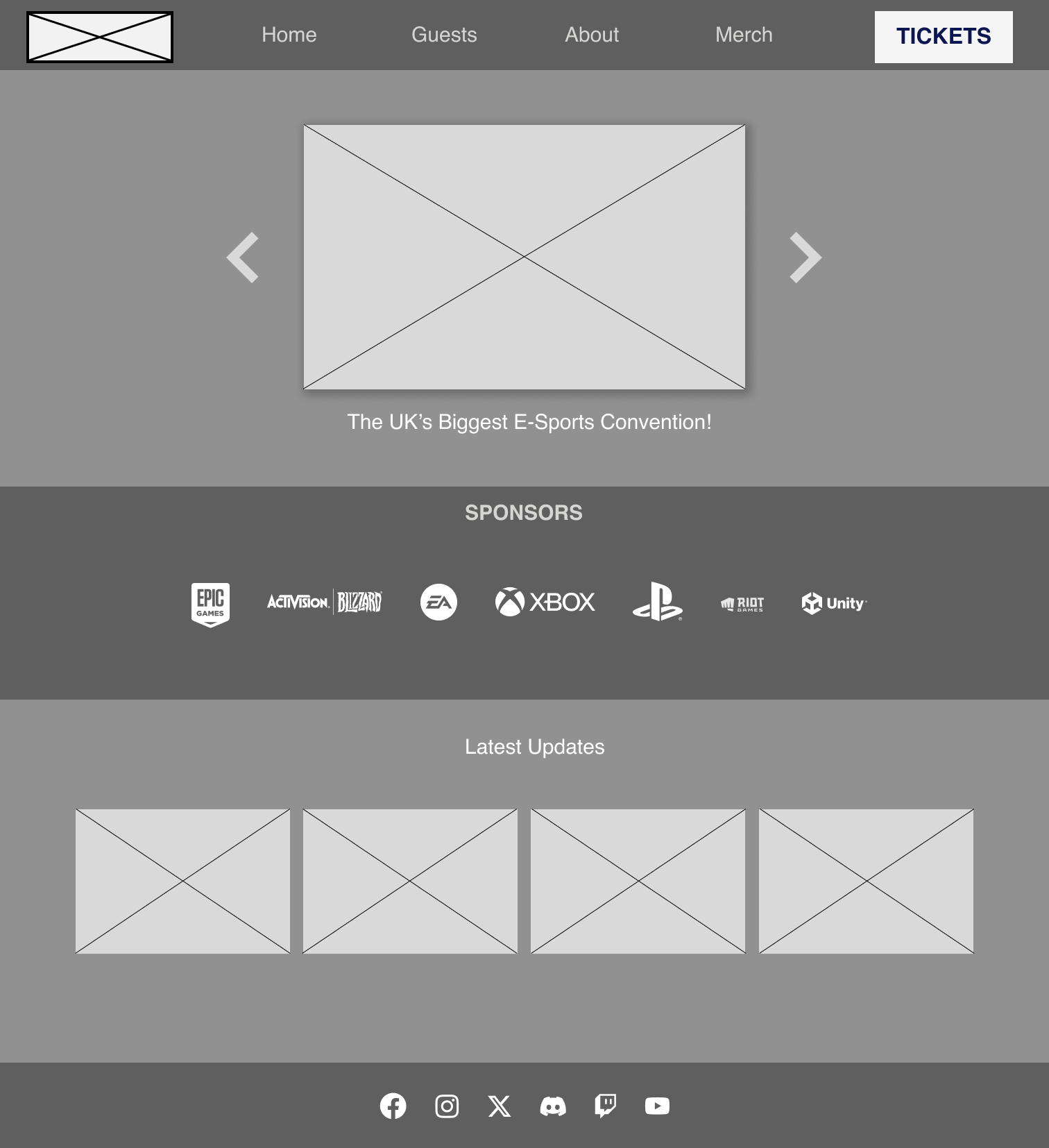
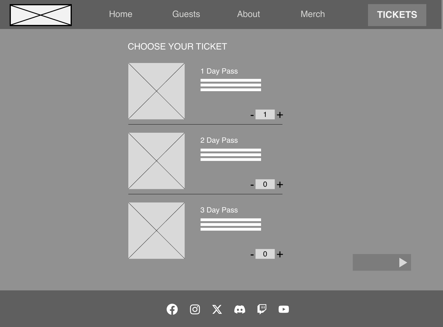
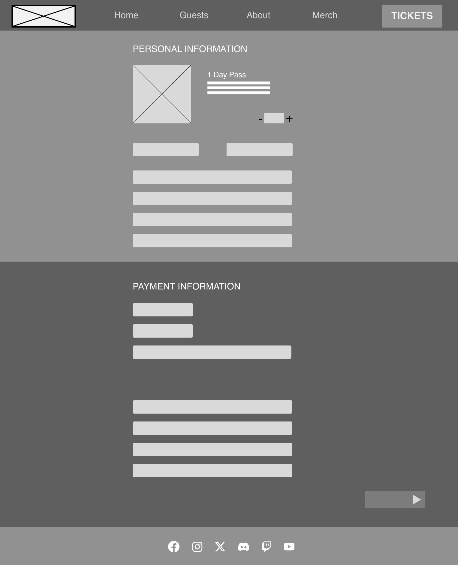
Along with the clear menu within the header, there is also a large CTA which has stayed in the same place as it was on the low-fidelity designs. The design of the CTA features a larger point size, and a bolder weight and is sat on a bright button that contrasts with the dark design colour of the wireframe, all of these features help the CTA to stand out so that it is a very prominent part of the webpage and header. This is an example of the Von Restorff effect which helps to guide the user’s eye to a focal point, which in this case is the CTA. The steps within the ticket purchase process have also been shortened by including the personal information and payment information on the same page so that the user does not get overwhelmed with the steps it takes to reach the goal of ticket purchases.
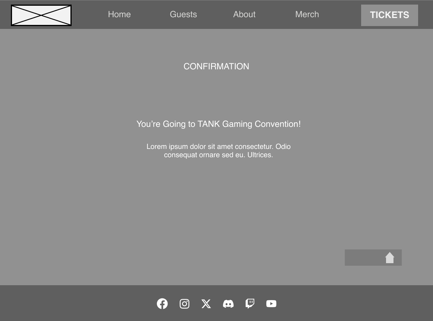
Another main change within the mid-fidelity wireframes is the inclusion of a footer at the bottom of each webpage with some useful navigational links to social media platforms within the brand, It gives the user another access point to information on other platforms to help them make informed decision before purchasing. Upon further development of the webpages, some more information could be added to the footer as they are a vital part of a webpage
‘A well-designed footer can encourage visitors to explore your website further, which means they’re more likely to take action, like making a purchase or subscribing to your newsletter. Plus, a great footer can even promote brand awareness by showcasing your brand’s logo, colors, and messaging.’
App Development
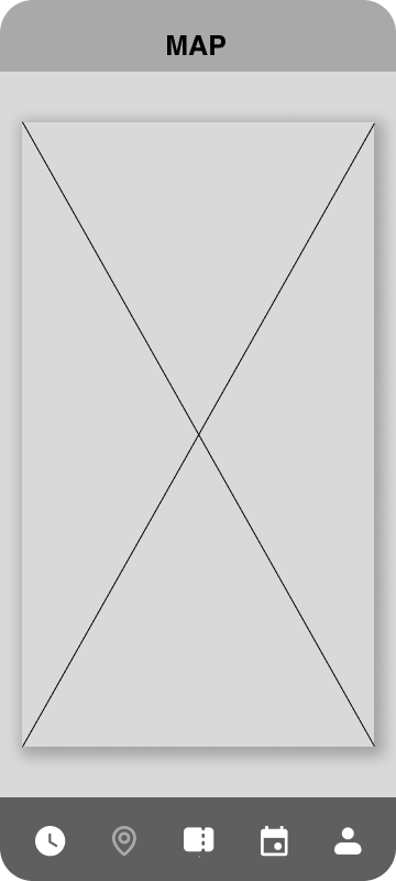
The festival app takes a different approach to the website, although a lot of the same features are added, the app is more so intended for use at the time of the festival with features such as the interactive map and timetable allowing users to have an ease of access to information without being sat in front of a computer screen. Upon feedback on the low-fidelity prototypes, it was clear that a vital page was missing and that was an account page, which has now been added and will include access to the account where settings and the user’s avatar can be changed. Another option that has been added to this page is a ‘log out’ button as it was overlooked within the first round of designs which would leave users at a dead end.
The menu options that were considered for the app were between a horizontal tab menu and a drop-down burger menu. After researching and finding out about how ineffective the drop-down burger menu can be, in terms of how difficult they can be to reach on the ever-growing size of a mobile screen; there is a stretch to reach the menus at the top creating lower click rates compared to other types of menus. It also makes the menu feel less important ‘It’s the same with any digital experience you’re designing. When you relegate navigational buttons and pages to the hamburger menu, you’re communicating that these things aren’t as important — and making them far less likely to go there.’
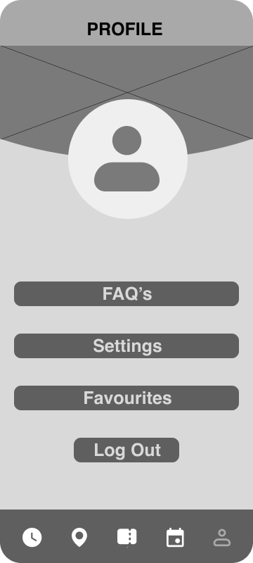
One of the main pros for choosing a horizontal tab menu is accessibility, due to the the tab menu being located at the bottom of the screen, it allows the app to be used one-handed; unlike the burger menu, the table menu has a clear universal icon for each page clearly showing the contents, allowing a faster experience for the user. ‘Users can quickly switch between sections by tapping on the corresponding icon.’
Much like the website, the mid-fidelity version of the app has also implemented a grid, following a 4 column grid allows each page to have structure and follow specific guidelines so that each page does not feel disconnected which could lead to confusion amongst users.
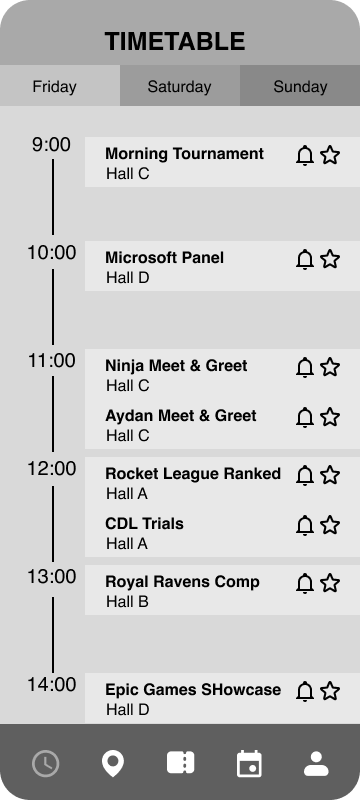
On the timetable page, a few features have been added and the interface has been improved to not only fit within the grid but to also streamline information and look more visually appealing, The addition of a favourites icon allows users to save their favourite events, which can then be found on their profile page, this allows them to take control of the content they want to see in one place. Another feature is a notification icon, which would send a notification to the user’s phone so that they don’t miss an event.
Moodboard
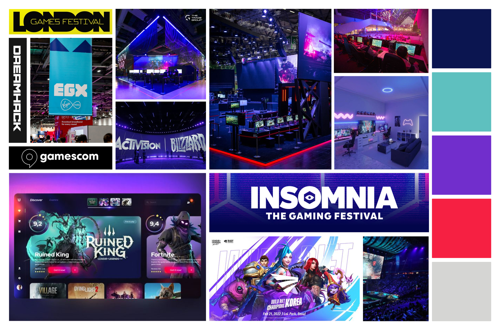
The mood board for the festival is created from a compilation of imagery surrounding the festival gaming theme, looking at other UI screenshots, other festival logos and typography, colours and imagery from the gaming and E-sports world to make sure the high-fidelity version feels appropriate to the theme and gives the user a sense of familiarity, leading to an increase in engagement. There are several benefits for using mood boards within the UI design process, it creates a tone for the brand early on, creating a clear direction that the visual design will go; which can be especially important if the design has to go another designer working on the same project. Another benefit to using mood boards within the design process is that there are fewer changes further down the line, they are an effective way to creatively plan ‘Moodboards can be used to get early buy-in to core visual design elements from product owners and clients, resulting in fewer revisions or changes in direction later on.’
A potential colour palette has been created from the colours contained within the mood board so that it feels fitting to the theme of the festival, with light, dark, mid-tones and a strong contrasting accent colour that will be used for important buttons such as the call to action to enforce the Von Restorff Effect. One of the reasons for the inclusion of a dark and light colour that contrasts is so that the site and app have options for accessibility which can be interchangeable for realigning information on a light or dark background.
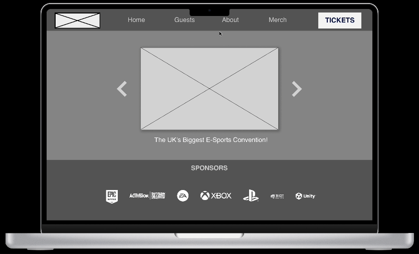
Responsive Layouts
Responsive layouts play a vital part in modern design and user interface due to amount of devices and screen sizes available in today’s world, it plays a large part in breaking down barriers on who can view the website. The website needs to be able to work across devices such as computer monitors, tablets and phones being the main devices that as website will be viewed on. There are several ways that you can tailor a website to change elements based on screen size, which in turn creates an improved experience so that the user does not struggle to navigate the site. A main component that the gaming and e-sport convention will put into action to improve how it responds to different screens, is a changing header menu; as the screen size gets smaller it will be comprised of a burger drop-down menu instead of the horizontal menu bar seen in the mid-fidelity prototypes(see above), this will result in a cleaner, uncluttered layout. responsive text boxes also play a vital role in how a website acts in different sizes, being able to change the size of the screen without losing text or needing a horizontal scroll. The image below shows how a potential responsive webpage from the mid-fidelity would work and how the same content is incorporated into a mobile-size screen.
Typography & Branding
Typography plays an essential role within user experience and user interface design, the choice of fonts and typefaces can make or break a design. Type choices should be clear and legible while fitting within the theme of the overall brand. E-sports branding typically follows a lot of the same stylisation and direction of traditional sports branding, with similar elements due to their competitive aspect, this is heavily reflected within the typography choices. A typography mood board has been compiled by looking at different gaming and sports typography to give a clear visual representation of the direction of the type choices moving into high fidelity.
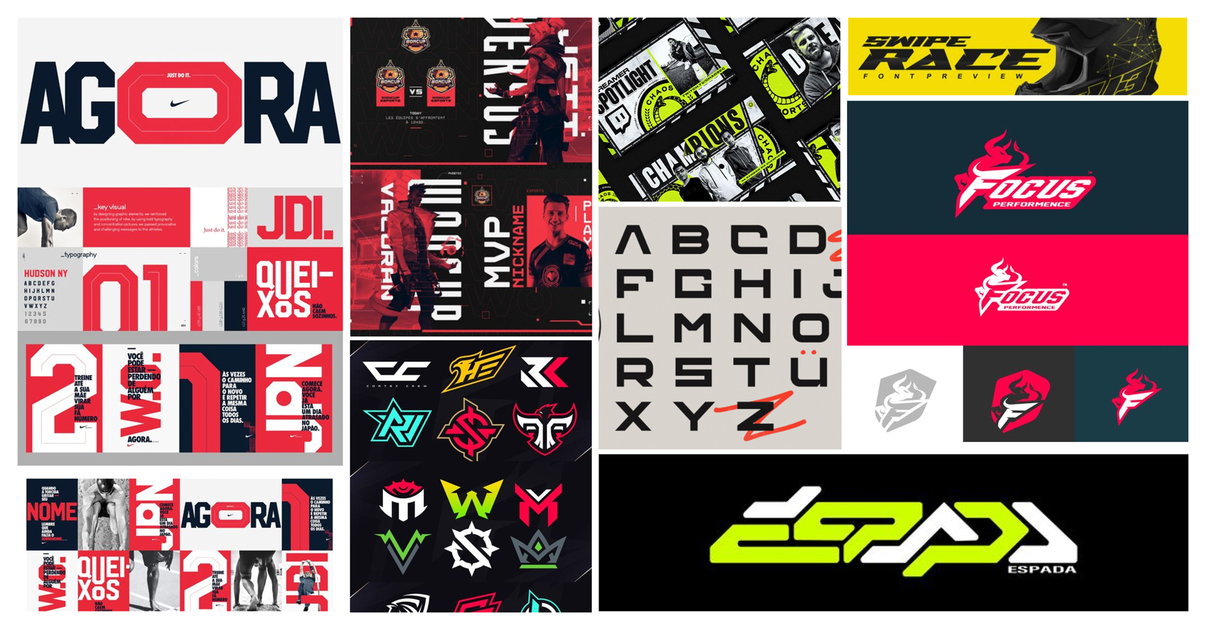
‘Character, attitude, personality, and imagery are all important parts of the sports world. These are also the essentials of a great brand’.
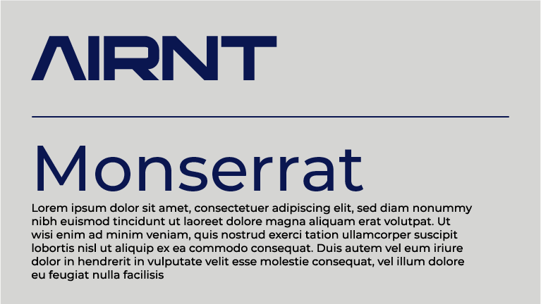
Character, attitude and personality are all things that have been taken into account when creating the mood board, looking at how different extended and condensed fonts help to enforce a familiar sports and gaming style. The first primary typeface chosen is ‘AIRNT’, a stylised and futuristic extended display typeface that adds character to the brand and website and has also been used to create an interesting conceptual logotype with inspiration taken from both mood boards, this will be used for menus and main headings. The second typeface to be used within the high-fidelity user interface is ‘Montserrat’ a clean, simple sans-serif typeface which will be used for subheadings and body copy. Montserrat offers a wide variety of weights which will allow showing contrast in certain areas of the design, which are more significant, allowing the user to find the key information with ease.
The branding for the festival has been carefully designed around the user experience, user interface and gaming theme. Although the website and app will both have a different use and slightly different features, they will ultimately feel more connected through the power of branding; colours, logos and a pattern which all take inspiration from both mood boards to give the user a sense of a familiarity that they are used to with competitors.
The festival name ‘TANK’ comes from E-sports terminology meaning ‘A character archetype that is distinguished by its survivability.’
An adaptive conceptual logo has been designed with responsive design in mind, A word mark of the festival name with the ‘A’ designed as a tank icon, which can be used in place of the word-mark in smaller places such as the app icon and on the responsive version of the website, further optimising the use of the website on smaller screens which can be seen above on the responsive design section.
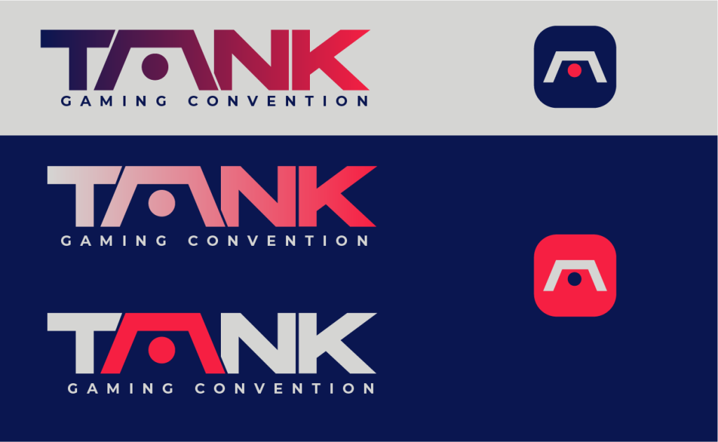
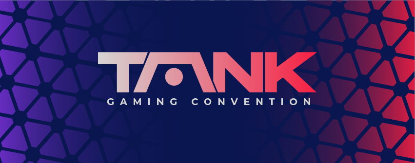
Colour and brand assets help to further the strength of the brand across the website and companion app. The colours from the initial mood board create a series of gradients to be used across assets and help solidify the brand presence while also having clear contrast between colours to maintain easy readability on smaller screens; which is especially important due to users with visual impairments ‘Low contrast can cause eye strain and make it difficult for users to distinguish between different elements.’ The pattern created below is inspired by triangular LED lights which are popular amongst gaming setups, which felt appropriate for the festival theme.
Onboarding(App)
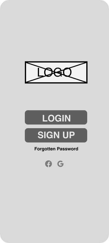
The onboarding process needs to take the correct approach to ensure that users have a clear understanding of the application. The companion app will tackle onboarding with a simple process. The main use of the companion app is to be used around the convention centre so last-minute app downloads are likely to happen, which is why the onboarding process will take a fast and simple approach so users can use the app as a tool and not be stuck in a process of trying to get set up and ready to go. A friendly welcome message when the app is loaded up reading “Hey! Are you ready to be a Tank?” followed with ‘Login’ and ‘Sign Up’ options so they can get straight into the app. Other login options will be displayed below, allowing users to log in to the application with other social media accounts such as Facebook or a Gmail account allowing them to skip the step of inputting their personal information; leading to them entering the app faster.
Once logged into the app, 5-6 pages will appear showing different features within the app, focusing on solutions to the pain points looked at in the early stages of the process, and showing the app functionality; additionally a button in the corner ‘skip’ allows the user to skip the tutorial and jump straight in. The inclusion of a progress bar helps guide the user and shows them how far through the onboarding process they are.
References
Supercharger Design. Available online: https://supercharge.design/blog/grids-and-layouts-in-ui-design-a-guide#:~:text=Grids%20are%20the%20backbone%20of,create%20a%20cohesive%20user%20experience.[Accessed 26/03/2024]
Guimaraes, F.(2022) Alignment in UI: The Invisible Structure Behind Designs. Available online: https://aelaschool.com/en/visualdesign/alignment-ui-invisible-structure-behind-designs/[Accessed 26/03/2024]
Chung, E.(2023) Best practices for website footer UX. Available online: https://blog.logrocket.com/ux-design/best-practices-website-footer-ux/#what-goes-in-a-footer[Accessed 26/03/2024]
Von Restorff Effect. Accessed online: https://lawsofux.com/von-restorff-effect/[Accessed 29/03/2024]
Ho Tran,T.(2019) 10 pros and cons of the hamburger menu. Accessed online: https://www.invisionapp.com/inside-design/pros-and-cons-of-hamburger-menus/[Accessed 01/04/2024]
6 Mobile Navigation Examples and 8 Types You Should be Aware of(2023). Available online: https://www.uxpin.com/studio/blog/mobile-navigation-examples/[Accessed 01/04/2024]
Morzuch, M(2022). How moodboards can help you create an excellent UI design? Accessed online: https://www.boldare.com/blog/moodboards-for-ui-design/[Accessed 26/03/2024]
Responsive Design: Best Practices & Examples. Accessed online: https://www.uxpin.com/studio/blog/best-practices-examples-of-excellent-responsive-design/[Accessed 06/04/2024]
McVicker, D.(2020) The seven essentials for achieving successful sports branding. Accessed online: https://digitalsport.co/the-seven-essentials-for-achieving-successful-sports-branding#:~:text=Final%20Thoughts,consider%20the%20tips%20listed%20here.[Accessed 07/04/2024]
Dewra, H.(2023) The Importance of Contrast in UX Design. Accessed online: https://bootcamp.uxdesign.cc/contrasting-for-clarity-the-importance-of-contrast-in-ux-design-68c5e2e9494a#:~:text=Color%20contrast&text=High%20contrast%20between%20text%20and,to%20distinguish%20between%20different%20elements.[Accessed 07/04/2024]
Hope, B.(2023) A-Z of esports & competitive gaming jargon. Accessed online: https://britishesports.org/the-hub/about-esports/competitive-game-jargon/#:~:text=Tank,is%20distinguished%20by%20its%20survivability.[Accessed 07/04/2024]