When I set out to create a conceptual logo for ‘Feast food festival’ I didn’t have a clear path of the direction I wanted it to take, I begin to take inspiration from my conceptual logo that I created on my development research blog and how I could look at incorporating food elements into the type. I started my process digitally, by looking at how the letter forms worked in different fonts for the word ‘Feast’ but I didn’t really find any directions that I wanted to further explore. I then moved back over to pencil and paper which allowed me to properly collect my thoughts and ideas so I could have a clearer understanding of the design direction my logo would take.
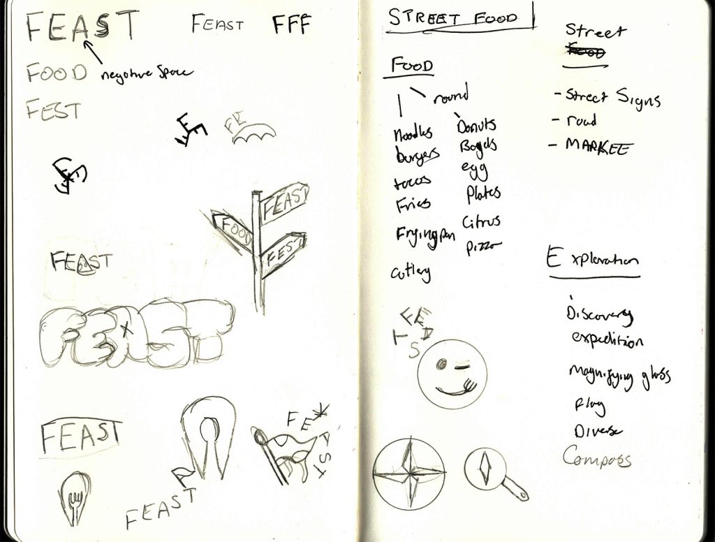
I realised I wanted to emphasise the reason of the street food festival within the conceptual logo and started looking at not just iconography for food and street culture, but also looking into iconography for exploration and discovery and how I could implement this into the logo itself. I searched for 2 ideas that I could fuse together which would create a logo to represent the exploration of street food.
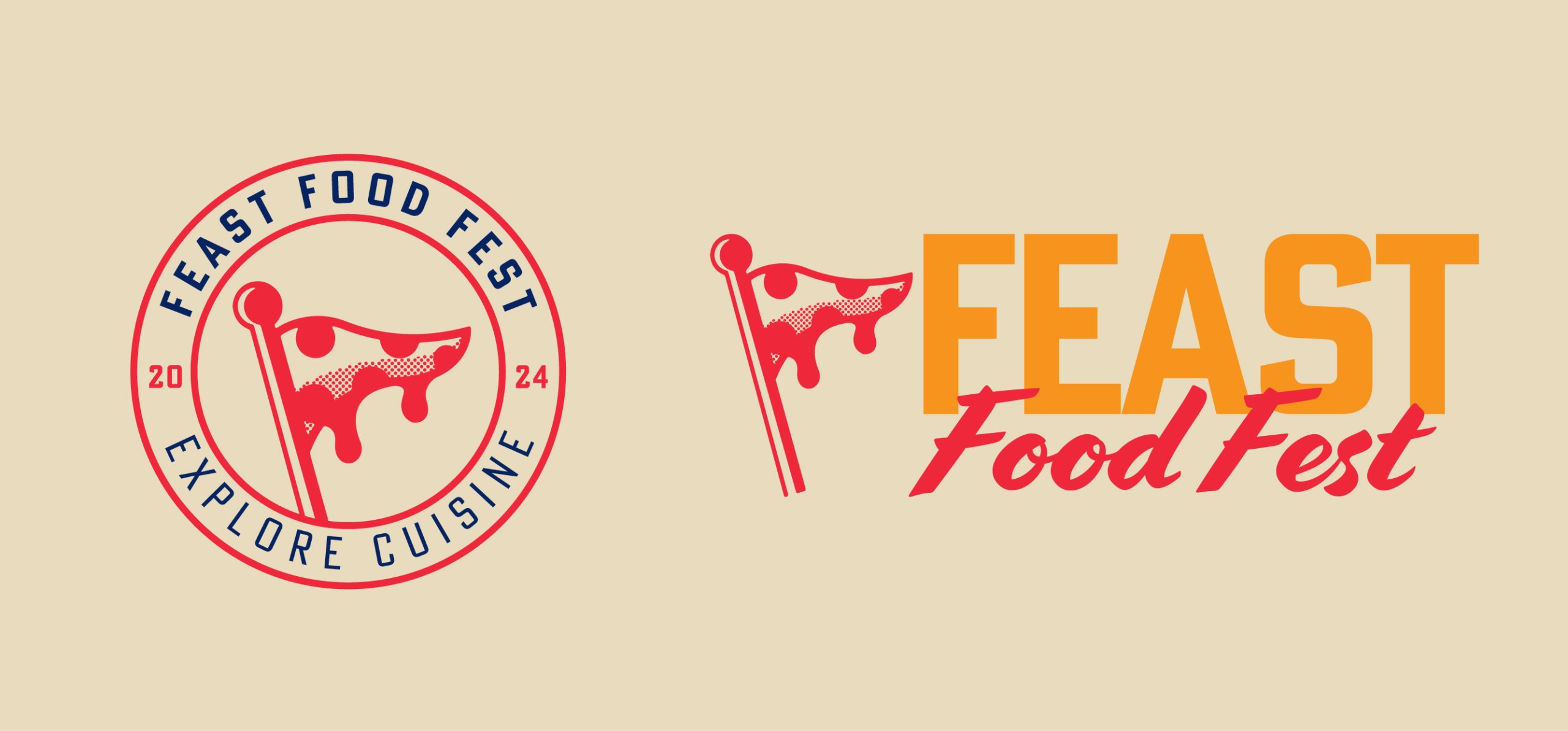
The approach I ended up going with was a flag representing exploration and an iconic slice of pepperoni pizza, with the slice acting as a waving flag in the wind on top of the pole. With all these things considered, I was able to create a conceptual logo suitable for my project purpose, which is to allow locals to explore street food from across the globe.
Malinic, R(2019) says that ‘A brand mark should be something that is easily turned into a tangible element – a badge, coin, clothing tag, and so on'(page 90). This is something that impacted my design decisions, by looking at the possible places the logo would be displayed and how I could make sure my logo mark worked at any scale. My badge variation of the logo is what I created while taking these ideas into consideration, I had to decide where a logo for a food festival would be located, so I made something that would work on large banners, aprons, hats, badges, stickers and so on.
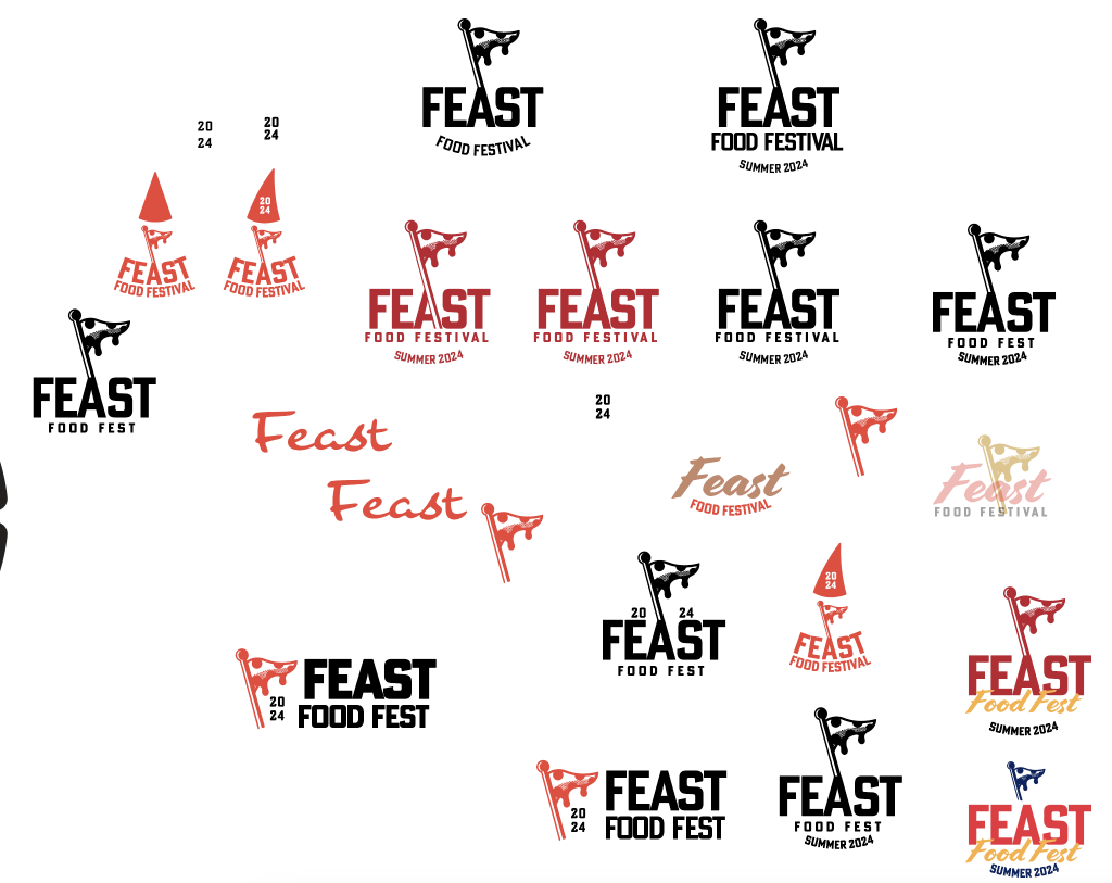
Once I had created a logo mark that truly represented Feast Food Festival, I moved on to selecting a typeface and looking at how the conceptual logo should be stacked, I had already used ‘Poster Gothic Condensed’ for the type with badge logo. I chose this typeface as it was professional and clear, it also resembles the typeface you would see on a car registration plate which loosely tied in to the element of the streets.
I then wanted to find a brush/script typeface to really stand out against the condensed block sans-serif, so after playing around and experimenting with different options, I landed on ‘Cortado’ and it added a new dynamic to the brand and gave the logo an authentic, homemade feel.
References
Malinic, R. (2019) Book of Branding. London: Brand Nu Limited