A Good Composition
Composition is a culmination of imagery, type, colour and white space and how they are organised in a certain way to effectively communicate a message and guide the viewer’s eye.
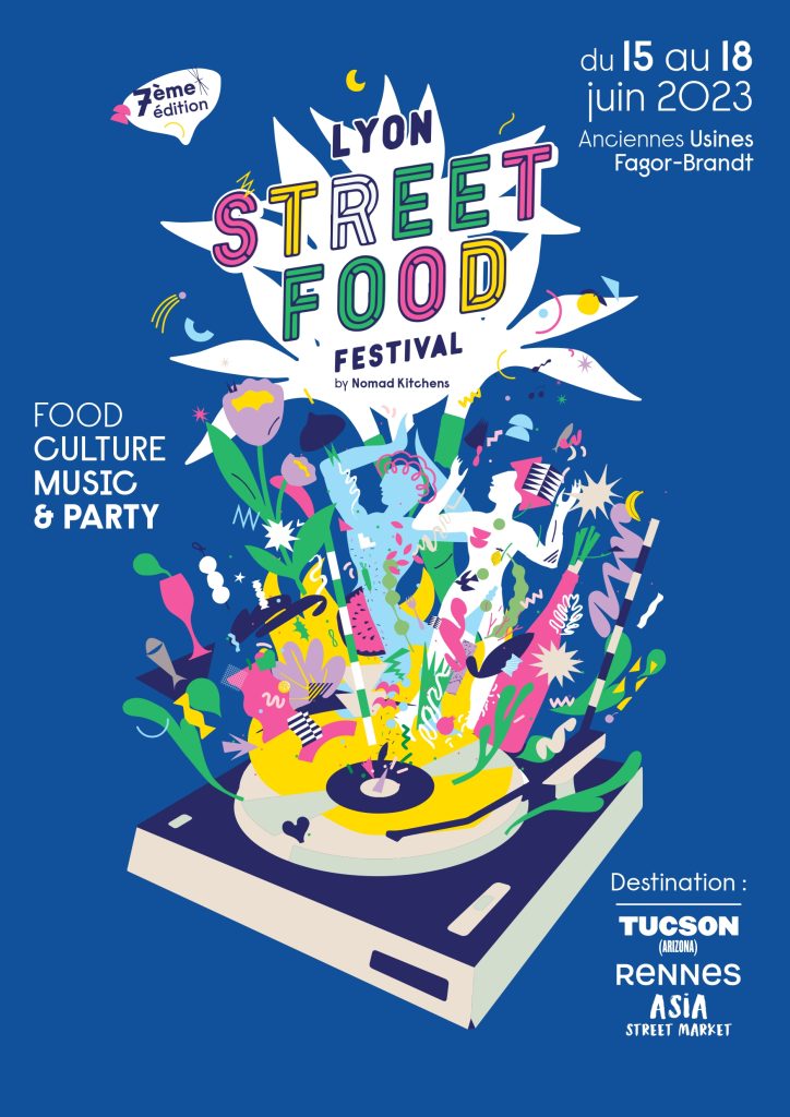
This poster effectively uses composition to portray a clear and precise message. The event title takes centre stage being the largest piece of type, coming out of the explosive illustration. These elements create the main focal point of the poster with the strategic use of white space in the surrounding area. White space isn’t necessarily white, it is a term used to describe the negative space used between elements of the design.
“When a design lacks white space or negative space, it often looks harsh. It’s almost overwhelming to the person looking at the crowded design that they can’t understand the message, or just don’t want to take the time to figure it out.”
The sharp, white angles on the bottom of the DJ deck are bold and bright which has a strong contrast against the blue background. These harsh diagonal lines aid the illustration in showing an explosive party, they also serve as a visual guide which directs the eye to the important pieces of information such as the date and time and the contents of the festival. Angles in composition are used to help direct the movement of the reader and allow the piece to flow more effectively.
The blocks of type are also strategically aligned with the poster margins and positioned in a way so that the date and time are viewed first, then the festival contents and lastly the locations of the event. The clever use of white space, and contrast in weight, colour and direction helps to create a compelling and engaging composition.
A Bad Composition


As stated earlier in the blog post, composition is a culmination of imagery, type, colour and white space, the poster on the left uses all of these assets ineffectively, leaving us with a poster that feels busy and unprofessional. The elements within the poster have no room to breathe due to the lack of space between them.
One key element that distracts from the composition of the poster, is the designer’s choice to have the counter areas of the type filled with blocks of colour. This gives certain areas of the poster more visual weight than others and draws the eye to pieces of information that don’t need to be highlighted, what makes this effect even worse is the choice to have blocky black type on a completely white background.
The redesign on the right fixes a lot of the issues with the initial poster, it keeps the food truck illustration and a road underneath the truck with some added perspective that guides the reader’s eye to the key pieces of information. The dark road breaks up the poster and the background is changed from white to light grey so the contrast isn’t as harsh. The perspective of the road is also used to make certain pieces of a type larger than others to create an effective balance between the types.
the spacing between the centred type allows each element to breathe and have its own space so it doesn’t feel clustered. The secondary information at the top of the page is scaled down so it breaks up some of the white space and from a hierarchy standpoint, it is the final piece of information that is read. All colours used in the secondary poster are taken from the initial illustration so the poster could feel cohesive without the need for any added colours.
References
Lyon Street Food Festival(2023). Available at – https://www.bra-tendances-restauration.com/au-quotidien/2023-05-10-le-lyon-street-food-festival-de-retour-en-juin-pour-une-7e-edition/ (Accessed On 30 October 2023)
Cincinnati Street Food Festival(2015). Available at – https://www.urbancincy.com/tag/cincinnati-street-food-festival/ (Accessed On 30 October 2023)
Thefutur.com, What Not To Do With A Design Layout. Available at – https://thefutur.com/content/what-not-to-do-with-a-design-layout (Accessed on 30 October 2023)
GCF Global, Layout and Composition. Available at – https://edu.gcfglobal.org/en/beginning-graphic-design/layout-and-composition/1/ (Accessed on 1 November 2023)