A Good Use of Colour

The use of colour in graphic design plays a huge role in how a piece of media is received by its audience, it evokes emotion and can be used to communicate without the use of type or imagery.
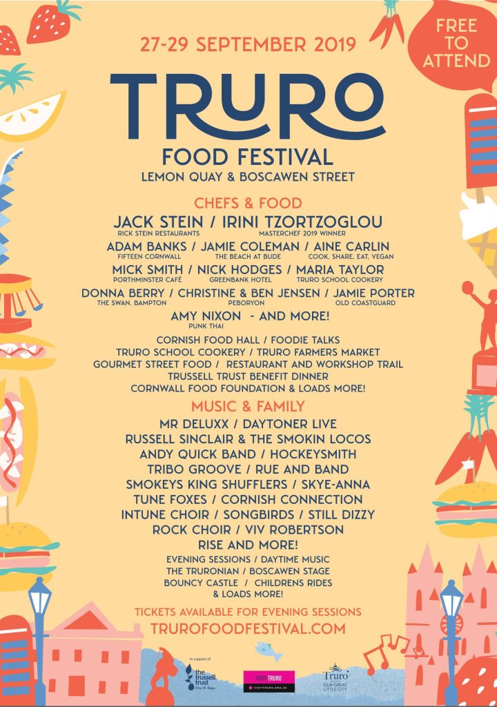
The colour choices within the poster allow it to communicate a sense of calmness and tranquillity, effectively reinforcing the small-town setting. yellows and red are associated with warmth and cheerfulness.
a split complementary palette is a type of colour scheme that uses a primary colour and is complimented by 2 secondary colours on the opposite side of the colour wheel. This poster is an example of this using shades of blue for the type and parts of illustration and complimenting it with the yellow and orange colours in the remainder of the poster.
The split-complimentary palette is used throughout the poster, and the value and saturation are changed for the type. The main type has been used in a darker blue which fits into this palette. The dark blue type against a pale yellow background creates a strong contrast with effective readability.
The contrast in colour needs balance, if the contrast is too high then it can cause eye strain, if the contrast is too low then it causes poor readability which in turn does not effectively communicate the message.
“A balance of contrast between the text and the background colour is an effective way to make your text safe for the user’s eyes.”
A Bad Use of Colour


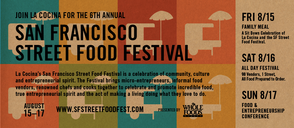
The street food banner on the top has poor use of colour, from the amount of colour used to the contrast of the type and background colours. The blocks of colour with the cutout of the food cart, provide a very cluttered composition. Upon first glance it is extremely difficult to distinguish the black type from the background, the copy text below is even more difficult to read due to the size and the changes of colour behind it. The palette used seems to be completely random and has no reasoning behind it, the colours used do not compliment each other effectively.
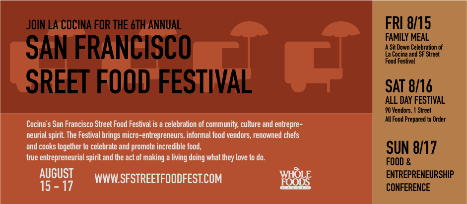
The redesigned banner effectively uses colour and composition to get across all the information. The banner now uses an analogous palette, which is a colour palette created by using a group of colours next to each other on the colour wheel. The browns and reds that have been chosen are very organic and give off a warm and calming feel.
The type choices on the right have stayed the same in the redesign, the type hierarchy and alignment are effective and the black type on the light brown background allows the information to be communicated. The redesign successfully retains design elements of the original like the food cart, the new version is more subtle and allows the type to be legible. This is due to the analogous palette, the lighter red stands out from the darker red but they are close enough in colour for the black type to have a high contrast. The change to light colour on the lower half of the redesign helps guide the viewer’s eye to the secondary information and visually breaks up the banner, which is a good example of how contrast in colour affects the viewer’s perception.
References
Truro Food Festival Poster(2019). Available at – https://www.facebook.com/trurofoodfestival/photos/a.2309795795955303/2433516733583208/ (Accessed on 28 October 2023)
La Cocina San Francisco Street Food Festival(2014). Available at – https://leslielaskinreese.com/summer-in-san-francisco/#comment-85 (Accessed on 29 October 2023)
Anthony, UXMovement.com(2022), Why You Should Never Use Pure Black for Text or Backgrounds. Available at – https://uxmovement.com/content/why-you-should-never-use-pure-black-for-text-or-backgrounds/ (Accessed on 29 October 2023)
GFC Global, The Power of Colour. Available at – https://edu.gcfglobal.org/en/beginning-graphic-design/color/1/ (Accessed on 28 October 2023)
copic.Too.com(2022), Colour Schemes. Available at – https://copic.too.com/blogs/educational/analogous-complimentary-and-split-complementary-color-schemes#:~:text=Last%20but%20not%20least%2C%20a,%2Dgreen%20and%20yellow%2Dorange. (Accessed on 28 October 2023)