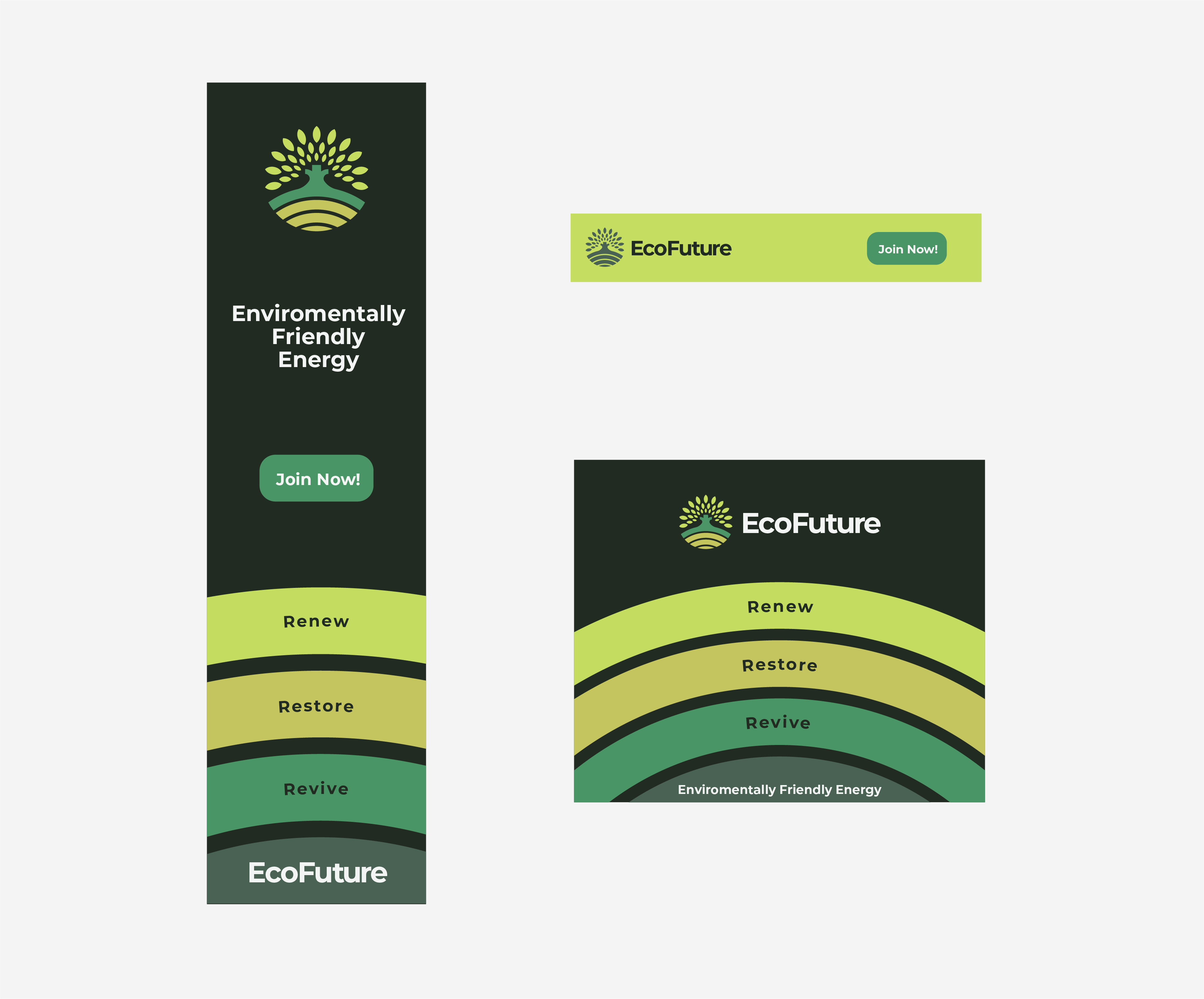
After sufficient research regarding eco-friendly brands, creating a visual style guide and the main logo, I was able to begin looking at how I could incorporate all these into online banners for the EcoFuture advertising banners, looking at what I could take from what I had created already to make an interesting and engaging visual layout. One of the things which was added to the brand at this stage was an additional colour, which was a very dark green to be used in contrast to the other tones whilst also keeping a monochromatic palette.
All 3 banners created follow a similar theme utilising one of the elements of the logo in the branding which starts to build a cohesive theme across all of the other elements and advertising materials. The repeating field pattern again emphasises growth and is also used in the bold green gradients to draw the user to the advertisement, by being bold and vibrant, this is reinforced by the addition of the dark green to create a strong contrast between the background and the foreground.
While creating the banners I came up with the slogan ‘Renew, Restore, Revive’ which pairs elegantly with the 3 rings and gives the viewer a clear and catchy indication of what EcoFuture is all about. The skyscraper web banner and the mobile banner were the 2 banners that came with the most limitations when designing, due to narrow width and height, the information had to be strategically placed without the composition looking overcrowded or being too small to read, which is where the use of colour came in to help with clear legibility. The skyscraper advertisement began to look even more crowded when including the logotype underneath the icon, so I opted to place it at the bottom of the advertisement instead; the initial thought was to remove the logotype from the banner but thought it was imperative to keep it in to improve the brand recognition and the effectiveness of the advertisement.
The mobile advertising banner slightly differs from the other 2 due to the smaller size and where it will be located, which would probably be within an application as an advertisement or on the bottom of the screen; it was important that the whole advertisement stood out more than the other as it would be easier to get lost, designing it to be a vibrant green background with a monotone green for both the type and logomark allows the design to maintain a high level of legibility. One of the things which online advertisements display is how effective the logo works on a small scale.