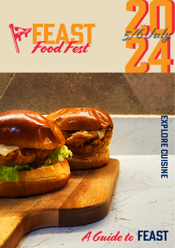
I took a completely different approaches with each of my cover designs, the design above is the cover I felt most appropriate as it feels to tie in with the double page spreads grid using the same flow line allowing it to feel consistent creating a clean and professional look. I opted for imagery for a large portion of the composition. This image was chosen due to its perspective and its ability to give some more depth to the flat colours. I was able to use photoshop to edit the photo and add warmth which complements the warm red and yellow used in the type so the image doesn’t feel out of place. I have used a stacked 2024, similar to my third spread and also layered on top is the month and date at the same 20% opacity value, throughout all of the spreads there are design decisions that correlate to one another.
Throughout each poster I was able to make sure that my typographic standards is clearly implemented showing the importance of getting that right and setting the brand guidelines early in the project.
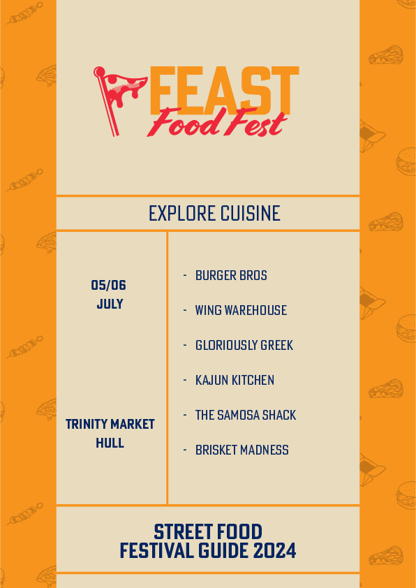
My second cover was an attempt to create a conceptual cover which was the style of stereotypical diner menu with the sections showing the date, location, contents of the festival and the brand tagline ‘explore cuisine’. Using hierarchy I emphasised what the magazine was for by putting the masthead at the top wit it being the largest element within the cover. I then followed on by highlighting the secondary information, time and location all in the bold version of my typeface while using the light version of the typeface for any additional information, guiding the readers eye to the most crucial pieces of information to the least important.
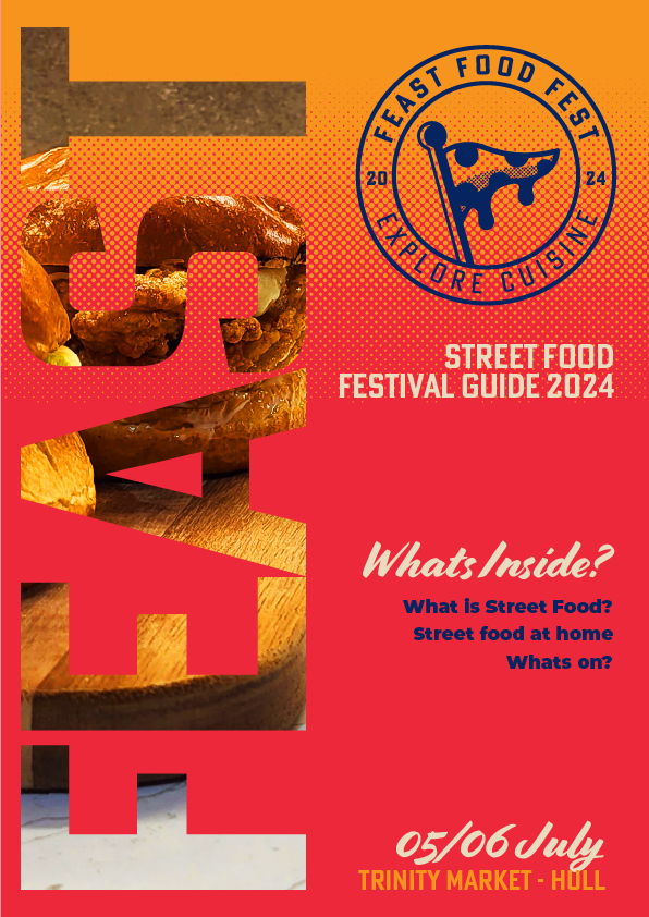
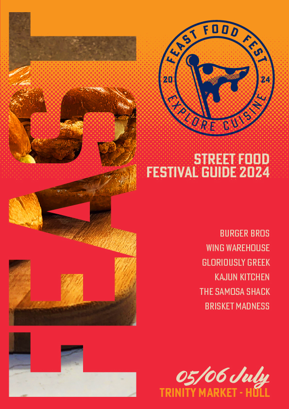
My third magazine cover allowed me to attempt to use a halftone effect which is something I want to implement into my double page spreads. I was not able to do so with my DPS as It led to trouble with the readability of the body copy, I was able to make it work for the cover due to the larger pieces of bold type. I have used the word mark ‘Feast’ down the left hand side, masked with my burger imagery, to split the composition in half to create visual balance. My third cover design also effectively uses hierarchy to direct the readers eye from the logo, to the date and location.
I went into the cover design with an open mind to create posters for the food festival. While working on cover 2 and 3, I tried to make a cover design that could also be used as a poster, hence why these covers contain both location and date.
Creating the three cover designs really allowed me understand the importance of my typographical standards, how my logo guidelines and type pairings came into play. I found that although I only chose 4 brand colours I was able to break up to composition of the covers with imagery, type and my brand pattern, in turn leading to design that is easy on the eye and conveys a clear, structured message.